flutter入坑
1,安装
首先下载flutter sdk
https://github.com/flutter/flutter/releases
或者
git clone -b beta https://github.com/flutter/flutter.git
配置用户变量
PUB_HOSTED_URL->https://pub.flutter-io.cn
FLUTTER_STORAGE_BASE_URL->https://storage.flutter-io.cn
配置系统path变量
C:\dev\flutter\bin
运行命名 ->flutter doctor
as安装插件-> flutter 和dart
完成之后重启as 新建flutter项目就行了;
2, as常用功能
查看flutter布局的树状图 ->as右边的flutter outline
抽取一个widget出来 ->在flutter outline 中选中这个widget然后右键 ->extract widget
3,flutter基础组件

Container
容器,一个常用的控件,由基本的绘制、位置和大小控件组成。负责创建矩形的可视元素,可以用BoxDecoration来设计样式,比如背景、边框和阴影,Container也有边距、填充和大小限制,另外,还可以在三维空间利用矩阵进行变换。
Container类似于android中的ViewGroup。
  new Container(
            alignment: Alignment.center,
            width: double.infinity,
            height: 50,
            padding: const EdgeInsets.all(15.0),
            margin: const EdgeInsets.all(15.0),
            //类似Android里面的shape
            decoration: new BoxDecoration(
              border: new Border.all(
                  color: Color(0xFFff0000)
              ),
              image: new DecorationImage(
                  fit: BoxFit.fill,
                  image: NetworkImage(
                      "https://gw.alicdn.com/tfs/TB1CgtkJeuSBuNjy1XcXXcYjFXa-906-520.png")),
              borderRadius: const BorderRadius.only(
                topLeft: const Radius.circular(3.0),
                topRight: const Radius.circular(6.0),
                bottomLeft: const Radius.circular(9.0),
                bottomRight: const Radius.circular(0.0),
              ),
            ),
          ),

Row
flex水平布局控件,能够将子控件水平排列,是基于Web的flexbox的布局模式设计的。
Row子控件有灵活与不灵活的两种,Row首先列出不灵活的子控件,减去它们的总宽度,计算还有多少可用的空间。然后Row按照Flexible.flex属性确定的比例在可用空间中列出灵活的子控件。要控制灵活子控件,需要使用Expanded控件。
注意: 该控件不支持滑动,如果子控件超过剩余空间,会报错,如果想支持水平滑动,考虑使用ListView。
如果只有一个子控件,可以使用 Align or Center控件定义该子控件位置。
new Row(
  children: <Widget>[
    new Expanded(
      child: new Text('Deliver features faster', textAlign: TextAlign.center),
    ),
    new Expanded(
      child: new Text('Craft beautiful UIs', textAlign: TextAlign.center),
    ),
    new Expanded(
      child: new FittedBox(
        fit: BoxFit.contain, // otherwise the logo will be tiny
        child: const FlutterLogo(),
      ),
    ),
  ],
)
Column
flex垂直布局控件,能够将子控件垂直排列。
RaisedButton
Material Design 风格的浮动按钮,以方形纸片样式悬停在界面上,点击后会产生墨水扩散效果。
避免在dialog和card控件里使用,一般弹出式的控件建议使用扁平化按钮,减少布局层次叠加。
使用时,要实现onPressed回调方法,否则按钮处于禁用状态,默认显示disabledColor样式的扁平化按钮,并且此时更改按钮的颜色不会生效。
注意该控件的父控件必须是Material控件。
Scaffold 实现了基本的Material Design布局结构。也就是说, MaterialApp 的 child 是 Scaffold Widget。
在Material设计中定义的单个界面上的各种布局元素,在 Scaffold 中都有支持,比如 左边栏(Drawers)、snack bars、以及 bottom sheets。
Scaffold
Scaffold 有下面几个主要属性:
appBar:显示在界面顶部的一个 AppBar,也就是 Android 中的 ActionBar 、Toolbar
body:当前界面所显示的主要内容 Widget
floatingActionButton:Material设计中所定义的 FAB,界面的主要功能按钮
persistentFooterButtons:固定在下方显示的按钮,比如对话框下方的确定、取消按钮
drawer:侧边栏控件
backgroundColor: 内容的背景颜色,默认使用的是 ThemeData.scaffoldBackgroundColor 的值
bottomNavigationBar: 显示在页面底部的导航栏
resizeToAvoidBottomPadding:类似于 Android 中的 android:windowSoftInputMode=”adjustResize”,控制界面内容 body 是否重新布局来避免底部被覆盖了,比如当键盘显示的时候,重新布局避免被键盘盖住内容。默认值为 true
显示 snackbar 或者 bottom sheet 的时候,需要使用当前的 BuildContext 参数调用 Scaffold.of 函数来获取 ScaffoldState 对象,然后使用 ScaffoldState.showSnackBar 和 ScaffoldState.showBottomSheet 函数来显示。
要特别注意 Scaffold.of 的参数 BuildContext, 如果包含该 BuildContext 的 Widget 是 Scaffold 的父 Widget,则 Scaffold.of 是无法查找到对应的 ScaffoldState 对象的,Scaffold.of 返回的是父对象中最近的 Scaffold 中的 ScaffoldState 对象。 比如,如果在 Scaffold 的 build 函数中,使用 build 的 BuildContext 参数是可以的:
@override
Widget build(BuildContext context) {
  return new RaisedButton(
    child: new Text('SHOW A SNACKBAR'),
    onPressed: () {
      Scaffold.of(context).showSnackBar(new SnackBar(
        content: new Text('Hello!'),
      ));
    },
  );
}
如果 build 函数返回一个 Scaffold 对象,则由于 Scaffold 对象是这个 Widget 的子对象,所以使用这个 build 的 BuildContext 参数是不能查找到 ScaffoldState 对象的,这个时候,通过在 Scaffold 中使用一个 Builder 来提供一个新的 BuildConext :
@override
Widget build(BuildContext context) {
  return new Scaffold(
    appBar: new AppBar(
      title: new Text('Demo')
    ),
    body: new Builder(
      // Create an inner BuildContext so that the onPressed methods
      // can refer to the Scaffold with Scaffold.of().
      builder: (BuildContext context) {
        return new Center(
          child: new RaisedButton(
            child: new Text('SHOW A SNACKBAR'),
            onPressed: () {
              Scaffold.of(context).showSnackBar(new SnackBar(
                content: new Text('Hello!'),
              ));
            },
          ),
        );
      },
    ),
  );
}
另外还可以把 build 函数中的 Widget 分别创建,分别引入新的 BuildContext 来获取 Scaffold。
Appbar
AppBar 和 SliverAppBar 是Material Design中的 App Bar,也就是 Android 中的 Toolbar,关于 Toolbar 的设计指南请参考Material Design中 Toolbar 的内容。
AppBar 和 SliverAppBar 都是继承StatefulWidget 类,都代表 Toobar,二者的区别在于 AppBar 位置的固定的应用最上面的;而 SliverAppBar 是可以跟随内容滚动的。
布局
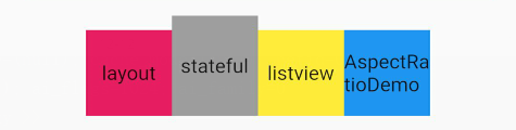
1,flex布局,这个是前端是常用布局方式,可以去这个地方学习一下http://www.runoob.com/w3cnote/flex-grammar.html
注:mainAxisAlignment=>子控件应该如何沿着主轴放置也就是Android里面的x
crossAxisAlignment=>子控件应该如何沿着交叉轴放置也就是Android里面的y
=====================>MainAxisAlignment.spaceEvenly, //按比例均分
例子:
   new Flex(direction: Axis.horizontal,
            //子控件应该如何沿着主轴放置也就是Android里面的x
            mainAxisAlignment: MainAxisAlignment.center,
            //子控件应该如何沿着交叉轴放置也就是Android里面的y
            crossAxisAlignment: CrossAxisAlignment.end,
            children: <Widget>[
              new GestureDetector(
                child: new Container(
                    width: 60.0,
                    height: 60.0,
                    color: Colors.pink,
                    child: const Center(
                      child: const Text("layout"),
                    )),
                onTap: () {
                  Navigator.push(context,
                      MaterialPageRoute(builder: (context) => new DemoPage()));
                },
              ),
              new GestureDetector(
                child: new Container(
                    width: 60.0,
                    height: 70.0,
                    color: Colors.grey,
                    child: const Center(
                      child: const Text("stateful"),
                    )),
                onTap: () {
                  Navigator.push(context,
                      MaterialPageRoute(
                          builder: (context) => new StatefulDemoWidget()));
                },
              ),

              new GestureDetector(
                child: new Container(
                    width: 60.0,
                    height: 60.0,
                    color: Colors.yellow,
                    child: const Center(
                      child: const Text("listview"),
                    )),
                onTap: () {
                  Navigator.push(context,
                      MaterialPageRoute(
                          builder: (context) => new ListViewDemoWidget()));
                },
              ),

              new GestureDetector(
                child: new Container(
                    width: 60.0,
                    height: 60.0,
                    color: Colors.blue,
                    child: const Center(
                      child: const Text("AspectRatioDemo"),
                    )),
                onTap: () {
                  Navigator.push(context,
                      MaterialPageRoute(
                          builder: (context) => new AspectRatioDemo()));
                },
              )
            ],
          ),
效果如下:
2,stack=>在实际开发中,还是需要在一些Widgets的上面再覆盖上新的Widgets。这时候就需要层式布局了。这种布局在Native上,以android为例,类似于relativeLayout 或者FrameLayout;
实际使用中Stack中的子Widgets分为两种:
- positioned
是包裹在组件Positioned中的组件
可以通过Positioned属性灵活定位
- non-positioned
没有包裹在Positioned组件中
需要通过父Widget Stack 的属性来控制布局
new Container(
      color: Colors.amber,
      height: 150,
      width: double.infinity,
      child: new Stack(
        children: <Widget>[
          new Container(
            width: 80,
            height: 40,
            color: Colors.blue,
          ),

          new Positioned(
              top: 20,
              left: 30,
              child: new Container(
                width: 80,
                height: 40,
                color: Colors.green,
              ))
        ],
      ),
    );
效果:

-
Expanded =>widget被标记为Expanded, ,这意味着它会填充满尚未被其他子项占用的的剩余可用空间。Expanded可以拥有多个children, 然后使用flex参数来确定他们占用剩余空间的比例。
-
设置宽度为屏幕宽度 width: double.infinity
资源图片的使用

这里有个坑,报如下的报错,其实就是要按照格式写那个资源文件的配置,注意-前面的空格位置,只能说很傻逼
Error on line 40, column 4 of pubspec.yaml: Expected a key while parsing a b
- 添加资源,不单单是图片,images是个和pubspec.yaml配置文件同级的目录,如果不同级,需要添加…
- 根据手机的像素比率来加载不同图片,做法很简单,只需要在图片同级目录下创建2.0x/…和3.0x/…的目录就可以了。
对其方式
这里的对其方式可以用下面的具体属性,也可以自定义(0.0-1.0)
    bottomCenter(0.5, 1.0)底部中心
    bottomLeft(0.0, 1.0)左下角
    bottomRight(1.0, 1.0)右下角
    center(0.5, 0.5)水平垂直居中
    centerLeft(0.0, 0.5)左边缘中心
    centerRight(1.0, 0.5)右边缘中心
    topCenter(0.5, 0.0)顶部中心
    topLeft(0.0, 0.0)左上角
    topRight(1.0, 0.0)右上角
使用例子:
 body: new Stack(
	children: <Widget>[
 		 new Align(
			alignment: new FractionalOffset(0.0, 0.0),
			child: new Image.network('http://up.qqjia.com/z/25/tu32710_10.jpg'),
  				),
  		new Align(
			alignment: FractionalOffset.bottomRight,
			child: new Image.network('http://up.qqjia.com/z/25/tu32710_11.jpg'),
  			),
		]
  ),
效果如下
//AspectRatio控件能强制子小部件的宽度和高度具有给定的宽高比,以宽度与高度的比例表示。
new AspectRatio(
	aspectRatio: 3.0 / 1.0,//宽高比为3:1
		child: new Container(
			  decoration: new BoxDecoration(
				color: Colors.lightBlueAccent[100],
 		 ),
	),
 ),
效果如下

- 装饰容器DecoratedBox(DecoratedBox控件会在子控件绘制之前或之后绘制一个装饰。类似android里面shape)
设置一个渐变的背景
DecoratedBox(
          decoration: new BoxDecoration(
          gradient: new LinearGradient(
              colors: [const Color(0xFFff0000),const Color(0xFF00ff00)])
          ),
        child: new Container(
          width: 500,
          height: 200,
        ),
      ),

- Opacity控件能调整子控件的不透明度,使子控件部分透明,不透明度的量从0.0到1.1之间,0.0表示完全透明,1.1表示完全不透明。
new Opacity(
          opacity: 0.1,
          child: new Container(
            width: 250.0,
            height: 100.0,
            decoration: new BoxDecoration(
              backgroundColor: const Color(0xff000000),
            ),
          ),
        ),
- PopupMenuButtonPopupMenuButton控件即弹出菜单控件,点击控件会出现菜单
class AspectRatioDemo extends StatefulWidget {

  @override
  State<StatefulWidget> createState() {
    return new AspectRatioState();
  }
}

class AspectRatioState extends State<AspectRatioDemo> {
  String title = "点击显示menuitem内容";

  @override
  Widget build(BuildContext context) {
    return new Scaffold(
      appBar: new AppBar(
        title: Text("AspectRatioDemo"),
        //PopupMenuButton控件即弹出菜单控件,点击控件会出现菜单
        actions: <Widget>[
          new PopupMenuButton(
            itemBuilder: (BuildContext context) => [
              new PopupMenuItem(
                child: new Text("选项1"),
                value: "选择1的值",
              ),
              new PopupMenuItem(
                child: new Text("选项2"),
                value: "选择2的值",
              ),
            ],
            //参数是PopupMenuItem的value,点击更改内容
            onSelected: (value) {
              setState(() {
                title = value;
              });
            },
          )
        ],
      ),
      body: new AspectRatio(
        aspectRatio: 3.0 / 1.0, //宽高比
        child: new Container(
          decoration: new BoxDecoration(
            color: Colors.red[100],
          ),
          child: new Center(
            child: new Text(title),
          ),
        ),
      ),
    );
  }
}

InkWell 水波纹,被inkWell包裹的就有水波纹
例子:
// The InkWell Wraps our custom flat button Widget
new InkWell(
  // When the user taps the button, show a snackbar
  onTap: () {
		Scaffold.of(context).showSnackBar(new SnackBar(
  			content: new Text('Tap'),
		));
  	},
  child: new Container(
		padding: new EdgeInsets.all(12.0),
		child: new Text('Flat Button'),
  ),
);
仿ios滑动删除功能
class MyApp extends StatelessWidget {
final List<String> items;
MyApp({Key key, @required this.items}) : super(key: key);
@override
Widget build(BuildContext context) {
final title = 'Dismissing Items';

return new MaterialApp(
  title: title,
  home: new Scaffold(
    appBar: new AppBar(
      title: new Text(title),
    ),
    body: new ListView.builder(
      itemCount: items.length,
      itemBuilder: (context, index) {
        final item = items[index];

        return new Dismissible(
          // Each Dismissible must contain a Key. Keys allow Flutter to
          // uniquely identify Widgets.
          key: new Key(item),
          // We also need to provide a function that will tell our app
          // what to do after an item has been swiped away.
          onDismissed: (direction) {
            items.removeAt(index);

            Scaffold.of(context).showSnackBar(
                new SnackBar(content: new Text("$item dismissed")));
          },
          // Show a red background as the item is swiped away
          background: new Container(color: Colors.red),
          child: new ListTile(title: new Text('$item')),
        );
      },
    ),
  ),
);
}
}
参考:
https://www.jianshu.com/p/9e6c470ea5bf
https://blog.csdn.net/hekaiyou/column/info/13593