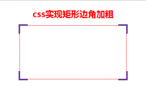
<body>
    <h1 style="color: red">css实现矩形边角加粗</h1>
    <div class="main">
        <span></span>
        <span></span>
        <span></span>
        <span></span>
    </div>
</body>
body{
    display: flex;
    justify-content: center;
    flex-direction: column;
    align-items: center;
}
.main{
    position: relative;
    width: 400px;
    height: 200px;
    border: 1px solid red;
}
.main span:nth-child(1){
    position: absolute;
    left: -5px;
    top: -5px;
    padding: 15px;
    border-style: solid;
    border-color: rebeccapurple;
    border-width: 5px 0 0 5px;
}
.main span:nth-child(2){
    position: absolute;
    right: -5px;
    top: -5px;
    padding: 15px;
    border-style: solid;
    border-color: rebeccapurple;
    border-width: 5px 5px 0 0;
}
.main span:nth-child(3){
    position: absolute;
    right: -5px;
    bottom: -5px;
    padding: 15px;
    border-style: solid;
    border-color: rebeccapurple;
    border-width: 0 5px 5px 0;
}
.main span:nth-child(4){
    position: absolute;
    left: -5px;
    bottom: -5px;
    padding: 15px;
    border-style: solid;
    border-color: rebeccapurple;
    border-width: 0 0 5px 5px;
}