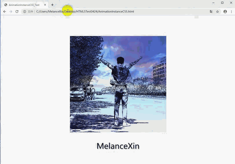
效 果 图
通过外边距实现图片的运动,同时让文本内容实现动态消失的效果。
代码模块:
<!DOCTYPE html>
<html lang="en">

<head>
    <meta charset="utf-8">
    <title>AnimationInstanceCSS_Test</title>
    <style type="text/css">
        .img {
            /* vertical-align:middle;	 */
            /* 垂直居中 */
            margin-top: 100px;
            /* 通过外边距实现居中效果 */
            width: 500px;
            height: 500px;
        }

        /* .img:hover  */
        html:hover .img
        /* 实现效果,鼠标放在页面内就执行 .img的animation */
        {
            animation-name: image_a;
            /* nimation 名字 */
            animation-delay: 500ms;
            /* animation 延迟 */
            animation-duration: 1s;
            /* animation 持续时间 */
            animation-fill-mode: forwards;
            /* 动画停止在最后一帧   若没进行设置,动画则会在结束后回到起始位置 */
        }

        @keyframes image_a {
            to {
                width: 120px;
                height: 100px;
                margin-top: 0px;
            }
        }

        .div {
            text-align: center;
            /* 水平居中 */
        }

        .p {
            font-family: 微软雅黑 ;
            font-size:40px;
            /* 字体大小 */
            text-shadow: 2px 2px 3px #b0b0b0;
            /* 阴影效果 */
            opacity: 1;
            /* 表示透明度  1 表示完全不透明  值为  0-1 范围内 */
        }

        .p:hover {
            transition-delay: 500ms;
            /* 过渡延迟时间500ms */
            transition-duration: 1s;
            /* 过渡持续时间 1s */
            font-family: 微软雅黑;
             font-size:40px;
             /* 字体大小 */
            text-shadow: 2px 2px 3px #b0b0b0;
            /* 阴影效果 */
            opacity: 0;
        }
    </style>
</head>

<body>
    <div class="div">
        <img src="image.jpg" class="img">
        <p class="p">MelanceXin</p>
    </div>
</body>

</html>
针对鼠标不能跟着图片一起行动的情况
html:hover .img{					//实现效果,鼠标放在页面内就执行 .img的animation
		animation-name:image_a;  	// animation 名字
		animation-delay:500ms;			//animation 延迟
		animation-duration:1s;			//animation 持续时间
		animation-fill-mode:forwards;		//动画停止在最后一帧   若没进行设置,动画则会在结束后回到起始位置
	}
可以不用animation,用 transition 也能实现图片的移动,如下
html:hover .img{
transition-delay:500ms'
transition-duration:1s;
width:100px;
height:100px;
margin-top:0px;
}
对比:animation 使用功能更加详细,但是同transition 相比之下,在简单的实现效果下,写法上显得更加复杂。