安卓开发笔记(三十):自定义Button
在笔者本人看了很多博客和书之后,发现很少博主对于自定义控件能够进行一个比较全面的思路讲解,大多数都是只讲了一些细节,但并没有讲如何把代码进行整体的实现。因此这里讲讲整体的自定义button实现的详细过程,其余的细节则可以查看其他博主的博客即可,也可以参考《Android开发艺术探索》这本书的第六章,看了我这篇博文之后,相信你一定对自定义控件会有一定的了解。
首先是创建一个根节点为shape的xml,用于描述我们所创建的button没有被按时的界面,如图:
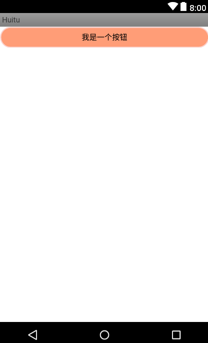
我们可以看到其四周都是由圆角来修饰的,那么我们怎么在shape根节点里把这个button的样式写出来呢?我们来看看代码,不知道如何创建shape文件的童鞋可以参考一下这个百度经验,传送门:https://jingyan.baidu.com/article/b907e62795139746e7891cb9.html
一.button_bg.xml
<?xml version="1.0" encoding="utf-8"?>
<shape xmlns:android="http://schemas.android.com/apk/res/android">
<solid
    android:color="#ff9d77"
    >
</solid>
<stroke
    android:width="2dp"
    android:color="#fad3cf">

</stroke>
<corners
    android:bottomLeftRadius="20dp"
    android:bottomRightRadius="20dp"
    android:topLeftRadius="20dp"
    android:topRightRadius="20dp" >
</corners>
<padding
    android:bottom="10dp"
    android:left="10dp"
    android:right="10dp"
    android:top="10dp"
    >


</padding>


</shape>
这样我们的按钮自定义界面就完成了,这是在没被按住的情况下,下面再来看看在按住情况下的程序代码,也是一个shape文件,后面我们会用选择器对它们的逻辑进行整合,最后在Button控件里进行调用这个选择器的逻辑。
二.demo.xml
<?xml version="1.0" encoding="utf-8"?>
<shape xmlns:android="http://schemas.android.com/apk/res/android"
   >
<gradient
    android:endColor="#FFFFFF"
    android:gradientRadius="200dp"
    android:startColor="#ff8c00"
    android:type="radial" >

</gradient>
<stroke
    android:width="5dp"
    android:color="#dcdcdc"
    >
</stroke>
<corners
    android:radius="23dp"   >
</corners>
<padding
    android:bottom="10dp"
    android:left="10dp"
    android:right="10dp"
    android:top="10dp"
    >


</padding>
</shape>
这样在按下按钮之后,就会呈现出来不同的显示效果,可以让用户明显感受到一种人机交互的感觉,之后是我们的选择器,因为在主活动当中我们只能够调用我们的选择器从而引出这两个效果。
三.selector.xml
这个文件的创建方式和shape类似,这里就不多说了,我们直接上代码:
<?xml version="1.0" encoding="utf-8"?>
<selector xmlns:android="http://schemas.android.com/apk/res/android">

<item android:drawable="@drawable/demo" android:state_pressed="true"></item>
    <item android:drawable="@drawable/button_bg"></item>


</selector>
我们可以看到在第一个item下面描述的是我们的按钮被按下去的界面将会变成demo.xml,平时正常的界面则是button_bg了。这就是上述代码的含义,之后我们再去主活动当中调用这个选择器,之后我们的自定义button就轻松完成啦!
四.activity.xml
<?xml version="1.0" encoding="utf-8"?>
<android.support.constraint.ConstraintLayout xmlns:android="http://schemas.android.com/apk/res/android"
    xmlns:app="http://schemas.android.com/apk/res-auto"
    xmlns:tools="http://schemas.android.com/tools"
    android:layout_width="match_parent"
    android:layout_height="match_parent"
    tools:context=".MainActivity">

    <Button
        android:layout_width="match_parent"
        android:layout_height="wrap_content"
        android:text="我是一个按钮"
        android:background="@drawable/selector"/>

</android.support.constraint.ConstraintLayout>
可以看到我们在button控件当中的backgroud属性当中引入了我们的选择器,这样子呢就可以把之前我们所定义的界面引入到这个button按钮当中了。