css渐变可以实现两个或多个指定的颜色之间显示平稳的过渡。(应用于背景)
线性渐变:向下/向上/向左/向右/对角方向
使用规则:
background: linear-gradient(direction, color-stop1, color-stop2, …);
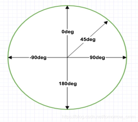
使用角度时:0deg是从下到上,90deg是从左到右,45deg是从左下到右上。
如果要实现一个纯色的渐变,只需要将颜色设置一个起始位置和结束位置就可以了。
纯色渐变效果图: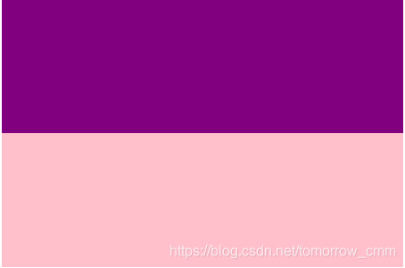
#div1{
        width:300px;
  height:200px;
  background:-webkit-linear-gradient(top,purple 0px,purple 100px,pink 100px,pink 200px );
  background:linear-gradient(top,purple 0px,purple 100px,pink 100px,pink 200px);
实现透明度(transparency):CSS3 渐变也支持透明度(transparency),可用于创建减弱变淡的效果。 为了添加透明度,我们使用 rgba() 函数来定义颜色结点。rgba() 函数中的最后一个参数可以是从 0 到 1 的值,它定义了颜色的透明度:0 表示完全透明,1 表示完全不透明。 下面的实例演示了从左边开始的线性渐变。起点是完全透明,慢慢过渡到完全不透明的红色。

#div1{
        width:300px;
  height:200px;
  background:-webkit-linear-gradient(top,rgba(255,5,0,0),rgba(255,5,0,1));
  background:linear-gradient(top,rgba(255,5,0,0),rgba(255,5,0,1));
重复的线性渐变 : repeating-linear-gradient() 函数用于重复线性渐变