引言
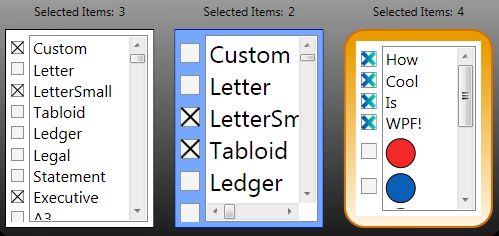
本文就WPF中的ListBox常用项给以实例代码演示,包括隐蔽属性的设置,Style设置,以及ControlTemplate的自定义。
Listbox平滑滚动
<ListBox ItemsSource="{Binding ActorList}" Width="300"
         ScrollViewer.CanContentScroll="False"/>
或者
 <ListBox.Template>
    <ControlTemplate>
      <ScrollViewer Focusable="False" CanContentScroll="True">
        <ItemsPresenter />
      </ScrollViewer>
    </ControlTemplate>
  </ListBox.Template>
参考:http://stackoverflow.com/a/3031298/1616023
StackPanel implements the IScrollInfo interface to do logical scrolling, but if ScrollViewer can't find an IScrollInfo child it falls back to doing physical scrolling.
There are three ways to obtain logical scrolling inside a ScrollViewer:
- Let the ScrollViewer's direct child be a panel that can do logical scrolling (such as a StackPanel)
- Let the ScrollViewer's direct child be an ItemsPresenter which presents such a panel
- Let the ScrollViewer's direct child be a custom class you write yourself that implements IScrollInfo
点击ListboxItem任意位置选中ListBoxItem
<ListBox.Resources>
    <Style TargetType="{x:Type ListBoxItem}">
        <Style.Triggers>
            <Trigger Property="IsKeyboardFocusWithin" Value="True">
                <Setter Property="IsSelected" Value="True" />
            </Trigger>
        </Style.Triggers>
    </Style>
</ListBox.Resources>
引用:Trigger SelectedIndex changed whilst clicking on any control within a ListBoxItem area
控制滚动条的显示
ScrollViewer.VerticalScrollBarVisibility="Visible"
ScrollViewer.HorizontalScrollBarVisibility="Disabled"
更改Items的container
 <ListBox.ItemsPanel>
                    <ItemsPanelTemplate>
                        <WrapPanel/>
                    </ItemsPanelTemplate>
                </ListBox.ItemsPanel>
或者
<ListBox.Style>
    <Style TargetType="{x:Type ListBox}">
        <Setter Property="Visibility" Value="Visible" />
        <Setter Property="ItemsPanel">
            <Setter.Value>
                <ItemsPanelTemplate>
                    <WrapPanel />
                </ItemsPanelTemplate>
            </Setter.Value>
        </Setter>
</Style>
</ListBox.Style>
自定义ItemsControl template
<ItemsControl x:Name="activitiesControl" Margin="10">
    <ItemsControl.Template>
        <ControlTemplate>
            <WrapPanel  Width="{TemplateBinding Width}" Height="{TemplateBinding Height}"
                    FlowDirection="LeftToRight" IsItemsHost="true">
            </WrapPanel>
        </ControlTemplate>
    </ItemsControl.Template>
    <ItemsControl.ItemTemplate>
        <DataTemplate>
            <Button Style="{DynamicResource ActionButton}" HorizontalAlignment="Right" Margin="5"
                Content="{Binding Value}" Width="200"
                Command="{Binding Path=ViewModel.ActionTypeCommand,
                    RelativeSource={RelativeSource Mode=FindAncestor,
                AncestorType=local:CustomerEditView}}" CommandParameter="{Binding Key}"/>
        </DataTemplate>
    </ItemsControl.ItemTemplate>
</ItemsControl>
参考另一文章 数据邦定之DataTemplate 根据对象属性切换模板
自定ListBox
A WPF Problem Solved Two Very Different Ways - Using XAML Only - Using a Custom Control

Listbox 为空时显示
利用AdornerLayer实现如下:

EmptyItemsControlOverlay
另一简单办法:
<Style TargetType="{x:Type ListBox}">
            <Style.Triggers>
                <DataTrigger Binding="{Binding Path=Items.Count,
                    RelativeSource={RelativeSource Self}}"  Value="0">
                    <Setter Property="Background">
                        <Setter.Value>
                            <VisualBrush Stretch="None">
                                <VisualBrush.Visual>
                                    <TextBlock  Text="No Items" VerticalAlignment="Center"  HorizontalAlignment="Center" IsEnabled="False" />
                                </VisualBrush.Visual>
                            </VisualBrush>
                        </Setter.Value>
                    </Setter>
<!--方法二-->
                    <!--<Setter Property="Template">
                        <Setter.Value>
                            <ControlTemplate>
                                <Border BorderThickness="1" BorderBrush="Black"
                                    Padding="10" Margin="10" Background="Transparent">
                                    --><!--<TextBlock>No items to display</TextBlock>--><!--
                                </Border>
                            </ControlTemplate>
                        </Setter.Value>
                    </Setter>-->
                </DataTrigger>
            </Style.Triggers>
        </Style>