版权声明:本文为博主原创文章,未经博主允许不得转载。 https://blog.csdn.net/AC_greener/article/details/88077496
1,使用flex布局(元素定宽,不定宽均适用)
<section>
    <style>
      .parent {
        border: 1px solid red;
        padding: 20px;
        display: flex;
        justify-content: center;
        align-items: center;
        width: 500px;
      }
      .child {
        background-color: aqua;
        height: 200px;
        width: 200px;
      }
    </style>
    <div class="parent">
      <div class="child"></div>
    </div>
  </section>
效果如下:

2,使用绝对定位+负margin(仅适用于定宽元素)
<section>
    <style>
      .parent {
        position: relative;
        border: 1px solid red;
        padding: 20px;
        width: 500px;
        height: 300px;
      }
      .child {
        background-color: aqua;
        height: 200px;
        width: 200px;
        position: absolute;
        top: 50%;
        left: 50%;
        /* 这里百分比是相对于父元素的 */
        margin-left: -100px;
        margin-top: -100px
      }
    </style>
    <div class="parent">
      <div class="child"></div>
    </div>
  </section>
3,绝对定位+transform(元素定宽,不定宽均适用)
<section>
    <style>
      .parent {
        position: relative;
        border: 1px solid red;
        padding: 20px;
        width: 500px;
        height: 300px;
      }
      .child {
        background-color: aqua;
        height: 200px;
        width: 200px;
        position: absolute;
        top: 50%;
        left: 50%;
        /* 这里百分比是相对于父元素的 */
        transform: translateX(-50%) translateY(-50%);
        /* 这里百分比是相对于子元素的 */
      }
    </style>
    <div class="parent">
      <div class="child"></div>
    </div>
  </section>
4,绝对定位+margin:auto(仅适用于元素定宽)
  <section>
    <style>
      .parent {
        position: relative;
        border: 1px solid red;
        padding: 20px;
        width: 500px;
        height: 300px;
      }
      .child {
        background-color: aqua;
        height: 200px;
        width: 200px;
        position: absolute;
        margin: auto;
        top: 0;
        left: 0;
        right: 0;
        bottom: 0
      }
    </style>
    <div class="parent">
      <div class="child"></div>
    </div>
  </section>
5, 绝对定位+CSS新属性calc(仅适用于定宽元素)
 <section>
    <style>
      .parent {
        position: relative;
        border: 1px solid red;
        padding: 20px;
        width: 500px;
        height: 300px;
      }
      .child {
        background-color: aqua;
        height: 200px;
        width: 200px;
        position: absolute;
        top: calc(50% - 100px);
        left: calc(50% - 100px);
      }
    </style>
    <div class="parent">
      <div class="child"></div>
    </div>
  </section>
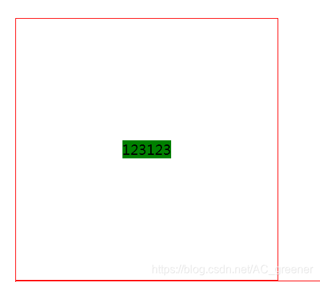
6,使用css3新属性:display:table-cell (元素定宽,不定宽均适用)
  .wp {
    border: 1px solid red;
    width: 300px;
    height: 300px;
    display: table-cell;
    text-align: center;
    vertical-align: middle;
}
.box {
    background: green;
    display: inline-block;
}

  </style>
    <div class="wp">
        <div class="box">123123</div>
    </div>
效果图:
7,使用grid布局 (元素定宽,不定宽均适用)
 .wp {
    border: 1px solid red;
    width: 300px;
    height: 300px;
    display: grid;
}

.box {
    background: green;
    align-self: center;
    justify-self: center;
}

  </style>
</head>
<body>
    <div class="wp">
        <div class="box">123123</div>
    </div>