滑动门:
    滑动门并不是一项全新的技术,它是利用背景图像的可层叠性,并允许他们在彼此之上进行滑动,以创造一些特殊的效果。
CSS精灵

CSS Sprites在国内很多人叫CSS精灵,是一种网页图片应用处理方式。它允许你将一个页面涉及到的所有零星图片都包含到一张大图中去。

CSS Sprites并不是一门新技术,目前它已经在网页开发中发展得十分成熟。大部分公司要求前端工程师必须使用CSS 精灵,处理图片;
CSS精灵 优点:
利用CSS 精灵能很好地减少了网页的http请求次数,从而大大的提高了页面的性能,这也是CSS 精灵最大的优点;减少图片大小


CSS精灵 缺点:
降低开发效率;
维护难度加大;
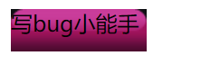
day01- 三层嵌套
<!DOCTYPE HTML>
<html>
<head>
<meta http-equiv="Content-Type" content="text/html; charset=utf-8">
<title>无标题文档</title>
<style>
.btn{width:100px; background:url(img/btn.png) repeat-x;}
.btnL{background:url(img/btnL.png) no-repeat;}
.btnR{height:31px; background:url(img/btnR.png) no-repeat right 0;}

<!--  background:url(img/btn.png) 打开图片
repeat    默认。背景图像将在垂直方向和水平方向重复。
repeat-x    背景图像将在水平方向重复。
repeat-y    背景图像将在垂直方向重复。
no-repeat    背景图像将仅显示一次。
inherit    规定应该从父元素继承 background-repeat 属性的设置
-->
</style>
</head>
<body>
<div class="btn">
    <div class="btnL">
        <div class="btnR">写bug小能手</div>
    </div>
</div>
</body>
</html>
图片:
day02-两层嵌套
<!DOCTYPE HTML>
<html>
<head>
<meta http-equiv="Content-Type" content="text/html; charset=utf-8">
<title>无标题文档</title>
<style>
.btn{width:200px;background:url(img/btn2.png) no-repeat;}
.btnR{height:31px; background:url(img/btnR.png) no-repeat right 0;}
/*
    扩展要求高,图片比较大的 用三层嵌套
    扩展要求不高,图片比较小的 用两层嵌套
*/
</style>
</head>
<body>
<div class="btn">
    <div class="btnR">写bug小能手</div>
</div>
</body>
</html>
图片:

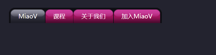
day03-滑动导航门
<!DOCTYPE HTML>
<html>
<head>
<meta http-equiv="Content-Type" content="text/html; charset=utf-8">
<title>无标题文档</title>
<style>
body,ul{margin:0;padding:0;}
li{ list-style:none;}
a{ text-decoration:none;}
body{background:#23232f;padding:50px;}
.nav{ background:#0f0f14 url(img/navL.png) no-repeat;float:left;}
.navR{background:url(img/navR.png) no-repeat right 0;float:left;padding:4px 4px 0 3px;}
.nav li{float:left;padding-left:1px;}
.nav a{float:left;background:url(img/btn2.png) no-repeat;}
.nav span{float:left;background:url(img/btnR.png) no-repeat right 0;height:31px; font-size:14px; line-height:30px;color:#fff;padding:0 18px;}
.nav a:hover,.nav .active{ background-image:url(img/hoverA.png);}
.nav a:hover span,.nav .active span{ background-image:url(img/hoverR.png);}
/*
    元素的宽度由内容撑开

    display:inline;

    display:inline-block;

    float

    position:absolute

    position:fixed

*/
</style>
</head>
<body>
<div class="nav">
    <ul class="navR">
        <li>
            <a href="3_滑动门导航.html" class="active">
                <span>MiaoV</span>
            </a>
        </li>
        <li>
            <a href="3_滑动门导航 - 副本.html">
                <span>课程</span>
            </a>
        </li>
        <li>
            <a href="3_滑动门导航 - 副本 (2).html">
                <span>关于我们</span>
            </a>
        </li>
        <li>
            <a href="3_滑动门导航 - 副本 (3).html">
                <span>加入MiaoV</span>
            </a>
        </li>
    </ul>
</div>
</body>
</html>
图片:
day04-圆角
扫描二维码关注公众号,回复:
5287632 查看本文章

<!DOCTYPE HTML>
<html>
<head>
<meta http-equiv="Content-Type" content="text/html; charset=utf-8">
<title>无标题文档</title>
<style>
.box{width:200px;height:200px;border:1px solid #e5e5e5;margin:30px auto; border-radius:40px;}
</style>
</head>
<body>
<div class="box"></div>
</body>
</html>
图片:

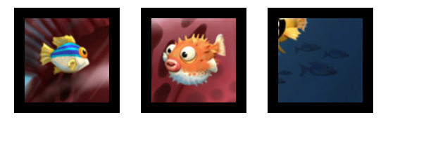
day05-css精灵
<!DOCTYPE HTML>
<html>
<head>
<meta http-equiv="Content-Type" content="text/html; charset=utf-8">
<title>无标题文档</title>
<style>
div{width:80px;height:80px;background:url(bigptr.jpg) no-repeat;border:10px solid #000;float:left;margin:10px; display:inline;}
.box1{ background-position:-151px -66px;}
.box2{ background-position:-241px -118px;}
.box3{ background-position:right bottom;}
</style>
</head>
<body>
<div class="box1"></div>
<div class="box2"></div>
<div class="box3"></div>
</body>
</html>
图片: