版权声明: https://blog.csdn.net/asialee_bird/article/details/83026056
1.绘制条形图
# -*- coding: utf-8 -*-
import matplotlib.pyplot as plt
import numpy as np
import pylab as pl
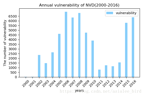
x=[2000,2001,2002,2003,2004,2005,2006,2007,2008,2009,2010,2011,2012,2013,2014,2015,2016]
values=[15,29,2348,1476,2634,4605,6969,6357,6844,4734,3881,803,1256,1154,1565,5778,6389]
# 创建一个点数为 6 x 4 的窗口, 并设置分辨率为 100像素/每英寸
fig=plt.figure(figsize=(6, 4), dpi=100)
# 再创建一个规格为 1 x 1 的子图
plt.subplot(1, 1, 1)
# 柱子总数
N = 17
# 包含每个柱子下标的序列
index = np.arange(N)
# 柱子的宽度
width = 0.35
# 绘制柱状图, 每根柱子的颜色为紫罗兰色
p2 = plt.bar(index, values, width, label="vulnerability", color="#87CEFA")
# 设置横轴标签
plt.xlabel('years')
# 设置纵轴标签
plt.ylabel('The number of vulnerability')
# 添加标题
plt.title('Annual vulnerability of NVD(2000-2016)')
# 添加纵横轴的刻度
plt.xticks(index, x)
plt.yticks(np.arange(0, 7000, 500))
pl.xticks(rotation=45) #x轴标签旋转
plt.legend(loc="vulnerability")# 添加图例
fig.tight_layout()# 自动紧凑布局
#plt.savefig('Figures/nvd.jpg') #保存图片
plt.show()
fig.tight_layout()
结果:
2.绘制折线图
# -*- coding: utf-8 -*-
import matplotlib.pyplot as plt
import numpy as np

fig=plt.figure(figsize=(10,8))
x1 = np.arange(20)
y1 = [0.42, 0.54,0.58,0.5825,0.59,0.62,0.65,0.73,0.75,0.765,0.77,0.7725,0.7725,0.78,0.785,0.785,0.79,0.7925,0.7925,0.79]

x2 = np.arange(20)
y2 = [0.43,0.46,0.52,0.613,0.62,0.65,0.75,0.755,0.79,0.795,0.81,0.815,0.825,0.84,0.84,0.85,0.865,0.87,0.865,0.87]


x3 = np.arange(20)
y3 = [0.46, 0.475,0.48,0.4825,0.49,0.52,0.55,0.53,0.55,0.565,0.585,0.58,0.6,0.64,0.64,0.655,0.65,0.65,0.67,0.66]

x4 = np.arange(20)
y4 = [0.43,0.46,0.52,0.613,0.62,0.65,0.65,0.655,0.69,0.695,0.71,0.715,0.725,0.74,0.74,0.75,0.765,0.77,0.765,0.78]


x5 = np.arange(20)
y5 = [0.41, 0.54,0.545,0.58,0.6,0.62,0.65,0.73,0.75,0.765,0.77,0.7725,0.7725,0.78,0.785,0.8,0.79,0.8,0.81,0.81]

x6 = np.arange(20)
y6 = [0.43,0.46,0.52,0.613,0.62,0.65,0.75,0.755,0.79,0.795,0.81,0.815,0.825,0.84,0.84,0.85,0.865,0.87,0.865,0.85]


x7 = np.arange(20)
y7 = [0.28,0.29,0.35,0.4,0.45,0.49,0.5,0.56,0.58,0.6,0.64,0.66,0.65,0.7,0.7,0.73,0.75,0.745,0.745,0.75]

x8 = np.arange(20)
y8 = [0.21,0.28,0.33,0.5,0.58,0.64,0.68,0.68,0.70,0.70,0.72,0.73,0.78,0.785,0.78,0.805,0.8,0.81,0.80,0.81]


plt.subplot(221)#注意:其中各个参数也可以用逗号,分隔开。第一个参数代表子图的行数;
                # 第二个参数代表该行图像的列数; 第三个参数代表每行的第几个图像
group_labels =np.arange(20)+1
plt.title('The value of Accuracy of different methods ')
plt.xlabel('Number of iterations')
plt.ylabel('Accuracy')
plt.plot(x1, y1, 'b', label='TF-DNN',marker='o')
plt.plot(x2, y2, 'r', label='TFI-DNN',marker='^')
plt.xticks(x1, group_labels, rotation=0)
plt.yticks(np.arange(0.1,1.1,0.1))
plt.legend(loc = 'best')


plt.subplot(222)
group_labels =np.arange(20)+1
plt.title('The value of Recall of different methods ')
plt.xlabel('Number of iterations')
plt.ylabel('Recall')
plt.plot(x3, y3, 'b', label='TF-DNN',marker='o')
plt.plot(x4, y4, 'r', label='TFI-DNN',marker='^')
plt.xticks(x1, group_labels, rotation=0)
plt.yticks(np.arange(0.1,1.1,0.1))
plt.legend(loc = 'best')


plt.subplot(223)
group_labels =np.arange(20)+1
plt.title('The value of Precision of different methods ')
plt.xlabel('Number of iterations')
plt.ylabel('Precision')
plt.plot(x5, y5, 'b', label='TF-DNN',marker='o')
plt.plot(x6, y6, 'r', label='TFI-DNN',marker='^')
plt.xticks(x1, group_labels, rotation=0)
plt.yticks(np.arange(0.1,1.1,0.1))
plt.legend(loc = 'best')


plt.subplot(2,2,4)
group_labels =np.arange(20)+1
plt.title('The value of F1-score of different methods ')
plt.xlabel('Number of iterations')
plt.ylabel('F1-score')
plt.plot(x7, y7, 'b', label='TF-DNN',marker='o')
plt.plot(x8, y8, 'r', label='TFI-DNN',marker='^')
plt.xticks(x1, group_labels, rotation=0)
plt.yticks(np.arange(0.1,1.1,0.1))
plt.legend(loc = 'best')


plt.legend(loc = 'best')
fig.tight_layout()# 自动紧凑布局
#plt.savefig('Figures/Accuracy.jpg')
plt.show()
fig.tight_layout()