内容提要:
- 组件的复用;
- 组件的组织:全局组件与局部组件
- 使用Props传递数据给子组件
- 组件必须拥有单独的根元素
- 使用事件发送消息给父组件:用一个事件发送一个值、在组件中使用v-model
- 用Slots内容限制
- 动态组件的使用
- DOM模板解析说明
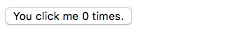
先看一个例子
Vue.component('button-counter',{
data: function() {
  return {
     count:0
  }
},
template: '<button v-on:click="count++">You click me {{ count }} times.</button>'
})
组件:具有特定名称的可复用的Vue实例
本例我们的组件是:,我们可以使用它去在new Vue创建的根实例里自定义一个元素。
<div id="component-demo">
<button-counter></button-counter>
</div>
new Vue({
el:"#component-demo"
})
既然组件是Vue实例,它们也接受和正常的new Vue实例相同的操作。例如:data,computed,watch,methods,和生命周期钩子。除了少数的根操作如el。
复用组件
组件可以被复用多次:
<div id="component-demo">
<button-counter></button-counter>
<button-counter></button-counter>
<button-counter></button-counter>
</div>
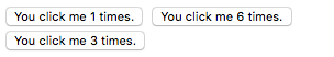
注意当点击button的时候,每一个由自己独立维护,count是分离的。这是因为每次你使用一个组件,一个新的实例被创建。
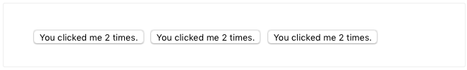
data必须是一个函数
当我们定义组件的时候,你可能注意到了data不能直接提供一个对象,像这样:
data:{
	count:0
}
相反,一个组件的data操作符必须是一个函数,所以每一个实例能维护一个独立的返回数据对象的拷贝:
data:function() {
    return {
        count: 0
    }
}
如果Vue没有这个规则,点击一个按钮将会影响其他所有的实例,像如下:
组织的组件
app的常见形式是树状嵌套组件:

例如,你可能有组件页眉、侧边栏、内容区,每一种类型包含其他的组件如导航链接,博客文章等。
注意:使用组件之前必须注册:注册分两种类型:全局注册global和局部注册local。到目前为止,我们仅仅使用了全局注册,用Vue.componnent:
Vue.component('my-componnent-name',{
    // ...options...
})
全局注册的组件能够被用于任何(new Vue)创建的实例及该实例的子组件树中。
这就是你现在需要知道的关于注册的所有内容,一旦你读完了本页并且感觉良好,我们推荐你稍后回来读完正的组件注册指导Component Registration。
使用Props传递数据给子组件
早些时候,我们提到创建一个组件用于博客文章。这个问题是除非你传递数据给它否则组件并不能用。例如标题或任何你想显出的内容。通过props传递带来的字段。
Props可以在你自定义字段的时候自定义属性。当为prop属性附一个值的时候,它将变成组件实例上的一个属性。为了传递一个标题给我们的博客文章组件,我们能够使用props操作,把它包括在一个组件props的列表中:
Vue.component('blog-post',{
    props:['title'],
    template: '<h3>{{ title }}</h3>'
})
默认情况,一个组件可以有任意多的propos。任何值都能传递给prop,在上面的自定义组件中,我们能在组件实例中接受一个值,类似于data。
一旦一个prop被注册,你能传递data给它的自定义属性,像这样:
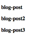
<div id="component-demo">
<blog-post title="blog-post"></blog-post>
<blog-post title="blog-post2"></blog-post>
<blog-post title="blog-post3"></blog-post>
</div>
Vue.component('blog-post',{
props: ['title'],
template: '<h3>{{ title }}</h3>'
})

new Vue({
el:"#component-demo"
})
在典型的app中,然而,你可能想传递一个post传递的数组在data中。
new Vue({
    el: '#blog-post-demo',
    data: {
        post: [
            {id: 1, title: 'My journey with me'},
            {id: 2, title: 'Blogging with me'},
            {id: 3, title: 'Why Vue is so fun'}
        ]
    }
})
然后你想要渲染一个组件用每一个值:
<blog-post
     v-for="post in posts"
     v-bind:key="post.id"
     v-bind:title="post.title">
</blog-post>
如上,你发现我们用v-bind去动态的传递props。在你能够预先知道渲染的内容时这是非常有用的,例如当从一个接口拉取数据的时候 fetching posts from an API。
这就是你现在需要知道的关于props的全部,一旦你读完这页并且理解这些内容,我们推荐你稍后回来读在Props的全部指导。
单个根元素
当增补一个组件的时候,你的模板内容最终将比一个title更多。
<h3>{{ title }}</h3>
至少,你想要包含的文章内容:
<h3>{{ title }}</h3>
<div v-html="content"></div>
如果你想要用你的模板,Vue会报错:**every component must hava a single root element.**你可以通过包一个父元素来修复这个错误。
像这样:
<div class="blog-post">
    <h3>{{ title }}</h3>
    <div v-html="content"></div>
</div>
正如我们组件的增长一样,我们不仅需要文章的标题和内容,也需要发布日期,评论等等。为这样一组信息都定一个props看起来非常混乱:
<blog-post
     v-for="post in posts"
     v-bind:key="post.id"
     v-bind:title="post.title"
     v-bind:content="post.content"
     v-bind:publishedAt="post.publishedAt"
     v-bind:comments="post.comments">
</blog-post>
所以这可能是重构的好时机,用一个单独的post属性代替。
<blog-post
     v-for="post in posts"
     v-bind:key="post.id"
     v-bind:post="post">
</blog-post>
Vue.component('blog-post',{
    props: ['post'],
    template:`
    <div class="blog-post">
    	<h3>{{ post.title }}</h3>
        <div v-html="post.content"></div>
    </div>
    `
})
以上的列子和将来使用Javascript的 template literal 去组成多行模板更具有可读性。这些将不被IE支持,如果你必须在不转义(eg:用Bael或TypeScript等工具)的情况下支持IE,用 newline escapes代替。
现在,只要新增一个post对象,它将在自动可用.
通过事件向父节点发送消息
正如我们优化了我们的组件,一些功能可用需要将信息反馈给父组件。例如:我们可能决定包含一个可访问的功能区放大博客文本,而页面的其余部分保持默认大小:
在父组件,我们能支持这个功能通过添加一个postFontSize 数据属性。
new Vue({
    el:'#blog-posts-events-demo',
    data: {
        posts:[/* ... */],
        postFontSize: 1
    }
})
能够被用在模板中去控制所有博文的文字尺寸:
<div id="blog-posts-events-demo">
    <div :style="{ fontSize: postFontSize + 'em' }">
        <blog-post
           v-for="post in posts"
           v-bind:key="post.id"
           v-bind:post="post">
        </blog-post>
    </div>
</div>
现在让我们增加一个按钮去正确的放大文本在每一个博文的内容之前:
Vue.component('blog-post', {
    props: ['post'],
    template: `
    <div class="blog-post">
    	<h3>{{ post.title }}</h3>
        <button>
           Enlarge text
        </button>
        <div v-html="post.content"></div>
    </div>
    `
})
问题是这个按钮不能做任何事情:
<button>
    Enlarge text
</button>
当我们点击一个button的时候,我们需要告诉父组件它应该放大所有博文的字体。幸运的是,Vue提供了一个自定义的事件系统解决了这个问题。为了向父节点发出事件,我们能够调用$emit method方法,传递一个事件名:
<button v-on:click="$emit('enlarge-text')">
    Enlarge text
</button>
然后在我们的博文,我们用v-on监听事件,就像我们处理本地DOM事件一样:
<blog-post
  ...
  v-on:enlarge-text="postFontSize += 0.1">
</blog-post>
详情代码如下:
Vue.component('blog-post', {
  props: ['post'],
  template: `
    <div class="blog-post">
      <h3>{{ post.title }}</h3>
      <button v-on:click="$emit('enlarge-text')">
        Enlarge text
      </button>
      <div v-html="post.content"></div>
    </div>
  `
})

new Vue({
  el: '#blog-posts-events-demo',
  data: {
    posts: [
      { id: 1, title: 'My journey with Vue' },
      { id: 2, title: 'Blogging with Vue' },
      { id: 3, title: 'Why Vue is so fun' }
      ],
    postFontSize: 1
  }
})
<div id="blog-posts-events-demo">
  <div :style="{ fontSize: postFontSize + 'em' }">
    <blog-post
      v-for="post in posts"
      v-bind:key="post.id"
      v-bind:post="post"
      v-on:enlarge-text="postFontSize += 0.1"
    ></blog-post>
  </div>
</div>
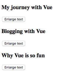
点击任何一个按钮会同步放大:
用事件发出一个值
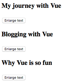
有时用一个事件发出一个特定的值是有用的。例如:我们可能像要组件负责把文本扩大多少,在这个例子中,我们能用$emit的第二个参数提供一个值:
<button v-on:click="$emit('enlarge-text',0.1)">
    Enlarge text
</button>
然后当我们在父组件上监听事件,我们能访问发出的事件的值用$event:
<blog-post>
    ...
    v-on:enlarge-text="postFontSize += $event"
</blog-post>
或,如果事件的处理是一个方法:
<blog-post>
    ...
    v-on:enlarge-text="onEnlargeText"
</blog-post>
值将会传递给方法的第一个参数:
methods:{
    onEnlargeText: function(enlargeAmount) {
        this.postFontSize += enlargeAmount
    }
}
在组件上使用v-model
自定义事件也能用于使用v-model创建自定义的输入框。记得这个:
<input v-model="searchText">
做同样的事情:
<input
       v-bind:value="searchText"
       v-on:input="searchText = $event.target.value">
但用一个组件的时候,v-model可以代替这样做:
<custom-input
   v-bind:value="searchText"
   v-on:input="searchText = $event">
</custom-input>
为了能够工作,组件内部的component必须 :
- 绑定一个value属性给到
valueprop - 在
input,用一个新值发出自己的自定义input
实际上是这样的:
Vue.component('custom-input', {
    props: ['value'],
    tempalte:`
      <input
        v-bind:value="value"
        v-on:input="$emit('input',$event.target.value)"
      >
    `
})
现在v-model可以在这个组件上完美工作了:
<custom-input v-model="searchText"></custom-input>
这就是你现在需要理解的组件的所有内容,一旦你完成了这章的阅读并且理解了所讲的内容,我们推荐你阅读自定义事件的完整指导Custom Events.
用Slot内容分发
就像HTML元素,它在传递内容给一个组件时常常是有用的,像这样:
<alert-box>
    Something bad happened.
</alert-box>
可能会被渲染为这样:
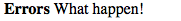
幸运的是,这个任务通过自定义元素变得非常简单:
Vue.component('alert-box', {
    template:
    `
       <div class="alert-box-demo">
		 <strong>Errors</strong>
         <slot></slot>
       </div>
    `
})
如你上面看到的,我们仅仅增加slot到我们想的地方就可以了。
这些就是slots的全部内容,如果你读完并理解这些内容。我们推荐你稍后回来读完成的指导Slots.
动态组件
有时,我们需要动态的切换组件,像一个tab界面:
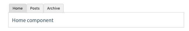
以上可能被实现通过Vue的元素里使用is属性:
<!-- Conponent changes when currentTabComponent -->
<component v-bind:is="currentTabComponent"></component>
在上面的例子里,currentTabComponent可能包含以下其一:
- 被注册组件的名字或
- 一个组件的操作对象
example1:注册一个名字
<div id="dynamic-component-demo" class="demo">
  <button
    v-for="tab in tabs"
    v-bind:key="tab"
    v-bind:class="['tab-button', { active: currentTab === tab }]"
    v-on:click="currentTab = tab"
  >{{ tab }}</button>

  <component
    v-bind:is="currentTabComponent"
    class="tab"
  ></component>
</div>
Vue.component('tab-home', {
	template: '<div>Home component</div>'
})
Vue.component('tab-posts', {
	template: '<div>Posts component</div>'
})
Vue.component('tab-archive', {
	template: '<div>Archive component</div>'
})

new Vue({
  el: '#dynamic-component-demo',
  data: {
    currentTab: 'Home',
    tabs: ['Home', 'Posts', 'Archive']
  },
  computed: {
    currentTabComponent: function () {
      return 'tab-' + this.currentTab.toLowerCase()
    }
  }
})
.tab-button {
  padding: 6px 10px;
  border-top-left-radius: 3px;
  border-top-right-radius: 3px;
  border: 1px solid #ccc;
  cursor: pointer;
  background: #f0f0f0;
  margin-bottom: -1px;
  margin-right: -1px;
}
.tab-button:hover {
  background: #e0e0e0;
}
.tab-button.active {
  background: #e0e0e0;
}
.tab {
  border: 1px solid #ccc;
  padding: 10px;
}
example2:绑定一个组件操作对象
<script src="https://unpkg.com/vue"></script>

<div id="tab-demo">
  <button
    v-for="tab in tabs"
    v-bind:key="tab"
    v-bind:class="['tab-button', { active: currentTab.name === tab.name }]"
    v-on:click="currentTab = tab"
  >{{ tab.name }}</button>

  <component
    v-bind:is="currentTab.component"
    class="tab"
  ></component>
</div>
var tabs = [
{
   name: 'Home',
   component:{
       template: '<div>Home component</div>'
   }
},
{
	name: 'Posts',
    component: {
        template: '<div>Posts component</div>'
	}
},
{
    name: 'Archive',
    component: {
        template: '<div>Archive component</div>'
   }
}
]

new Vue({
  el: '#tab-demo',
  data: {
    tabs: tabs,
    currentTab: tabs[0]
  }
})
// 同example1
这就是现在所有需要知道的动态组件知识,一旦你读完了这节并理解了这些,我们推荐稍后读完整班的指导Dynamic & Async Components.
DOM模板解析说明
一些HTML元素,像<ul>,<ol>,<table>和<select>对能出现在内部的元素有限制,一些元素如<li>,<tr>和<option>仅能出现在一些特定的元素内部。
因此这会导致在用元素创建组件的时候也会有这样的限制,例如:
<table>
    <blog-post-row></blog-post-row>
</table>
自定义组件将被作为无效内容被调起,在最终呈现的输出中导致错误,幸运的是,is属性提供了一个变通方案:
<table>
    <tr is="blog-post-row"><tr>
</table>
需要注意的是如果字符串模板来源于以下来源之一以下限制并不适用:
- 字符串模板(e.g. template:'...')

- 单文件组件[Single-file (`.vue`) components](https://vuejs.org/v2/guide/single-file-components.html)

- <script type="text/x-template">
这是所有你现在需要知道的DOM组件解析说明知识,实际上,这也是Vue’s基础的结束。恭喜!仍然有更多知识要学习,但首先,我们建议你休息一下去自己使用Vue构建一些有趣的东西。
一旦你对刚刚的知识理解了,你可以读完成的动态&异步组件知识Dynamic & Async Components,也可以学习侧边栏组件深入的其他页。