1、高度固定 三栏布局解决方案
<!DOCTYPE html>
<html lang="zh">

    <head>
        <meta charset="UTF-8" />
        <meta name="viewport" content="width=device-width, initial-scale=1.0" />
        <meta http-equiv="X-UA-Compatible" content="ie=edge" />
        <title>高度固定 三栏布局解决方案</title>
        <style type="text/css">
            html *{
                padding: 0;
                margin: 0;
            }
            .layout{
                min-height: 100px;
                margin-top: 20px;
            }
            .layout article div{
                min-height: 100px;
            }
        </style>
    </head>

    <body>
        <!--浮动实现-->
        <section class="layout float">
            <style>
                .layout.float .left-center-right{
                    overflow: hidden;
                }
                .layout.float .left-center-right .left{
                    float: left;
                    width: 200px;
                    background-color: red;
                }
                .layout.float .left-center-right .right{
                    float: right;
                    width: 300px;
                    background-color: blue;
                }
                .layout.float .left-center-right .center{
                    background-color: yellow;
                }
            </style>
            <article class="left-center-right">
                <div class="left">

                </div>
                <div class="right">

                </div>
                <div class="center">
                    三栏布局
                </div>
            </article>
        </section>
        <!--定位实现-->
        <section class="layout position">
            <style>
                .layout.position .left-center-right{
                    position: relative;
                }
                .layout.position .left-center-right div{
                    position: absolute;
                }
                .layout.position .left-center-right .left{
                    top: 0;
                    left: 0;
                    width: 200px;
                    background-color: red;
                }
                .layout.position .left-center-right .right{
                    top: 0;
                    right: 0;
                    width: 300px;
                    background-color: blue;
                }
                .layout.position .left-center-right .center{
                    top: 0;
                    left: 200px;
                    right: 300px;
                    background-color: yellow;
                }
            </style>
            <article class="left-center-right">
                <div class="left">

                </div>
                <div class="center">
                    三栏布局
                </div>
                <div class="right">

                </div>
            </article>
        </section>
        <!--flex实现-->
        <section class="layout flex">
            <style>
                .layout.flex .left-center-right{
                    display: flex;
                }
                .layout.flex .left-center-right .left{
                    width: 200px;
                    background-color: red;
                }
                .layout.flex .left-center-right .right{
                    width: 300px;
                    background-color: blue;
                }
                .layout.flex .left-center-right .center{
                    flex: 1;
                    background-color: yellow;
                }
            </style>
            <article class="left-center-right">
                <div class="left">

                </div>
                <div class="center">
                    三栏布局
                </div>
                <div class="right">

                </div>
            </article>
        </section>
        <!--grid实现-->
        <section class="layout grid">
            <style>
                .layout.grid .left-center-right{
                    display: grid;
                    /*注意不要忘记了 s 如rows*/
                    grid-template-rows: 100px;
                    grid-template-columns: 200px auto 300px;
                }
                .layout.grid .left-center-right .left{
                    background-color: red;
                }
                .layout.grid .left-center-right .right{
                    background-color: blue;
                }
                .layout.grid .left-center-right .center{
                    background-color: yellow;
                }
            </style>
            <article class="left-center-right">
                <div class="left">

                </div>
                <div class="center">
                    三栏布局
                </div>
                <div class="right">

                </div>
            </article>
        </section>
        <!--table实现-->
        <section class="layout table">
            <style>
                .layout.table .left-center-right{
                    display: table;
                    width: 100%;
                    height: 100px;
                }
                .layout.table .left-center-right div{
                    display: table-cell;
                }
                .layout.table .left-center-right .left{
                    width: 200px;
                    background-color: red;
                }
                .layout.table .left-center-right .right{
                    width: 300px;
                    background-color: blue;
                }
                .layout.table .left-center-right .center{
                    background-color: yellow;
                }
            </style>
            <article class="left-center-right">
                <div class="left">

                </div>
                <div class="center">
                    三栏布局
                </div>
                <div class="right">

                </div>
            </article>
        </section>
        <!--inline-block实现-->
        <section class="layout inline-block">
            <style>
                .layout.inline-block .left-center-right{
                    /*注意 是去掉inline-block的间隙*/
                    font-size: 0;
                }
                .layout.inline-block .left-center-right div{
                    display: inline-block;
                }
                .layout.inline-block .left-center-right .left{
                    width: 200px;
                    font-size: 16px;
                    background-color: red;
                }
                .layout.inline-block .left-center-right .right{
                    width: 300px;
                    font-size: 16px;
                    background-color: blue;
                }
                .layout.inline-block .left-center-right .center{
                    /*注意 calc运算符的左右两侧有空格*/
                    width: calc(100% - 500px);
                    font-size: 16px;
                    background-color: yellow;
                }
            </style>
            <article class="left-center-right">
                <div class="left">
                    左
                </div>
                <div class="center">
                    三栏布局
                </div>
                <div class="right">
                    右
                </div>
            </article>
        </section>
    </body>

</html>
效果: 
2、以上6种方法区别
浮动:需要清除浮动
定位:脱离文档流
flex:移动端
table:操作繁琐、seo不友好
grid:比较新的技术。
3、若高度不是固定的,哪些方法不是适应了?
<!DOCTYPE html>
<html lang="zh">

    <head>
        <meta charset="UTF-8" />
        <meta name="viewport" content="width=device-width, initial-scale=1.0" />
        <meta http-equiv="X-UA-Compatible" content="ie=edge" />
        <title>高度固定 三栏布局解决方案</title>
        <style type="text/css">
            html *{
                padding: 0;
                margin: 0;
            }
            .layout{
                min-height: 100px;
                margin-top: 20px;
            }
            .layout article div{
                min-height: 100px;
            }
        </style>
    </head>

    <body>
        <!--浮动实现-->
        <section class="layout float">
            <style>
                .layout.float .left-center-right{
                    overflow: hidden;
                }
                .layout.float .left-center-right .left{
                    float: left;
                    width: 200px;
                    background-color: red;
                }
                .layout.float .left-center-right .right{
                    float: right;
                    width: 300px;
                    background-color: blue;
                }
                .layout.float .left-center-right .center{
                    background-color: yellow;
                }
            </style>
            <article class="left-center-right">
                <div class="left">

                </div>
                <div class="right">

                </div>
                <div class="center">
                    三栏布局float
                    <p>增加高度</p>
                    <p>增加高度</p>
                    <p>增加高度</p>
                    <p>增加高度</p>
                    <p>增加高度</p>
                </div>
            </article>
        </section>
        <!--定位实现-->
        <section class="layout position">
            <style>
                .layout.position .left-center-right{
                    position: relative;
                }
                .layout.position .left-center-right div{
                    position: absolute;
                }
                .layout.position .left-center-right .left{
                    top: 0;
                    left: 0;
                    width: 200px;
                    background-color: red;
                }
                .layout.position .left-center-right .right{
                    top: 0;
                    right: 0;
                    width: 300px;
                    background-color: blue;
                }
                .layout.position .left-center-right .center{
                    top: 0;
                    left: 200px;
                    right: 300px;
                    background-color: yellow;
                }
            </style>
            <article class="left-center-right">
                <div class="left">

                </div>
                <div class="center">
                    三栏布局position
                    <p>增加高度</p>
                    <p>增加高度</p>
                    <p>增加高度</p>
                    <p>增加高度</p>
                    <p>增加高度</p>
                </div>
                <div class="right">

                </div>
            </article>
        </section>
        <!--flex实现-->
        <section class="layout flex">
            <style>
                .layout.flex .left-center-right{
                    display: flex;
                }
                .layout.flex .left-center-right .left{
                    width: 200px;
                    background-color: red;
                }
                .layout.flex .left-center-right .right{
                    width: 300px;
                    background-color: blue;
                }
                .layout.flex .left-center-right .center{
                    flex: 1;
                    background-color: yellow;
                }
            </style>
            <article class="left-center-right">
                <div class="left">

                </div>
                <div class="center">
                    三栏布局flex
                    <p>增加高度</p>
                    <p>增加高度</p>
                    <p>增加高度</p>
                    <p>增加高度</p>
                    <p>增加高度</p>
                </div>
                <div class="right">

                </div>
            </article>
        </section>
        <!--grid实现-->
        <section class="layout grid">
            <style>
                .layout.grid .left-center-right{
                    display: grid;
                    /*注意不要忘记了 s 如rows*/
                    grid-template-rows: 100px;
                    grid-template-columns: 200px auto 300px;
                }
                .layout.grid .left-center-right .left{
                    background-color: red;
                }
                .layout.grid .left-center-right .right{
                    background-color: blue;
                }
                .layout.grid .left-center-right .center{
                    background-color: yellow;
                }
            </style>
            <article class="left-center-right">
                <div class="left">

                </div>
                <div class="center">
                    三栏布局grid
                    <p>增加高度</p>
                    <p>增加高度</p>
                    <p>增加高度</p>
                    <p>增加高度</p>
                    <p>增加高度</p>
                </div>
                <div class="right">

                </div>
            </article>
        </section>
        <!--table实现-->
        <section class="layout table">
            <style>
                .layout.table .left-center-right{
                    display: table;
                    width: 100%;
                    height: 100px;
                }
                .layout.table .left-center-right div{
                    display: table-cell;
                }
                .layout.table .left-center-right .left{
                    width: 200px;
                    background-color: red;
                }
                .layout.table .left-center-right .right{
                    width: 300px;
                    background-color: blue;
                }
                .layout.table .left-center-right .center{
                    background-color: yellow;
                }
            </style>
            <article class="left-center-right">
                <div class="left">

                </div>
                <div class="center">
                    三栏布局table
                    <p>增加高度</p>
                    <p>增加高度</p>
                    <p>增加高度</p>
                    <p>增加高度</p>
                    <p>增加高度</p>
                </div>
                <div class="right">

                </div>
            </article>
        </section>
        <!--inline-block实现-->
        <section class="layout inline-block">
            <style>
                .layout.inline-block .left-center-right{
                    /*注意 是去掉inline-block的间隙*/
                    font-size: 0;
                }
                .layout.inline-block .left-center-right div{
                    display: inline-block;
                }
                .layout.inline-block .left-center-right .left{
                    width: 200px;
                    font-size: 16px;
                    background-color: red;
                }
                .layout.inline-block .left-center-right .right{
                    width: 300px;
                    font-size: 16px;
                    background-color: blue;
                }
                .layout.inline-block .left-center-right .center{
                    /*注意 calc运算符的左右两侧有空格*/
                    width: calc(100% - 500px);
                    font-size: 16px;
                    background-color: yellow;
                }
            </style>
            <article class="left-center-right">
                <div class="left">
                    左
                </div>
                <div class="center">
                    三栏布局inline-block
                    <p>增加高度</p>
                    <p>增加高度</p>
                    <p>增加高度</p>
                    <p>增加高度</p>
                    <p>增加高度</p>
                </div>
                <div class="right">
                    右
                </div>
            </article>
        </section>
    </body>

</html>
效果:
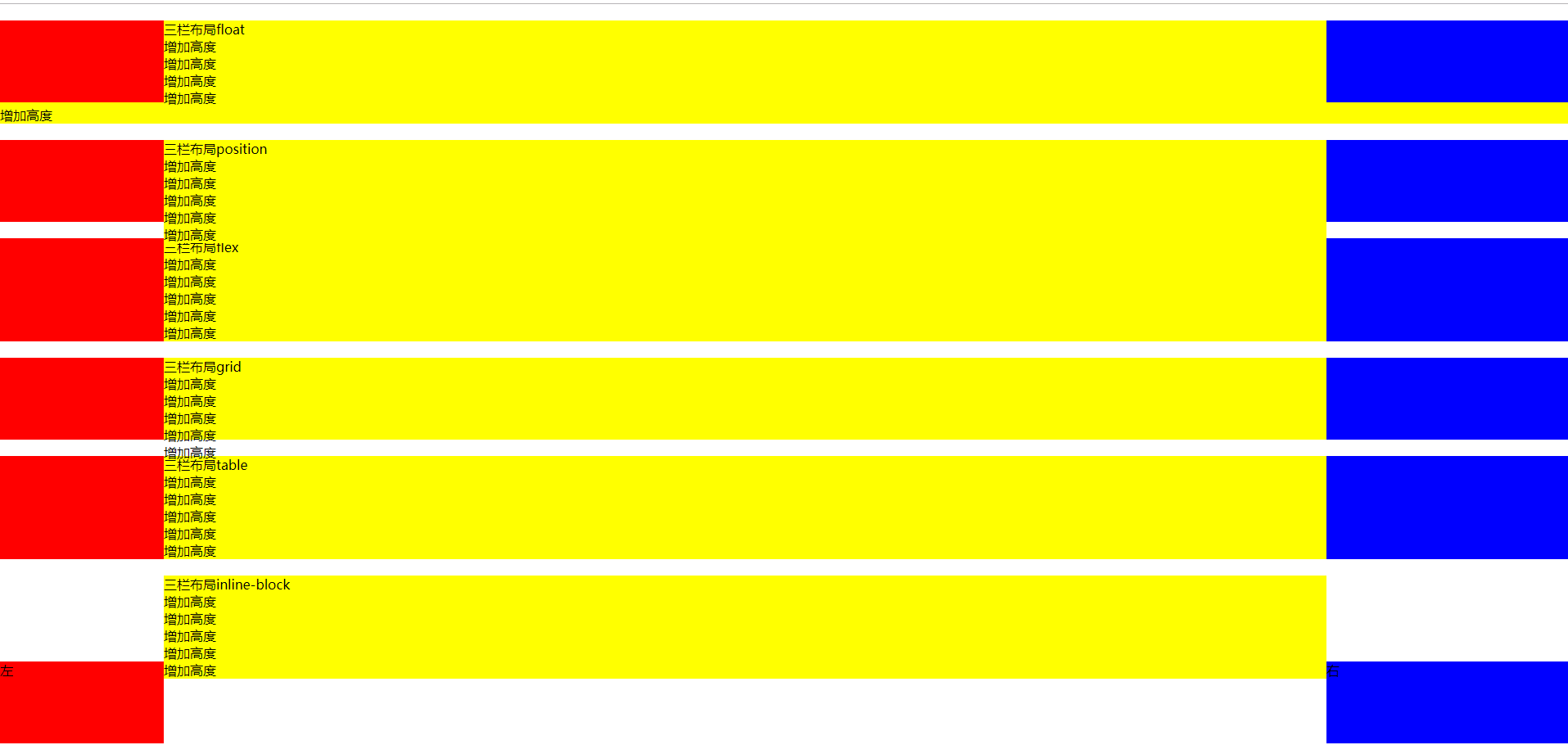
只有table和flex布局还可以。