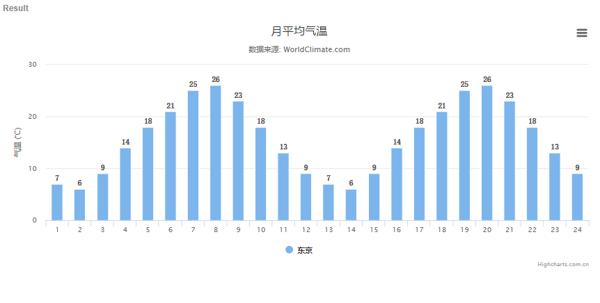
var chart = Highcharts.chart('container', {
    chart: {
        type: 'column'
    },
    title: {
        text: '月平均气温'
    },
    subtitle: {
        text: '数据来源: WorldClimate.com'
    },
    xAxis: {
        categories: ['1', '2', '3', '4', '5', '6', '7', '8', '9', '10', '11', '12','13', '14', '15', '16', '17', '18', '19', '20', '21', '22', '23', '24']
    },
    yAxis: {
        title: {
            text: '气温 (°C)'
        }
    },
    plotOptions: {
        column: {
            dataLabels: {
                enabled: true,
                style: {
                    color: '#555',
                    fontSize: '12px',
                    fontFamily: '宋体',
                    textShadow: false,
                    textOutline: "none"
                }
            },
            //pointWidth:35, //柱子宽度,如果设定该值,则下面2个属性无效
            pointPadding: 0.1,//每列之间的距离值,默认此值为0.1
            //groupPadding: 0.1,//每个值之间的间距,其实和poingPadding有一样的效果。不过这个主要是用于对付存在分组的情况
            //borderWidth: 0,
            shadow: false
        }
    },
    series: [{
        name: '东京',
        data: [7, 6, 9, 14, 18, 21, 25, 26, 23, 18, 13, 9,7, 6, 9, 14, 18, 21, 25, 26, 23, 18, 13, 9]
    }]
});