版权声明:本文为博主原创文章,未经博主允许不得转载。 https://blog.csdn.net/u011320740/article/details/79297865
加上如下代码即可:
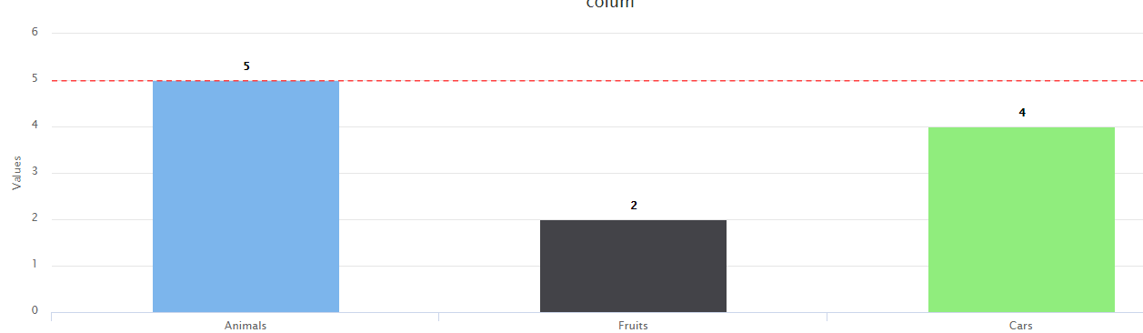
plotLines:[{//基准线
            color:'#FF4040',
            dashStyle:'Dash',
            width:1.5,//基准线宽度
            value:5,//基准线的参考值
            zIndex:5
}]完整代码:
<!DOCTYPE HTML PUBLIC "-//W3C//DTD HTML 4.01//EN" "http://www.w3.org/TR/html4/strict.dtd">
 <script src="jquery-1.10.2.min.js"></script>
<script src="highcharts.js"></script>
<div id="container" style="min-width: 310px; height: 400px; margin: 0 auto"></div>
<script>

// Create the chart
$(function () {
    $('#container').highcharts({
    chart: {
        type: 'column',
    },
    title: {
        text: 'colum'
    },
    xAxis: {
        type: 'category',

    },
    yAxis:{
        plotLines:[{//基准线
            color:'#FF4040',
            dashStyle:'Dash',
            width:1.5,
            value:5,
            zIndex:5
        }]
    },
    legend: {
        enabled: false
    },

    plotOptions: {
        series: {
            borderWidth: 0,
            dataLabels: {
                enabled: true
            },
            events:{
            click:function(e){//点击事件

                }
             }
        }

    },

    series: [{
        name: 'Things',
        colorByPoint: true,
        data: [{
            name: 'Animals',
            y: 5

        }, {
            name: 'Fruits',
            y: 2
        }, {
            name: 'Cars',
            y: 4
        }]
    }],


})
})


</script>
测试结果:
或者还有另一种基准线方式
加上如下代码即可,添加位置与上面一样:
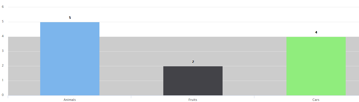
plotBands: [{ //彩色带横跨绘图区,标志着轴间隔。
                    color: '#ccc',
                    from: 0,
                    to: 4
                }],