效果如下:
其实要实现这个很简单,只需要配合一个CSS3的属性就能简单实现了。
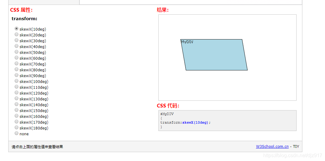
transform: skewX()
定义沿着 X 轴的 2D 倾斜转换。
W3C案例地址
用好这个属性就简单许多了
<!DOCTYPE html>
<html>
	<head>
		<meta charset="utf-8">
		<title>平行四边形</title>
		<style type="text/css">
			.Parallelograms {
				width: 750px;
				height: 10px;
				background: #fff;
				font-size: 0px;
				overflow: hidden;
				white-space: nowrap;
			}
			.Parallelogram {
				display: inline-block;
				width: 70px;
				margin: 0 10px;
				height: 10px;
				background: #f58f8f;
				transform: skewX(-25deg);
			}
			.Parallelogram:nth-child(1) {
				margin-left: -45px;
			}
			.Parallelogram:nth-child(odd) {
				background: #8fc9f5;
			}
		</style>
	</head>
	<body>
		<div class="Parallelograms">
			<div class="Parallelogram"></div>
			<div class="Parallelogram"></div>
			<div class="Parallelogram"></div>
			<div class="Parallelogram"></div>
			<div class="Parallelogram"></div>
			<div class="Parallelogram"></div>
			<div class="Parallelogram"></div>
			<div class="Parallelogram"></div>
			<div class="Parallelogram"></div>
			<div class="Parallelogram"></div>
			<div class="Parallelogram"></div>
			<div class="Parallelogram"></div>
		</div>
	</body>
</html>