1 决策树
首先是决策树可视化实现方法,都是惯有思路:
http://ywtail.github.io/2017/06/08/sklearn%E5%86%B3%E7%AD%96%E6%A0%91%E5%8F%AF%E8%A7%86%E5%8C%96/
https://code.i-harness.com/zh-CN/q/1a8780a
https://yq.aliyun.com/articles/156265
Graphviz参数含义:
precision 设置输出的纯度指标的数值精度
filled 指定是否为节点上色
max_depth 指定展示出来的树的深度,可以用来控制图像大小
将决策树可视化之后的结果,根据每个节点中的文字内容,我们就可以知道,这个节点包含的数据纯度大小(基尼指数或熵值),选用了哪个属性以及属性值对数据进行再划分,样本量多少,还可以根据节点颜色的深浅来推断类别,不同颜色代表不同类别,颜色深度越浅说明各个类别的混杂程度高,颜色越深说明纯度越高。上图中绿、紫、土黄三个颜色就表示了鸢尾花的三种类别。
2 随机森林
基本原理是将随机森林的每一颗决策树进行可视化:
1. 创建模型训练和提取单棵决策树:
from sklearn.ensemble import RandomForestClassifier
model = RandomForestClassifier(n_estimators=10)
# Train
model.fit(iris.data, iris.target)
# Extract single tree
estimator = model.estimators_[5]
2. 将树导出为.dot文件:它使用了Scikit-Learn中的export_graphviz函数。这里有许多参数用于控制外观和显示的信息。可以查看文档以了解详细信息。
from sklearn.tree import export_graphviz
# Export as dot file
export_graphviz(estimator_limited,
out_file='tree.dot',
feature_names = iris.feature_names,
class_names = iris.target_names,
rounded = True, proportion = False,
precision = 2, filled = True)
3. 使用系统命令转换dot为png:在Python中运行系统命令可以方便执行此任务。这需要安装graphviz,其中包括dot实用程序。有关转换的完整选项,请参阅文档。
# Convert to png
from subprocess import call
call(['dot', '-Tpng', 'tree.dot', '-o', 'tree.png', '-Gdpi=600'])
4.可视化:Jupyter Notebook中出现最佳可视化效果。(等效地,也可以matplotlib用来显示图像)。
# Display in jupyter notebook
from IPython.display import Image
Image(filename = 'tree.png')
3 特征重要性可视化
决策树各特征权重可视化。决策树特征权重:即决策树中每个特征单独的分类能力。或者说是特征重要性。
y_importances = clf.feature_importances_
x_importances = iris.feature_names
y_pos = np.arange(len(x_importances))
# 横向柱状图
plt.barh(y_pos, y_importances, align='center')
plt.yticks(y_pos, x_importances)
plt.xlabel('Importances')
plt.xlim(0,1)
plt.title('Features Importances')
plt.show()

# 竖向柱状图
plt.bar(y_pos, y_importances, width=0.4, align='center', alpha=0.4)
plt.xticks(y_pos, x_importances)
plt.ylabel('Importances')
plt.ylim(0,1)
plt.title('Features Importances')
plt.show()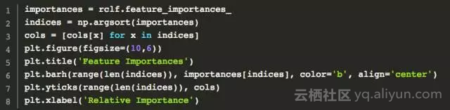

4 混淆矩阵可视化
利用matplotlib
参考https://blog.csdn.net/guoyilin/article/details/42047615
1

def plot_confusion_matrix(cm, classes,
                          normalize=False,
                          title='Confusion matrix',
                          cmap=plt.cm.Blues):
    """
    This function prints and plots the confusion matrix.
    Normalization can be applied by setting `normalize=True`.
    """
    if normalize:
        cm = cm.astype('float') / cm.sum(axis=1)[:, np.newaxis]
        print("Normalized confusion matrix")
    else:
        print('Confusion matrix, without normalization')

    print(cm)

    plt.imshow(cm, interpolation='nearest', cmap=cmap)
    plt.title(title)
    plt.colorbar()
    tick_marks = np.arange(len(classes))
    plt.xticks(tick_marks, classes, rotation=45)
    plt.yticks(tick_marks, classes)

    fmt = '.2f' if normalize else 'd'
    thresh = cm.max() / 2.
    for i, j in itertools.product(range(cm.shape[0]), range(cm.shape[1])):
        plt.text(j, i, format(cm[i, j], fmt),
                 horizontalalignment="center",
                 color="white" if cm[i, j] > thresh else "black")

    plt.ylabel('True label')
    plt.xlabel('Predicted label')
    plt.tight_layout()


# Compute confusion matrix
cnf_matrix = confusion_matrix(y_test, y_pred)
np.set_printoptions(precision=2)

# Plot non-normalized confusion matrix
plt.figure()
plot_confusion_matrix(cnf_matrix, classes=class_names,
                      title='Confusion matrix, without normalization')

# Plot normalized confusion matrix
plt.figure()
plot_confusion_matrix(cnf_matrix, classes=class_names, normalize=True,
                      title='Normalized confusion matrix')

plt.show()
2
#混淆矩阵
confusion_mat=confusion_matrix(y_true,y_pred)
def plot_confusion_matrix(confusion_mat):
    plt.imshow(confusion_mat,interpolation='nearest',cmap=plt.cm.Paired)
    plt.title('Confusion Matrix')
    plt.colorbar()
    tick_marks=np.arange(4)
    plt.xticks(tick_marks,tick_marks)
    plt.yticks(tick_marks,tick_marks)
    plt.ylabel('True Label')
    plt.xlabel('Predicted Label')
    plt.show()
plot_confusion_matrix(confusion_mat)
3
# -*- coding: utf-8 -*-
import numpy as np
import matplotlib.pyplot as plt
from pylab import *

# 其中cm是计算好的混淆矩阵
# cm = confusion_matrix(test_label, predict_label)
# 比如上述这样产生cm
def ConfusionMatrixPng(cm,classlist):

    norm_conf = []
    for i in cm:
        a = 0
        tmp_arr = []
        a = sum(i, 0)
        for j in i:
            tmp_arr.append(float(j) / float(a))
        norm_conf.append(tmp_arr)
    fig = plt.figure()
    plt.clf()
    ax = fig.add_subplot(111)
    ax.set_aspect(1)
    res = ax.imshow(np.array(norm_conf), cmap=plt.cm.jet,
                    interpolation='nearest')
    width = len(cm)
    height = len(cm[0])
    cb = fig.colorbar(res)
    alphabet = classlist
    plt.xticks(fontsize=7)
    plt.yticks(fontsize=7)
    locs, labels = plt.xticks(range(width), alphabet[:width])
    for t in labels:
        t.set_rotation(90)
    # plt.xticks('orientation', 'vertical')
    # locs, labels = xticks([1,2,3,4], ['Frogs', 'Hogs', 'Bogs', 'Slogs'])
    # setp(alphabet, 'rotation', 'vertical')
    plt.yticks(range(height), alphabet[:height])
    plt.savefig('confusion_matrix.png', format='png')
    plt.show()
seaborn中的热力图方式
import seaborn as sn
import pandas as pd
confusion_matrix = [[13,1,1,0,2,0],
     [3,9,6,0,1,0],
     [0,0,16,2,0,0],
     [0,0,0,13,0,0],
     [0,0,0,0,15,0],
     [0,0,1,0,0,15]]
df_cm = pd.DataFrame(confusion_matrix)
sn.heatmap(df_cm)
5 MDS二维图
通过MDS图我们能大致看出哪些类是比较容易搞混的:
6 模型参数调节


7 随机森林的优点和缺点
随机森林的局限性
除了 Bagging 树模型的一般局限性外,随机森林还有一些局限性:
- 当我们需要推断超出范围的独立变量或非独立变量,随机森林做得并不好,我们最好使用如 MARS 那样的算法。
- 随机森林算法在训练和预测时都比较慢。
- 如果需要区分的类别十分多,随机森林的表现并不会很好。
总的来说,随机森林在很多任务上一般要比提升方法的精度差,并且运行时间也更长。所以在 Kaggle 竞赛上,有很多模型都是使用的梯度提升树算法或其他优秀的提升方法。