有深度学习需求的小伙伴请点击原文链接【教程】第二章:图例与标注,在线调试代码,玩转数据分析!
上一章节我们学习了matplotlib的基本用法和坐标轴设置方面的一些内容,这节课,我们要学习在图中添加图例与标注。
添加图例
matplotlib 中的 legend 图例就是为了帮我们展示出每个数据对应的图像名称. 更好的让读者认识到你的数据结构。上次课我们了解到关于坐标轴设置方面的一些内容,代码如下:
import matplotlib.pyplot as plt
import numpy as np

x = np.linspace(-3, 3, 50)
y1 = 2*x + 1
y2 = x**2

plt.figure()
#set x limits
plt.xlim((-1, 2))
plt.ylim((-2, 3))

# set new sticks
new_sticks = np.linspace(-1, 2, 5)
plt.xticks(new_sticks)
# set tick labels
plt.yticks([-2, -1.8, -1, 1.22, 3],
           [r'$really\ bad$', r'$bad$', r'$normal$', r'$good$', r'$really\ good$'])
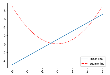
本节中我们将对图中的两条线绘制图例,首先我们设置两条线的类型等信息(蓝色实线与红色虚线),并且通过label参数为两条线设置名称。比如直线的名称就叫做 “linear line”, 曲线的名称叫做 “square line”。当然,只是设置好名称并不能使我们的图例出现,要通过plt.legend()设置图例的显示。legend获取代码中的 label 的信息, plt 就能自动的为我们添加图例。
# set line syles
l1 = plt.plot(x, y1, label='linear line')
l2 = plt.plot(x, y2, color='red', linewidth=1.0, linestyle='--', label='square line')
plt.legend()
>>>
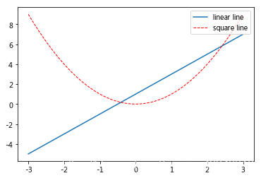
如果希望图例能够更加个性化,可通过以下方式更改:参数 loc 决定了图例的位置,比如参数 loc=‘upper right’ 表示图例将添加在图中的右上角。
其中’loc’参数有多种,’best’表示自动分配最佳位置,其余的如下:
‘best’ : 0,
‘upper right’ : 1,
‘upper left’ : 2,
‘lower left’ : 3,
‘lower right’ : 4,
‘right’ : 5,
‘center left’ : 6,
‘center right’ : 7,
‘lower center’ : 8,
‘upper center’ : 9,
‘center’ : 10
l1 = plt.plot(x, y1, label='linear line')
l2 = plt.plot(x, y2, color='red', linewidth=1.0, linestyle='--', label='square line')
plt.legend(loc='upper right')
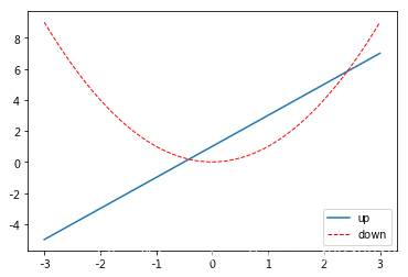
同样可以通过设置 handles 参数来选择图例中显示的内容。首先,在上面的代码 plt.plot(x, y2, label=‘linear line’) 和 plt.plot(x, y1, label=‘square line’) 中用变量 l1 和 l2 分别存储起来,而且需要注意的是 l1, l2,要以逗号结尾, 因为plt.plot() 返回的是一个列表。然后将 l1,l2 这样的objects以列表的形式传递给 handles。另外,label 参数可以用来单独修改之前的 label 信息, 给不同类型的线条设置图例信息。
l1, = plt.plot(x, y1, label='linear line')
l2, = plt.plot(x, y2, color='red', linewidth=1.0, linestyle='--', label='square line')
plt.legend(handles=[l1,l2,], labels=['up','down'], loc='best')
Annotation 标注
当图线中某些特殊地方需要标注时,我们可以使用 annotation. matplotlib 中的 annotation 有两种方法,一种是用 plt 里面的 annotate,一种是直接用 plt 里面的 text 来写标注。首先回顾一下上一章节的画图教程:
x = np.linspace(-3, 3, 50)
y = 2*x + 1

plt.figure(num=1, figsize=(8, 5),)

ax = plt.gca()
ax.spines['right'].set_color('none')
ax.spines['top'].set_color('none')
ax.spines['top'].set_color('none')
ax.xaxis.set_ticks_position('bottom')
ax.spines['bottom'].set_position(('data', 0))
ax.yaxis.set_ticks_position('left')
ax.spines['left'].set_position(('data', 0))

plt.plot(x, y,)
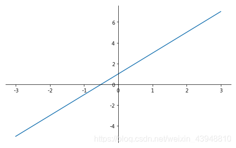
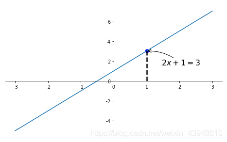
然后标注出点(x0, y0)的位置信息。用plt.plot([x0, x0,], [0, y0,], ‘k–’, linewidth=2.5) 画出一条垂直于x轴的虚线。其中,[x0, x0,], [0, y0,] 表示在图中画一条从点 (x0,y0) 到 (x0,0) 的直线,‘k–’ 表示直线的颜色为黑色(black),线形为虚线。而 plt.scatter 函数可以在图中画点,此时我们画的点为 (x0,y0), 点的大小(size)为 50, 点的颜色为蓝色(blue),可简写为 b。
plt.figure(num=1, figsize=(8, 5),)
ax = plt.gca()
ax.spines['right'].set_color('none')
ax.spines['top'].set_color('none')
ax.spines['top'].set_color('none')
ax.xaxis.set_ticks_position('bottom')
ax.spines['bottom'].set_position(('data', 0))
ax.yaxis.set_ticks_position('left')
ax.spines['left'].set_position(('data', 0))
plt.plot(x, y,)

x0 = 1
y0 = 2*x0 + 1
plt.plot([x0, x0,], [0, y0,], 'k--', linewidth=2.5)
# set dot styles
plt.scatter([x0, ], [y0, ], s=50, color='b')

添加注释 annotate
接下来我们就对(x0, y0)这个点进行标注。第一种方式就是利用函数 annotate(),其中 r’ ’ %y0 代表标注的内容,可以通过字符串 %s 将 y0 的值传入字符串;参数xycoords=‘data’ 是说基于数据的值来选位置, xytext=(+30, -30) 和 textcoords=‘offset points’ 表示对于标注位置的描述 和 xy 偏差值,即标注位置是 xy 位置向右移动 30,向下移动30, arrowprops是对图中箭头类型和箭头弧度的设置,需要用 dict 形式传入。
plt.figure(num=1, figsize=(8, 5),)
ax = plt.gca()
ax.spines['right'].set_color('none')
ax.spines['top'].set_color('none')
ax.spines['top'].set_color('none')
ax.xaxis.set_ticks_position('bottom')
ax.spines['bottom'].set_position(('data', 0))
ax.yaxis.set_ticks_position('left')
ax.spines['left'].set_position(('data', 0))
plt.plot(x, y,)

x0 = 1
y0 = 2*x0 + 1
plt.plot([x0, x0,], [0, y0,], 'k--', linewidth=2.5)
# set dot styles
plt.scatter([x0, ], [y0, ], s=50, color='b')
plt.annotate(r'$2x+1=%s$' % y0, xy=(x0, y0), xycoords='data', xytext=(+30, -30),
             textcoords='offset points', fontsize=16,
             arrowprops=dict(arrowstyle='->', connectionstyle="arc3,rad=.2"))
添加注释 text
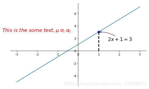
第二种注释方式是通过 text() 函数,其中 -3.7,3, 是选取text的位置, ‘ ’ 为 text 的内容,其中空格需要用到转字符 \ ,fontdict 设置文本字的大小和颜色。
plt.figure(num=1, figsize=(8, 5),)
ax = plt.gca()
ax.spines['right'].set_color('none')
ax.spines['top'].set_color('none')
ax.spines['top'].set_color('none')
ax.xaxis.set_ticks_position('bottom')
ax.spines['bottom'].set_position(('data', 0))
ax.yaxis.set_ticks_position('left')
ax.spines['left'].set_position(('data', 0))
plt.plot(x, y,)

x0 = 1
y0 = 2*x0 + 1
plt.plot([x0, x0,], [0, y0,], 'k--', linewidth=2.5)
# set dot styles
plt.scatter([x0, ], [y0, ], s=50, color='b')
plt.annotate(r'$2x+1=%s$' % y0, xy=(x0, y0), xycoords='data', xytext=(+30, -30),
             textcoords='offset points', fontsize=16,
             arrowprops=dict(arrowstyle='->', connectionstyle="arc3,rad=.2"))
plt.text(-3.7, 3, r'$This\ is\ the\ some\ text. \mu\ \sigma_i\ \alpha_t$',
         fontdict={'size': 16, 'color': 'r'})
tick 能见度
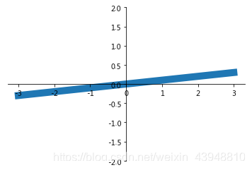
当图片中的内容较多,相互遮盖时,我们可以通过设置相关内容的透明度来使图片更易于观察,也即是通过本节中的bbox参数设置来调节图像信息.首先参考之前的例子, 我们先绘制图像基本信息:
x = np.linspace(-3, 3, 50)
y = 0.1*x

plt.figure()
# 在 plt 2.0.2 或更高的版本中, 设置 zorder 给 plot 在 z 轴方向排序
plt.plot(x, y, linewidth=10, zorder=1)
plt.ylim(-2, 2)
ax = plt.gca()
ax.spines['right'].set_color('none')
ax.spines['top'].set_color('none')
ax.spines['top'].set_color('none')
ax.xaxis.set_ticks_position('bottom')
ax.spines['bottom'].set_position(('data', 0))
ax.yaxis.set_ticks_position('left')
ax.spines['left'].set_position(('data', 0))
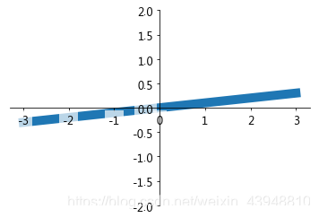
然后对被遮挡的图像调节相关透明度,本例中设置 x轴 和 y轴 的刻度数字进行透明度设置。其中label.set_fontsize(12)重新调节字体大小,bbox设置目的内容的透明度相关参,facecolor调节 box 前景色,edgecolor 设置边框, 本处设置边框为无,alpha设置透明度. 最终结果如下:
plt.plot(x, y, linewidth=10, zorder=1)
plt.ylim(-2, 2)
ax = plt.gca()
ax.spines['right'].set_color('none')
ax.spines['top'].set_color('none')
ax.spines['top'].set_color('none')
ax.xaxis.set_ticks_position('bottom')
ax.spines['bottom'].set_position(('data', 0))
ax.yaxis.set_ticks_position('left')
ax.spines['left'].set_position(('data', 0))
for label in ax.get_xticklabels() + ax.get_yticklabels():
    label.set_fontsize(12)
    # 在 plt 2.0.2 或更高的版本中, 设置 zorder 给 plot 在 z 轴方向排序
    label.set_bbox(dict(facecolor='white', edgecolor='None', alpha=0.7, zorder=2))
plt.show()
小伙伴们,以上就是图例与标注的所有教程,今天的内容没有太多机动性,所以就不再设置练习题了。可能大家会觉得设置图例和标注的参数比较复杂很难记忆,不用担心,我们不需要刻意去记住,只要知道matplotlib提供了这样的画图功能,在使用的时候,在去查找相关参数即可!
上述文中所有代码部分都可以使用在线数据分析协作工具K-Lab复现,点击链接一键直达~
K-Lab提供基于Jupyter Notebook的在线数据分析服务,涵盖Python&R等主流编程语言,可满足数据科学家、人工智能工程师、商业分析师等数据工作者在线完成数据处理、模型搭建、代码调试、撰写分析报告等数据分析全过程。