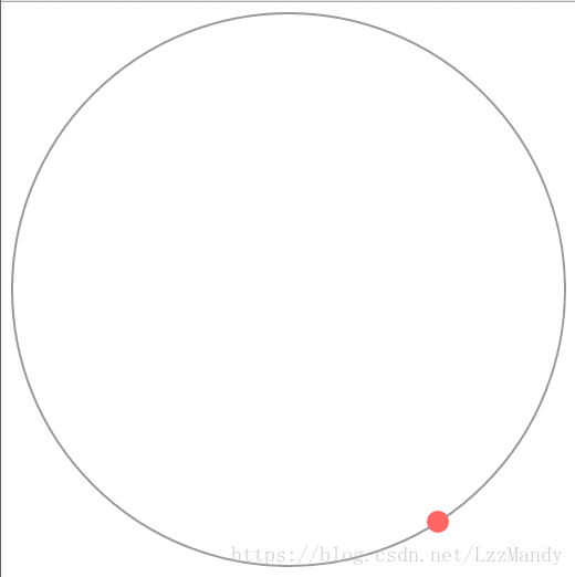
1、代码
<!DOCTYPE html PUBLIC "-//W3C//DTD XHTML 1.0 Transitional//EN" "http://www.w3.org/TR/xhtml1/DTD/xhtml1-transitional.dtd">
<html xmlns="http://www.w3.org/1999/xhtml">
<head>
<meta http-equiv="Content-Type" content="text/html; charset=gb2312" />
<title></title>
<link href="css/style.css" rel="stylesheet" type="text/css" />
<!--   引入jQuery -->
 <script src="../../scripts/jquery.js" type="text/javascript"></script>
<style>
html,
body {
    width: 100%;
    height: 100%;
    margin: 0;
}
  @keyframes animX{
          0% {left: 0px;}
        100% {left: 500px;}
    }
    @keyframes animY{
          0% {top: 0px;}
        100% {top: 500px;}
    }

    #ball {
        width: 20px;
        height: 20px;
        background-color: #f66;
        border-radius: 50%;
        position: absolute;
        animation: animX 4s cubic-bezier(0.36,0,0.64,1) -2s infinite alternate, animY 4s cubic-bezier(0.36,0,0.64,1)  0s infinite alternate;
    }

    #lopp {
        width: 498px;
        height: 498px;
        border: 2px solid #999;
        border-radius: 50%;
        position: absolute;
        left: 9px;
        top: 9px;
    }
</style>
</head>
<body>
<div id="lopp"></div>
    <div id="ball"></div>
</body>
</html>