版权声明:三和小钢炮 https://blog.csdn.net/fwx426328/article/details/84504147
flex布局
本文写给想在一分钟内运用flex的同学们,要详细学习的同学请参看阮一峰老师的文章:
http://www.ruanyifeng.com/blog/2015/07/flex-grammar.html
(一)应用范围
flex布局有兼容性问题,目前用在h5移动端。
(二) 快速上手
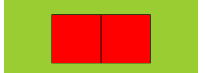
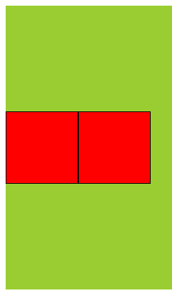
例如:小盒子在大盒子居中问题。
<style type="text/css">
.out-box{
	height: 400px;
	width: 400px;
	background: yellowgreen;
	display: flex;
	justify-content: center;
    align-items: center;
}
.in-box {
	width: 100px;
	height: 100px;
	background: red;
}
</style>
<div class="out-box">
	<div class="in-box"></div>
</div>

(三)设置flex
我们这样设置flex。
.out-box{
	display: flex;
}
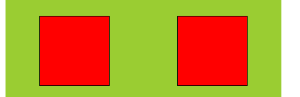
(四)水平设置
justify-content: center;
justify-content: space-between;
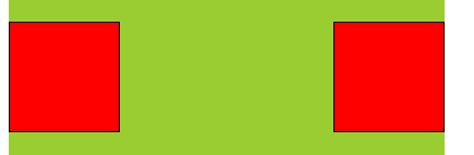
justify-content: space-around;
(五)垂直设置
align-items: center;
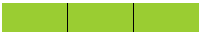
(六) 百分比
(1) 等分
<style type="text/css">
.out-box{
	background: yellowgreen;
	display: flex;
}
.in {
	flex: 1;
	height: 100px;
	border: solid 1px #000;
}
</style>
<div class="out-box">
	<div class="in"></div>
	<div class="in"></div>
	<div class="in"></div>
</div>
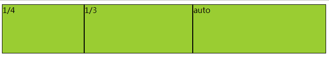
(2) 1/4 - 1/3 - auto
<style type="text/css">
.out-box{
	background: yellowgreen;
	display: flex;
}
.in {
	flex: 1;
	height: 100px;
	border: solid 1px #000;
}
.div-4 {
	flex: 0 0 25%;
}
.div-3 {
	flex: 0 0 33.3%;
}
</style>
<div class="out-box">
	<div class="in div-4">1/4</div>
	<div class="in div-3">1/3</div>
	<div class="in">auto</div>
</div>
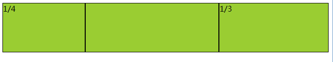
(3)1/4 - auto - 1/3
<style type="text/css">
.out-box{
	background: yellowgreen;
	display: flex;
}
.in {
	flex: 1;
	height: 100px;
	border: solid 1px #000;
}
.div-4 {
	flex: 0 0 25%;
}
.div-3 {
	flex: 0 0 33.3%;
}
</style>
<div class="out-box">
	<div class="in div-4">1/4</div>
	<div class="in"></div>
	<div class="in div-3">1/3</div>
</div>