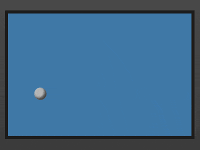
效果预览
在线演示按下右侧的“点击预览”按钮可以在当前页面预览,点击链接可以全屏预览。
https://codepen.io/comehope/pen/OwWROO
可交互视频
此视频是可以交互的,你可以随时暂停视频,编辑视频中的代码。
请用 chrome, safari, edge 打开观看。
https://scrimba.com/p/pEgDAM/cnKwKA3
源代码下载
本地下载每日前端实战系列的全部源代码请从 github 下载:
https://github.com/comehope/front-end-daily-challenges
代码解读
定义 dom,只有 1 个元素:
<div class="box"></div>
居中显示:
body {
    margin: 0;
    height: 100vh;
    display: flex;
    align-items: center;
    justify-content: center;
    background: linear-gradient(#666, #333);
}
定义容器尺寸:
扫描二维码关注公众号,回复:
4423849 查看本文章

.box {
    width: 30em;
    height: 20em;
    font-size: 10px;
    background-color: steelblue;
    border: 0.5em solid #222;
}
用伪元素画出小球:
.box {
    position: relative;
}

.box::before {
    content: '';
    position: absolute;
    width: 2em;
    height: 2em;
    background-color: silver;
    border-radius: 50%;
    box-shadow: inset -0.3em -0.3em 0.5em rgba(0, 0, 0, 0.6);
}
定义沿 x 轴即横向移动的动画效果:
@keyframes moveX {
    from {
        left: 0;
    }

    to {
        left: calc(30em - 2em);
    }
}
定义沿 y 轴即纵向移动的动画效果:
@keyframes moveY {
    from {
        top: 0;
    }

    to {
        top: calc(20em - 2em);
    }
}
最后,把动画效果应用到小球上:
.box::before {
    animation:
        moveX 2s linear infinite alternate,
        moveY 2.5s linear infinite alternate;
}
大功告成!
原文地址:https://segmentfault.com/a/1190000015713438