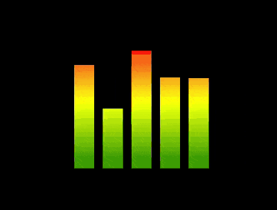
效果预览
按下右侧的“点击预览”按钮可以在当前页面预览,点击链接可以全屏预览。
https://codepen.io/comehope/pen/oybWBy
可交互视频教程
此视频是可以交互的,你可以随时暂停视频,编辑视频中的代码。
请用 chrome, safari, edge 打开观看。
https://scrimba.com/p/pEgDAM/cG64puy
源代码下载
本地下载
每日前端实战系列的全部源代码请从 github 下载:
https://github.com/comehope/front-end-daily-challenges
代码解读
定义 dom,容器中包含 5 个子元素:
<div class="equalizer">

<span></span>

<span></span>

<span></span>

<span></span>

<span></span>

</div>
居中显示:
body {

margin: 0;

height: 100vh;

display: flex;

align-items: center;

justify-content: center;

background-color: black;

}
定义均衡器的样式:
.equalizer {

width: 10em;

height: 10em;

display: flex;

justify-content: space-between;

}
.equalizer span {

width: 1.5em;

background: linear-gradient(0deg, green, yellow, red);

}
定义均衡器竖条的动画效果:
.equalizer span {

animation: up-and-down 2s linear infinite;

}
@keyframes up-and-down{

0%, 100% {

clip-path: inset(27% 0 0 0);

}
10% {
    clip-path: inset(17% 0 0 0);
}

20% {
    clip-path: inset(55% 0 0 0);
}

30% {
    clip-path: inset(30% 0 0 0);
}

40% {
    clip-path: inset(13% 0 0 0);
}

50% {
    clip-path: inset(38% 0 0 0);
}

60% {
    clip-path: inset(80% 0 0 0);
}

70% {
    clip-path: inset(21% 0 0 0);
}

80% {
    clip-path: inset(0% 0 0 0);
}

90% {
    clip-path: inset(36% 0 0 0);
}
}
最后,设置各竖条依次动画:
.equalizer span {

animation: up-and-down 2s linear infinite calc(-1 * 0.4s * (var(--n) - 1));

}
.equalizer span:nth-child(1) {

--n: 1;

}
.equalizer span:nth-child(2) {

--n: 2;

}
.equalizer span:nth-child(3) {

--n: 3;

}
.equalizer span:nth-child(4) {

--n: 4;

}
.equalizer span:nth-child(5) {

--n: 5;

}
大功告成!
原文地址:https://segmentfault.com/a/1190000015157160