1.三列或多列布局与两列布局的微妙关系
1)三列布局可以看成是两个两列布局的组合,其html结构可以写成如下
    <div class ="header">头部信息</div>
    <div class ="container">
        <div class ="wrap">
            <div class ="mainBox">主要内容区域</div>
            <div class ="subMainBox">次要内容区域</div>
        </div>
        <div class ="sideBox" >侧边栏</div>
    </div>
    <div class ="footer">底部信息</div>
2)三列布局也可以是三个单独的列并排,此时只是比两列布局多了一个列,html结构如下
    <div class ="header">头部信息</div>
    <div class ="container">
        <div class ="mainBox">主要内容区域</div>
        <div class ="subMainBox">次要内容区域</div>
        <div class ="sideBox" >侧边栏</div>
    </div>
    <div class ="footer">底部信息</div>
不管是什么样的组合方式都是从两列布局演变而来的。
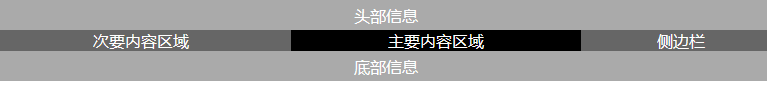
2.两列定宽中间自适应
html结构如下
    <div class ="header">头部信息</div>
    <div class ="container">
        <div class ="mainBox">
            <div class ="content">主要内容区域</div>
        </div>
        <div class ="subMainBox">次要内容区域</div>
        <div class ="sideBox" >侧边栏</div>
    </div>
    <div class ="footer">底部信息</div>
CSS
    <style type ="text/css" >
        *{ padding :0; margin:0;}
        .header,.footer{ height:30px; color:#FFF; background-color :#AAA; line-height:30px; text-align :center; }
        .container{ text-align:center; color :#FFF; }
        .mainBox{ float:left ; width :100%; background-color:#FFF;}
        .mainBox .content{ background-color:#000; margin:0 200px 0 300px;}
        .subMainBox{ float:left; background-color:#666; width :300px; margin-left:-100%;}
        .sideBox{ float:left; background-color:#666; width :200px; margin-left:-200px;}
        .container:after{ content:""; display:block; height:0 ; line-height:0; font-size:0; visibility :hidden; clear:both;}
    </style>
原理:通过左右边距留出左右两列的位置,再通过浮动和负边距使得三列并排在一行,content未设置宽度,根据父容器自适应从而达到中间自适应效果
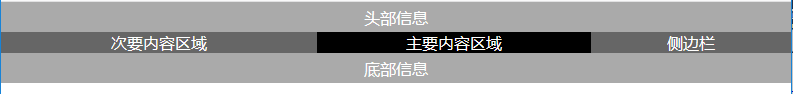
3.左侧定宽,右侧及中间自适应
只需要改变上面例子的宽度就可以了
    <style type ="text/css" >
        *{ padding :0; margin:0;}
        .header,.footer{ height:30px; color:#FFF; background-color :#AAA; line-height:30px; text-align :center; }
        .container{ text-align:center; color :#FFF; }
        .mainBox{ float:left ; width :100%; background-color:#FFF;}
        .mainBox .content{ background-color:#000; margin:0 200px 0 40%;}
        .subMainBox{ float:left; background-color:#666; width :40%; margin-left:-100%;}
        .sideBox{ float:left; background-color:#666; width :200px; margin-left:-200px;}
        .container:after{ content:""; display:block; height:0 ; line-height:0; font-size:0; visibility :hidden; clear:both;}
    </style>
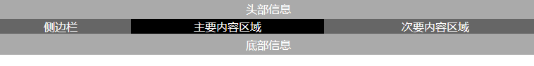
如果需要对调左右两边的位置可以这样
    <style type ="text/css" >
        *{ padding :0; margin:0;}
        .header,.footer{ height:30px; color:#FFF; background-color :#AAA; line-height:30px; text-align :center; }
        .container{ text-align:center; color :#FFF; }
        .mainBox{ float:left ; width :100%; background-color:#FFF;}
        .mainBox .content{ background-color:#000; margin:0 40% 0 200px;}
        .subMainBox{ float:left; background-color:#666; width :40%; margin-left:-40%;}
        .sideBox{ float:left; background-color:#666; width :200px; margin-left:-100%;}
        .container:after{ content:""; display:block; height:0 ; line-height:0; font-size:0; visibility :hidden; clear:both;}
    </style>
4.三列宽度自适应
三列自适应只需要把左右两列的宽度设置成百分比就行了
    <style type ="text/css" >
        *{ padding :0; margin:0;}
        .header,.footer{ height:30px; color:#FFF; background-color :#AAA; line-height:30px; text-align :center; }
        .container{ text-align:center; color :#FFF; }
        .mainBox{ float:left ; width :100%; background-color:#FFF;}
        .mainBox .content{ background-color:#000; margin:0 40% 0 20%;}
        .subMainBox{ float:left; background-color:#666; width :40%; margin-left:-40%;}
        .sideBox{ float:left; background-color:#666; width :20%; margin-left:-100%;}
        .container:after{ content:""; display:block; height:0 ; line-height:0; font-size:0; visibility :hidden; clear:both;}
    </style>