版权声明:本文为博主原创文章,转载请注明博主信息和博文网址。 https://blog.csdn.net/dss_dssssd/article/details/84567689
在matplotlib7中说明了,除了描述箭头属性的参数,其余传入annotate函数的参数,都将解释为text的属性参数。
1. text的bbox属性 以及其他的属性
描述Text的属性,包括颜色,字体大小,字体类型等
matplotlib.text.Text
着重讲述一下字典属性bbox
简单的说就是在用不同的矩形框将文字框起来,并用一系列属性来定义矩形框的
- boxstyle : 矩形框的类型
- alpha: [0, 1] 透明度,0为完全透明,1为完全不透明
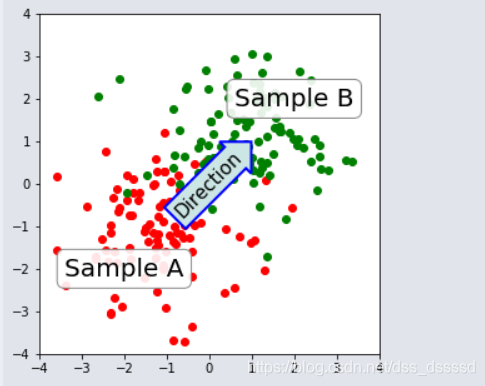
import numpy.random
import matplotlib.pyplot as plt

fig = plt.figure(1, figsize=(5,5))
fig.clf()

ax = fig.add_subplot(111)
ax.set_aspect(1)

x1 = -1 + numpy.random.randn(100)
y1 = -1 + numpy.random.randn(100)
x2 = 1. + numpy.random.randn(100)
y2 = 1. + numpy.random.randn(100)

ax.scatter(x1, y1, color="r")
ax.scatter(x2, y2, color="g")

# 设置Sample A/B的bbox
bbox_props = dict(boxstyle="round", fc="w", ec="0.5", alpha=0.9)
ax.text(-2, -2, "Sample A", ha="center", va="center", size=20,
        bbox=bbox_props)
ax.text(2, 2, "Sample B", ha="center", va="center", size=20,
        bbox=bbox_props)

# 设置Direction Text的bbox
bbox_props = dict(boxstyle="rarrow", fc=(0.8,0.9,0.9), ec="b", lw=2)
t = ax.text(0, 0, "Direction", ha="center", va="center", rotation=45,
            size=15,
            bbox=bbox_props)

# 通过text对象的get_bbox_patch方法可以得到bbox对象,利用set_*方法设置属性
bb = t.get_bbox_patch()
bb.set_boxstyle("rarrow", pad=0.6)

ax.set_xlim(-4, 4)
ax.set_ylim(-4, 4)

plt.draw()
plt.show()
- 在matplotlib7中有一张图,可以看出tick的label看不清楚了,通过label中的set_*方法可以对字体以及透明度重新设置
import matplotlib.pyplot as plt
import numpy as np

x = np.linspace(-np.pi, np.pi, 128,endpoint=True)
cosx,sinx,x_3 = np.cos(x), np.sin(x), x / 3

#%%
fig = plt.figure(1)
axes0 = plt.subplot(111)
line1, line2 = axes0.plot(x, cosx, 'r',x, sinx, 'c')

line1.set_linewidth(2.5)
line2.set_linewidth(1)
# plt.xlim(x.min() *2, x.max()*2)
axes0.set_xlim(x.min() *1.2, x.max()*1.2)
axes0.set_ylim(cosx.min() * 1.2, cosx.max() * 1.2)

axes0.set_xticks([-np.pi, -np.pi/2, 0, np.pi/2, np.pi])
axes0.set_xticklabels([r'$-\pi$', r'$-\frac{\pi}{2}$', 0,  r'$+\frac{\pi}{2}$', r'$+\pi$'])
axes0.set_yticks([-1, 0, 1])
axes0.set_yticklabels([r'-1', r'0', r'+1'])

# add legend
axes0.legend([line1, line2], ['y=cos(x)', 'y=sin(x)'])

# 轴居中
axes0.spines['right'].set_color('none')
axes0.spines['top'].set_color('none')
axes0.xaxis.set_ticks_position('bottom')
axes0.spines['bottom'].set_position(('data',0))
axes0.yaxis.set_ticks_position('left')
axes0.spines['left'].set_position(('data',0))
# 添加注释
t = 2 * np.pi / 3

# 通过添加散点来是的图更好看[t,0], [t, 0.01],  ....[t, np.sin(t)]
axes0.plot([t, t], [0, np.sin(t)], color='c', linewidth=1.5, linestyle="--")
axes0.scatter([t],[np.sin(t)] ,s=50, c='c')
axes0.annotate(r'$\sin(\frac{2\pi}{3})=\frac{\sqrt{3}}{2}$',
              xy=(t, np.sin(t)), xycoords='data',
              xytext=(+10, +30), textcoords='offset points',
              fontsize=16, color= 'c',
              arrowprops=dict(arrowstyle="->", connectionstyle="arc3,rad=.2"))

# 同样对cosx做处理
axes0.plot([t, t], [0, np.cos(t)], color='r', linewidth=1.5, linestyle="--")
axes0.scatter([t],[np.cos(t)] ,s=50, c='r')
axes0.annotate(r'$\cos(\frac{2\pi}{3})=-\frac{1}{2}$',
              xy=(t, np.cos(t)), xycoords='data',
              xytext=(-90, -50), textcoords='offset points',
              fontsize=16, color= 'r',
              arrowprops=dict(arrowstyle="->", connectionstyle="arc3,rad=.2"))

# newly code added
for label in axes0.get_xticklabels() + axes0.get_yticklabels():
    label.set_fontsize(16)
    label.set_bbox(dict(facecolor='white', edgecolor='None', alpha=0.9 ))


plt.show()

2. 设置箭头属性
- arrowprops 字典属性
箭头创建过程如下:
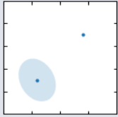
import matplotlib.pyplot as plt
import matplotlib.patches as mpatches

x1, y1 = 0.3, 0.3
x2, y2 = 0.7, 0.7

fig = plt.figure(1, figsize=(8,3))

from mpl_toolkits.axes_grid.axes_grid import AxesGrid
from mpl_toolkits.axes_grid.anchored_artists import AnchoredText

#from matplotlib.font_manager import FontProperties

def add_at(ax, t, loc=2):
    fp = dict(size=10)
    _at = AnchoredText(t, loc=loc, prop=fp)
    ax.add_artist(_at)
    return _at


grid = AxesGrid(fig, 111, (1, 4), label_mode="1", share_all=True)

grid[0].set_autoscale_on(False)

ax = grid[0]
ax.plot([x1, x2], [y1, y2], ".")
el = mpatches.Ellipse((x1, y1), 0.3, 0.4, angle=30, alpha=0.2)
ax.add_artist(el)
'''
add code to plot arrow
'''

plt.draw()
plt.show()
接下来只贴创建过程中的参数代码
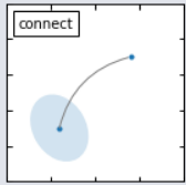
- 在两点之间创建一条连接路径,通过参数
connectionstyle控制
ax.annotate("",
            xy=(x1, y1), xycoords='data',
            xytext=(x2, y2), textcoords='data',
            arrowprops=dict(arrowstyle="-", #linestyle="dashed",
                            color="0.5",
                            patchB=None,
                            shrinkB=0,
                            connectionstyle="arc3,rad=0.3",
                            ),
            )

add_at(ax, "connect", loc=2)
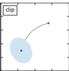
- 如果给出patch对象(patchA或patchB),路径会省略掉一部分防止与patch对象交叠
ax.annotate("",
            xy=(x1, y1), xycoords='data',
            xytext=(x2, y2), textcoords='data',
            arrowprops=dict(arrowstyle="-", #linestyle="dashed",
                            color="0.5",
                            patchB=None,
                            shrinkB=0,
                            connectionstyle="arc3,rad=0.3",
                            ),
            )

add_at(ax, "connect", loc=2)
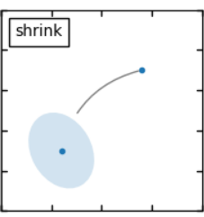
- 接下通过shrinkA,shrinkB参数确定与patch边缘的距离
ax.annotate("",
            xy=(x1, y1), xycoords='data',
            xytext=(x2, y2), textcoords='data',
            arrowprops=dict(arrowstyle="-", #linestyle="dashed",
                            color="0.5",
                            patchB=el,
                            shrinkB=5,
                            connectionstyle="arc3,rad=0.3",
                            ),
            )

add_at(ax, "shrink", loc=2)
扫描二维码关注公众号,回复:
4350235 查看本文章

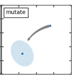
- 最后通过
arrowstyle参数确定arrow的形状
ax.annotate("",
            xy=(x1, y1), xycoords='data',
            xytext=(x2, y2), textcoords='data',
            arrowprops=dict(arrowstyle="fancy", #linestyle="dashed",
                            color="0.5",
                            patchB=el,
                            shrinkB=5,
                            connectionstyle="arc3,rad=0.3",
                            ),
            )

add_at(ax, "mutate", loc=2)
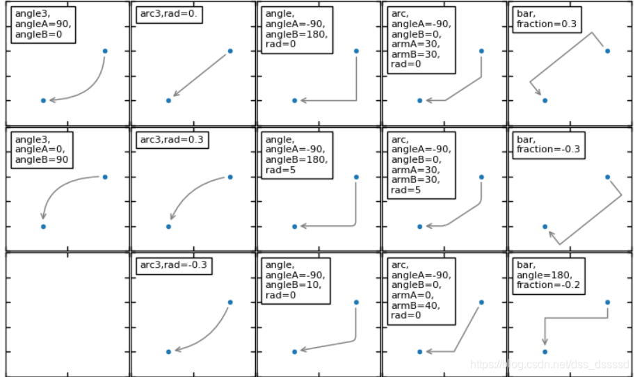
关于connectionstyle,
示例代码以及图片:
import matplotlib.pyplot as plt
import matplotlib.patches as mpatches

fig = plt.figure(1, figsize=(8,5))
fig.clf()
from mpl_toolkits.axes_grid.axes_grid import AxesGrid
from mpl_toolkits.axes_grid.anchored_artists import AnchoredText

#from matplotlib.font_manager import FontProperties

def add_at(ax, t, loc=2):
    fp = dict(size=8)
    _at = AnchoredText(t, loc=loc, prop=fp)
    ax.add_artist(_at)
    return _at


grid = AxesGrid(fig, 111, (3, 5), label_mode="1", share_all=True)

grid[0].set_autoscale_on(False)


x1, y1 = 0.3, 0.3
x2, y2 = 0.7, 0.7


def demo_con_style(ax, connectionstyle, label=None):

    if label is None:
        label = connectionstyle

    x1, y1 = 0.3, 0.2
    x2, y2 = 0.8, 0.6

    ax.plot([x1, x2], [y1, y2], ".")
    ax.annotate("",
                xy=(x1, y1), xycoords='data',
                xytext=(x2, y2), textcoords='data',
                arrowprops=dict(arrowstyle="->", #linestyle="dashed",
                                color="0.5",
                                shrinkA=5, shrinkB=5,
                                patchA=None,
                                patchB=None,
                                connectionstyle=connectionstyle,
                                ),
                )

    add_at(ax, label, loc=2)

column = grid.axes_column[0]

demo_con_style(column[0], "angle3,angleA=90,angleB=0",
               label="angle3,\nangleA=90,\nangleB=0")
demo_con_style(column[1], "angle3,angleA=0,angleB=90",
               label="angle3,\nangleA=0,\nangleB=90")


column = grid.axes_column[1]

demo_con_style(column[0], "arc3,rad=0.")
demo_con_style(column[1], "arc3,rad=0.3")
demo_con_style(column[2], "arc3,rad=-0.3")


column = grid.axes_column[2]

demo_con_style(column[0], "angle,angleA=-90,angleB=180,rad=0",
               label="angle,\nangleA=-90,\nangleB=180,\nrad=0")
demo_con_style(column[1], "angle,angleA=-90,angleB=180,rad=5",
               label="angle,\nangleA=-90,\nangleB=180,\nrad=5")
demo_con_style(column[2], "angle,angleA=-90,angleB=10,rad=5",
               label="angle,\nangleA=-90,\nangleB=10,\nrad=0")


column = grid.axes_column[3]

demo_con_style(column[0], "arc,angleA=-90,angleB=0,armA=30,armB=30,rad=0",
               label="arc,\nangleA=-90,\nangleB=0,\narmA=30,\narmB=30,\nrad=0")
demo_con_style(column[1], "arc,angleA=-90,angleB=0,armA=30,armB=30,rad=5",
               label="arc,\nangleA=-90,\nangleB=0,\narmA=30,\narmB=30,\nrad=5")
demo_con_style(column[2], "arc,angleA=-90,angleB=0,armA=0,armB=40,rad=0",
               label="arc,\nangleA=-90,\nangleB=0,\narmA=0,\narmB=40,\nrad=0")


column = grid.axes_column[4]

demo_con_style(column[0], "bar,fraction=0.3",
               label="bar,\nfraction=0.3")
demo_con_style(column[1], "bar,fraction=-0.3",
               label="bar,\nfraction=-0.3")
demo_con_style(column[2], "bar,angle=180,fraction=-0.2",
               label="bar,\nangle=180,\nfraction=-0.2")


#demo_con_style(column[1], "arc3,rad=0.3")
#demo_con_style(column[2], "arc3,rad=-0.3")


grid[0].set_xlim(0, 1)
grid[0].set_ylim(0, 1)
grid.axes_llc.axis["bottom"].toggle(ticklabels=False)
grid.axes_llc.axis["left"].toggle(ticklabels=False)
fig.subplots_adjust(left=0.05, right=0.95, bottom=0.05, top=0.95)

plt.draw()
plt.show()
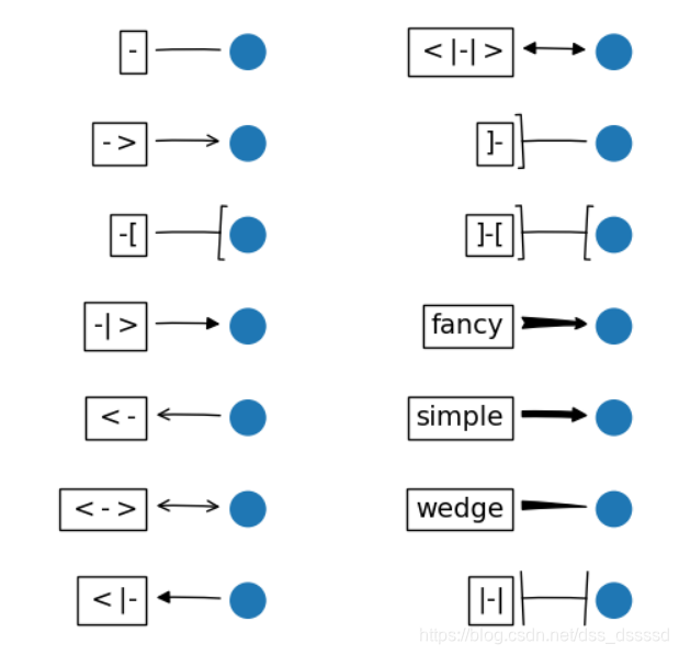
关于arrowstyle
import matplotlib.patches as mpatches
import matplotlib.pyplot as plt

styles = mpatches.ArrowStyle.get_styles()

ncol = 2
nrow = (len(styles) + 1) // ncol
figheight = (nrow + 0.5)
fig1 = plt.figure(1, (4.*ncol/1.5, figheight/1.5))
fontsize = 0.2 * 70


ax = fig1.add_axes([0, 0, 1, 1], frameon=False, aspect=1.)

ax.set_xlim(0, 4*ncol)
ax.set_ylim(0, figheight)


def to_texstring(s):
    s = s.replace("<", r"$<$")
    s = s.replace(">", r"$>$")
    s = s.replace("|", r"$|$")
    return s

for i, (stylename, styleclass) in enumerate(sorted(styles.items())):
    x = 3.2 + (i//nrow)*4
    y = (figheight - 0.7 - i % nrow)  # /figheight
    p = mpatches.Circle((x, y), 0.2)
    ax.add_patch(p)

    ax.annotate(to_texstring(stylename), (x, y),
                (x - 1.2, y),
                #xycoords="figure fraction", textcoords="figure fraction",
                ha="right", va="center",
                size=fontsize,
                arrowprops=dict(arrowstyle=stylename,
                                patchB=p,
                                shrinkA=5,
                                shrinkB=5,
                                fc="k", ec="k",
                                connectionstyle="arc3,rad=-0.05",
                                ),
                bbox=dict(boxstyle="square", fc="w"))

ax.xaxis.set_visible(False)
ax.yaxis.set_visible(False)


plt.draw()
plt.show()
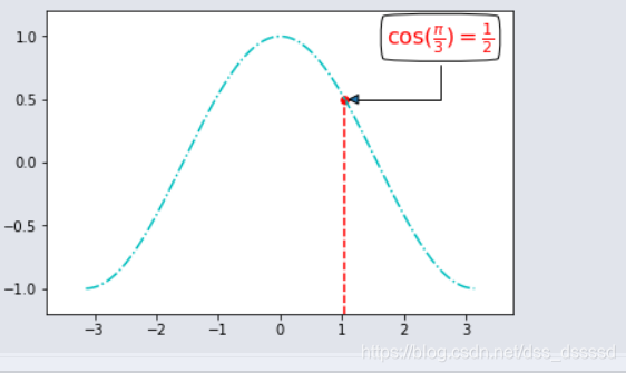
示例代码:
fig = plt.figure(1)
ax = fig.subplots()
line1,  = ax.plot(x, cosx, 'c-.',label = 'y=cos(x)' )

ax.set_xlim(x.min() *1.2, x.max()*1.2)
ax.set_ylim(cosx.min() * 1.2, cosx.max() * 1.2)
t =  np.pi / 3

# 注释[t, np.cos(t)]
ax.scatter([t], [np.cos(t)], s=30, c='r')
ax.plot([t, t], [cosx.min() * 1.2, np.cos(t)], color='r', linewidth=1.5, linestyle="--")

ax.annotate(r'$\cos(\frac{\pi}{3})=\frac{1}{2}$',
              xy=(t, np.cos(t)), xycoords='data',
              xytext=(+30, +40), textcoords='offset points',
              fontsize=16, color= 'r',
              # bbox
              bbox=dict(boxstyle="round4", fc="w"),
              # arrow
              arrowprops=dict(arrowstyle="-|>", connectionstyle="angle,angleA=-90,angleB=180,rad=0"))

plt.show()