1.transition
CSS过渡,可以将一个属性值在一定时间内过渡
用法:transition:all 0.3s ease;
参数:需要过渡的属性,过渡时间,过渡方式
实例:
a.foo {
			padding: 5px 10px;
			background:#9c3;
			/*支持不同的浏览器*/
			-webkit-transition:background 1s ease, color .8s linear;
			-moz-transition:background 1s ease, color .8s linear;
			-o-transition:background 1s ease, color .8s linear;
			transition: background 1s ease, color .8s linear;
		}
		a.foo:hover,a.fooL:focus {
			color: #030;
			background: #690 ;
		}
效果:

2.rgba
rgb颜色与alpha透明度
用法:rgba(255, 255, 255, 0.5)
3.shadow
添加阴影
用法:text-shadow: 0 5px 6px #fff;(对文字)
box-shadow: 0 5px 6px #fff;(对边框)
参数:水平阴影,垂直阴影,阴影尺寸,阴影颜色。(还有其他参数可去http://www.w3school.com.cn/cssref/pr_box-shadow.asp浏览)
实例:
h1 {
			text-shadow: 0 5px 6px rgba(120, 64, 123, 0.5);
		}
		div {
			width: 100px;
			height: 30px;
			box-shadow: 5px 5px 6px rgba(120, 78, 56, 0.4);
		}
效果: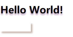
4.border-radius
圆角效果
用法:border-radius:14px;
参数:圆角值也可用百分比
实例:
div {
			border: 1px solid;
			border-radius:25px;
		}
效果: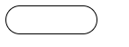
我们现在就用这些属性做一个比较简单的导航栏试试吧
css:
#nav {
			float: right;
			padding-top: 22px;
			padding-right: 20px;
		}
		#nav li {
			float: left;
			margin-left: 30px;
			list-style-type: none;
		}
		#nav li a {
			padding: 5px 15px;
			font-weight: bold;
			color: #ccc;
			text-decoration: none;
			color: rgba(255, 255, 255, 0.7);
			text-shadow: 0 1px 1px rgba(0, 0, 0, 0.5);
			/*支持不同的浏览器*/
			-webkit-border-radius:14px;
			-moz-border-radius:14px;
			-o-border-radius:14px;
			border-radius: 14px;
			-webkit-transition:all .3s ease-in-out;
			-moz-transition:all .3s ease-in-out;
			-o-transition:all .3s ease-in-out;
			transition:all .3s ease-in-out;
		}
		#nav li a:hover,#nav li a:focus {
			color: #fff;
			background: rgba(255, 35, 120, 0.15);
		}
html:
<ul id="nav">
		<li><a href="#">home</a></li>
		<li><a href="#">news</a></li>
		<li><a href="#">stuff</a></li>
		<li><a href="#">about</a></li>
	</ul>
效果: