1、demo1
<!DOCTYPE html>
<html>
<head lang="en">
    <meta charset="UTF-8">
    <title>css3 hover</title>
    <style>
        *{margin: 0;padding: 0;box-sizing: border-box}
        .demo,.img,.mask,.border{width: 300px;height: 300px}
        .demo{position: relative;display: inline-block;margin: 50px auto}
        .img{border-radius: 50%;background-repeat: no-repeat;background-size:cover;background-position:center;}
        .mask{position: absolute;top: 0;left: 0;border-radius: 50%;text-align: center;color:rgba(255,255,255,0);line-height: 300px;
            transition:all .5s ease-in;}
        .border{border: 10px solid #072256;border-left-color:#E07514;border-top-color:#E07514;position: absolute;top: 0;left: 0;
            border-radius: 50%;transition:all 0.5s ease-in-out }
        .demo:hover .mask{background: rgba(0,0,0,0.5);color:rgba(255,255,255,1);}
        .demo:hover .border{transform: rotate(180deg)}
    </style>
</head>
<body>
<a href="javascript:void(0)" class="demo">
    <div class="img" style="background-image:url(http://ww3.sinaimg.cn/mw690/9c7cd2cdjw1e60hntjcq2j211y0lcq5e.jpg)"></div>
    <div class="mask">
        <p>welcome to</p>
    </div>
    <div class="border"></div>
</a>
</body>
</html>
2、demo2
<!DOCTYPE html>
<html>
<head lang="en">
    <meta charset="UTF-8">
    <title>气泡loading效果</title>
    <style>
        *{margin: 0;padding: 0;box-sizing: border-box}
        body{background: #222;}
        .cardfan{width: 300px;height: 200px;margin: 2rem auto;}
        .cardfan img{position: absolute;border: 10px solid #fff;box-shadow: 4px 4px 3px rgba(0,0,0,0.2); transform-origin: center 400px;transition: transform 0.7s ease}
        .cardfan img:first-child{transform: rotate(5deg)}
        .cardfan:hover img:first-child{transform: rotate(25deg)}
        .cardfan img:last-child{transform: rotate(-5deg)}
        .cardfan:hover img:last-child{transform: rotate(-25deg)}
    </style>
</head>
<body>
<div class="cardfan">
    <img src="http://p3.qhimg.com/t0166077e858154cdb6.jpg" alt="" width="300" height="200"/>
    <img src="http://p7.qhimg.com/t01c9fca4f9a05cd8c4.jpg" alt="" width="300" height="200"/>
    <img src="http://p0.qhimg.com/t01fad64ae21ddd6221.jpg" alt="" width="300" height="200"/>
</div>
</body>
</html>
3、
<!DOCTYPE html>
<html>
<head lang="en">
    <meta charset="UTF-8">
    <title>border-width效果</title>
    <style>
        *{margin: 0;padding: 0;box-sizing: border-box}
        body{background-color: #eaf0f2;}
        .paper-flip{position: relative;width: 500px;height: 300px;margin: 100px auto;}
        .share-layer{position: absolute;top: 0;left:0;width: 500px;height:300px;background: #fff;box-shadow: 0 2px 3px rgba(0,0,0,0.1)}
        .btn-wrap{text-align: center; margin-top: 140px;opacity: 0;pointer-events: none}
        .btn{padding: 10px;border-radius: 4px;color: #fff;display: inline-block}
        .btn-facebook{background-color: #3b5998; }
        .btn-twitter{background-color: #00aced;margin: 0 10px}
        .btn-google{background-color: #d34836;}
        .btn-close{position: absolute;top: 10px;right: 10px;font-size: 30px;cursor:default;opacity: 0;z-index: 11;pointer-events: none}
        .image-layer{position: absolute;top: 0;left: 0;width: 500px;height: 300px;overflow: hidden;}
        .image-layer img{width: 100%;cursor: pointer}
        .image-layer:before{content: '';position:absolute;top: 0;right: 0;border-style: solid;border-width: 0;border-color: rgba(0,0,0,0.2) #fff;
        border-radius: 0 0 0 4px;box-shadow: 0 1px 1px rgba(0,0,0,0.3),-1px 1px 1px rgba(0,0,0,0.2);transition: all 0.4s ease-out}
        .image-layer:hover:before{border-right-width: 80px;border-bottom-width: 80px;}
        .paper-flip.folded .btn-close{transition: 0.4s;transition-delay: 0.6s;opacity: 1;cursor: pointer;pointer-events: initial}
        .paper-flip.folded .btn-wrap{opacity: 1;transition: all 0.4s;transition-delay: 0.6s;pointer-events: initial}
        .paper-flip.folded .share-layer{transition:all 0.1s;transition-delay: 0.4s;z-index: 1}
        .paper-flip.folded .image-layer:before{border-right-width: 1000px;border-bottom-width: 600px;}
    </style>
</head>
<body>
<div class="paper-flip" id="paper-flip">
    <div class="share-layer">
        <div class="btn-wrap">
            <a class="btn btn-facebook">FaceBook</a>
            <a class="btn btn-twitter">Twitter</a>
            <a class="btn btn-google">Google +</a>
        </div>
        <span class="btn-close">×</span>
    </div>

    <div>
        <div class="image-layer" id="image-layer">
            <img src="http://p6.qhimg.com/d/inn/3f563406/table.jpg" alt="">
        </div>
    </div>
</div>
<script>
    document.getElementById('paper-flip').addEventListener('click',function(e){
        console.log(e)
        if(e.target.className=='btn-close'){
            this.className = "paper-flip";
        } else {
            this.className = "paper-flip folded";
        }
    })
</script>

</body>
</html>
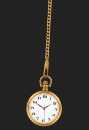
4、demo4
<!DOCTYPE html>
<html>
<head lang="en">
    <meta charset="UTF-8">
    <title>弧形运动效果</title>
    <style>
        *{margin: 0;padding: 0;box-sizing: border-box}
        body{background: #222}
        .stage{width: 120px;height: auto;margin: 0 auto;position: relative;transform: rotate(-30deg);transform-origin: center top;animation:sway 2.2s infinite alternate ease-in-out}
        .watch{ width:100%;height:auto;}
        .seconds{position: absolute;width: 8%;height: auto;bottom: 11.5%;left: 45.5%;transform-origin: center 72.4%;animation:second 60s infinite linear}
        @keyframes sway{
            to{
                transform: rotate(30deg);
            }
        }
        @keyframes second{
            to{
                transform: rotate(355deg);
            }
        }
    </style>
</head>
<body>
<div class="stage">
    <img src="http://p0.qhimg.com/t0197c451833414523e.png" alt="钟表" class="watch"/>
    <img src="http://p9.qhimg.com/t0145f1ae8ad6753b05.png" alt="秒针" class="seconds">
</div>
</body>
</html>