只用一个div实现一个八卦图
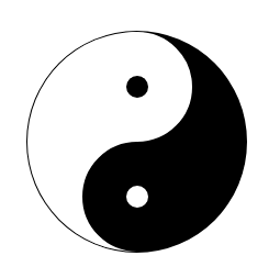
效果图:
html:
<div></div>
css:
<style>
        div{
            width: 100px;
            height: 200px;
            background: #fff;
            position: absolute;
            left: 0;
            right: 0;
            top:0;
            bottom: 0;
            margin: auto;
            border-style: solid;
            border-color: #000;
            border-width: 1px 100px 1px 1px;
            border-radius: 50%;
        }
        div:before {
            content: '';
            background: #000;
            width: 20px;
            height: 20px;
            border: 40px solid #fff;
            border-radius: 100%;
            position: absolute;
            left: 50%;
            top: 0;
        }
        div:after {
            content: '';
            background: #fff;
            width: 20px;
            height: 20px;
            border: 40px solid #000;
            border-radius: 100%;
            position: absolute;
            right: -50%;
            bottom: 0;
        }
    </style>
补:加一个小小的动画
效果:让八卦图顺时针旋转
html代码:
<div></div>
css代码:
<style>
        div{
            width: 100px;
            height: 200px;
            background: #fff;
            position: absolute;
            left: 0;
            right: 0;
            top:0;
            bottom: 0;
            margin: auto;
            border-style: solid;
            border-color: #000;
            border-width: 1px 100px 1px 1px;
            border-radius: 50%;
            animation: change 3s;/*参数1:动画名称;参数2:规定动画完成一个周期所花费的秒或毫秒。默认是 0。*/
            animation-iteration-count: infinite;/*设置动画次数无限[默认值是1]*/
            animation-timing-function: linear;/*使动画匀速旋转[默认值是ease,动画以低速开始,然后加快,在结束前变慢。]*/
        }
        div:before {
            content: '';
            background: #000;
            width: 20px;
            height: 20px;
            border: 40px solid #fff;
            border-radius: 100%;
            position: absolute;
            left: 50%;
            top: 0;
        }
        div:after {
            content: '';
            background: #fff;
            width: 20px;
            height: 20px;
            border: 40px solid #000;
            border-radius: 100%;
            position: absolute;
            right: -50%;
            bottom: 0;
        }
        /*@keyframes:规定动画。*/
        @keyframes change {
            0% {transform: rotate(0deg)}
            100% {transform: rotate(360deg)}
        }
    </style>