版权声明:转载请注明来源及作者,谢谢! https://blog.csdn.net/qq_42442369/article/details/84207394
需求:
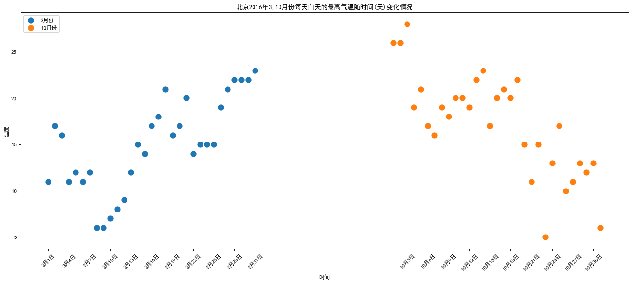
- 绘制北京2016年3,10月份每天白天的最高气温随时间(天)变化的散点图,并找出规律
难点:
- 散点图语法
- 绘制两边分布式x轴坐标
# 数据来源:天气网 http://lishi.tianqi.com/beijing/index.html
import matplotlib.pyplot as plt
# 3月份和10月份每天白天气温情况
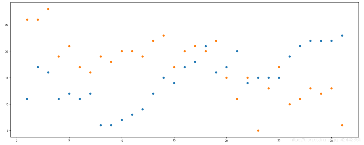
a = [11,17,16,11,12,11,12,6,6,7,8,9,12,15,14,17,18,21,16,17,20,14,15,15,15,19,21,22,22,22,23]
b = [26,26,28,19,21,17,16,19,18,20,20,19,22,23,17,20,21,20,22,15,11,15,5,13,17,10,11,13,12,13,6]
# 作为x轴的时间天数
x = range(1,32)
plt.figure(figsize = (20, 8), dpi = 80)
# # x轴都一样,重叠在一起就没意义了
plt.scatter(x, a)
plt.scatter(x, b)
#展示
plt.show()
import matplotlib.pyplot as plt

plt.rcParams['font.sans-serif'] = ['SimHei']
plt.rcParams['axes.unicode_minus'] = False

y_3 = [11,17,16,11,12,11,12,6,6,7,8,9,12,15,14,17,18,21,16,17,20,14,15,15,15,19,21,22,22,22,23]
y_10 = [26,26,28,19,21,17,16,19,18,20,20,19,22,23,17,20,21,20,22,15,11,15,5,13,17,10,11,13,12,13,6]

x_3 = range(1,32)
# 为了在x轴上区分开
x_10 = range(51,82)

#设置图形大小
plt.figure(figsize=(20,8),dpi=80)

#使用scatter方法绘制散点图,和之前绘制折线图的唯一区别
plt.scatter(x_3,y_3,label=u"3月份", linewidth = 5 )
plt.scatter(x_10,y_10,label=u"10月份", linewidth = 5)

#调整x轴的刻度
# 注意: 不能直接range(1,82),因为中间还差数,所以list+
_x = list(x_3)+list(x_10)
_xtick_labels = [u"3月{}日".format(i) for i in x_3]

# 因为从51开始的, -50就行了
_xtick_labels += [u"10月{}日".format(i-50) for i in x_10]
plt.xticks(_x[::3],_xtick_labels[::3], rotation=45)

#添加图例
plt.legend(loc="upper left")

#添加描述信息
plt.xlabel(u"时间")
plt.ylabel(u"温度")
plt.title(u"北京2016年3,10月份每天白天的最高气温随时间(天)变化情况")

# plt.grid() 散点图加网格线不美观

#展示
plt.show()

# 大致规律:3月份气温随着时间增加而增加;10月份气温随着时间增加而递减