版权声明: https://blog.csdn.net/qq_41115965/article/details/83714291
温馨提示
代码参考
[本人博客]:【https://blog.csdn.net/qq_41115965/article/details/83713343】
代码修改
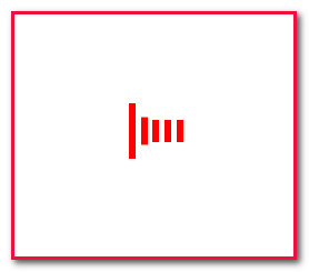
不同于使用 GIF 图片,使用 CSS3 动画的时候 loading 布局,应做以下改变:
html文件
<div class="loading">
			<div class="picture">
				<i></i>
				<i></i>
				<i></i>
				<i></i>
				<i></i>
			</div>
		</div>
CSS文件
/* 加载动画样式start */
			.loading {
				width: 100%;
				height: 100%;
				position: fixed;
				top: 0;
				left: 0;
				z-index: 100;
				background: #ffffff;
			}

			.loading .picture {
				position: absolute;
				top: 0;
				left: 0;
				bottom: 0;
				right: 0;
				margin: auto;
				width: 70px;
				height: 50px;
			}

			.loading .picture i {
				display: inline-block;
				background: #FF0000;
				width: 6px;
				height: 50px;
				margin: 0 2px;
				animation: loading 1.2s infinite;
				margin: 0 auto;
			}
			.loading .picture i:nth-child(2){
				animation-delay: 0.2s;
			}

			.loading .picture i:nth-child(3){
				animation-delay: 0.4s;
			}
			.loading .picture i:nth-child(4){
				animation-delay: 0.6s;
			}
			.loading .picture i:nth-child(5){
				animation-delay: 0.8s;
			}

			@keyframes loading{
				0%, 40%,100%{
					transform: scaleY(0.4);
				}
				20%{
					transform: scaleY(1.0);
				}
			}

			/* 加载动画样式end */
注意事项
对应的 JS 文件不需要做修改。
效果图