先看理想效果
先上代码,在进行解释
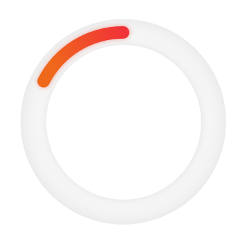
<div id="app">
        <svg width="230" height="230" viewBox="0 0 230 230" transform="rotate(90),scale(-1,1)">
            //进度条渐变色
            <defs>
                <linearGradient id="orange" x1="0%" y1="0%" x2="100%" y2="0%">
                    <stop offset="0%"   stop-color="#F34D4D"/>
                    <stop offset="100%" stop-color="#F27D31"/>
                </linearGradient>
            </defs>
        //进度条渐变
        //外层圆
        <circle cx="115" cy="115" r="87" fill="none" stroke="#f7f7f7" stroke-width="30" />
        //外层圆
        //内容圆
          <circle cx="115" cy="115" r="87" fill="none" stroke="url(#orange)" stroke-width="12" stroke-dasharray="50,547" :stroke-dashoffset="dashOffsetCircle" stroke-linecap="round" />
        //内层圆
    </svg>
</div>
svg: witdh:230单位,
   height: 230单位,注意不是px 是单位
   viewBox="x轴摆放的位置 y轴摆放的位置 在视图内显示的x大小 在视图内显示y的大小", svg 可以理解为相框,viewBox 相当于设定内容的摆放位置与缩放
    transform 与 css 理解一致
defs: 设定填充颜色
circle: 为设置圆标签
    cx: 圆心在x轴的位置
    cy: 圆心在y轴的位置
    fill: 设置绘制图案的填充颜色或图案
    stroke: 定制绘制线的颜色
    stroke-width: 绘制线的宽度
    stroke-dasharray: 设置实线和虚线的宽度
   stroke-dashoffset: 实线虚线绘制的起点距路径开始的距离
stroke="url(#orange)" 引用defs 上的渐变色