版权声明:本文为博主原创文章,未经博主允许不得转载。 https://blog.csdn.net/sinat_35656188/article/details/80434724
一、HTML
<style type="text/css">
* {
margin: 0;
padding: 0;
list-style: none;
}
/*水平无限滚动css*/
#container {
width: 100%;
height: 35px;
margin: 10px auto;
overflow: hidden;
position: relative;
border: 1px solid red;
box-sizing: border-box;
}
#container ul {
width: 100%;
right: -100%;
top: 0;
position: absolute;
-webkit-animation: scollLeft 10s linear 0s infinite;
}
#container ul li {
float: left;
line-height: 35px;
width: 10%;
text-align: center;
box-sizing: border-box;
}
@-webkit-keyframes scollLeft {
from {
right: -100%;
}
to {
right: 100%;
}
}
@keyframes scollLeft {
from {
right: -100%;
}
to {
right: 100%;
}
}
@-moz-keyframes scollLeft {
from {
right: -100%;
}
to {
right: 100%;
}
}
@-o-keyframes scollLeft {
from {
right: -100%;
}
to {
right: 100%;
}
}
/*上下无限抖动css*/
.jump span {
float: left;
position: relative;
}
.jump span:nth-child(1) {
-webkit-animation: jump 1s linear 0s infinite alternate;
}
.jump span:nth-child(2) {
-webkit-animation: jump 1s linear 0.2s infinite alternate;
}
.jump span:nth-child(3) {
-webkit-animation: jump 1s linear 0.4s infinite alternate;
}
.jump span:nth-child(4) {
-webkit-animation: jump 1s linear 0.6s infinite alternate;
}
.jump span:nth-child(5) {
-webkit-animation: jump 1s linear 0.8s infinite alternate;
}
@-webkit-keyframes jump {
0% {
top: 0px;
color: red;
}
50% {
top: -10px;
color: green;
}
100% {
top: 10px;
color: blue;
}
}
@keyframes jump {
0% {
top: 0px;
color: red;
}
50% {
top: -10px;
color: green;
}
100% {
top: 10px;
color: blue;
}
}
@-moz-keyframes jump {
0% {
top: 0px;
color: red;
}
50% {
top: -10px;
color: green;
}
100% {
top: 10px;
color: blue;
}
}
</style>
</head>
<body>
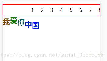
<div id="container">
<ul>
<li>1</li>
<li>2</li>
<li>3</li>
<li>4</li>
<li>5</li>
<li>6</li>
<li>7</li>
<li>8</li>
<li>9</li>
<li>10</li>
</ul>
</div>
<h2 class="jump">
<span>我</span>
<span>爱</span>
<span>你</span>
<span>中</span>
<span>国</span>
</h2>
</body>