版权声明:本文为博主原创文章,如果喜欢欢迎收藏转载! https://blog.csdn.net/Never_Give_up_z/article/details/83053032
响应式 Web 设计 - Viewport
什么是 Viewport?
viewport 是用户网页的可视区域。
viewport 翻译为中文可以叫做"视区"。
手机浏览器是把页面放在一个虚拟的"窗口"(viewport)中,通常这个虚拟的"窗口"(viewport)比屏幕宽,这样就不用把每个网页挤到很小的窗口中(这样会破坏没有针对手机浏览器优化的网页的布局),用户可以通过平移和缩放来看网页的不同部分。

设置 Viewport
<meta name="viewport" content="width=device-width, initial-scale=1.0">

width:控制 viewport 的大小,可以指定的一个值,如 600,或者特殊的值,如 device-width 为设备的宽度(单位为缩放为 100% 时的 CSS 的像素)。
height:和 width 相对应,指定高度。
initial-scale:初始缩放比例,也即是当页面第一次 load 的时候缩放比例。
maximum-scale:允许用户缩放到的最大比例。
minimum-scale:允许用户缩放到的最小比例。
user-scalable:用户是否可以手动缩放。
响应式 Web 设计 - 网格视图
使用网格视图有助于我们设计网页。这让我们向网页添加元素变的更简单。
响应式网格视图通常是 12 列,宽度为100%,在浏览器窗口大小调整时会自动伸缩。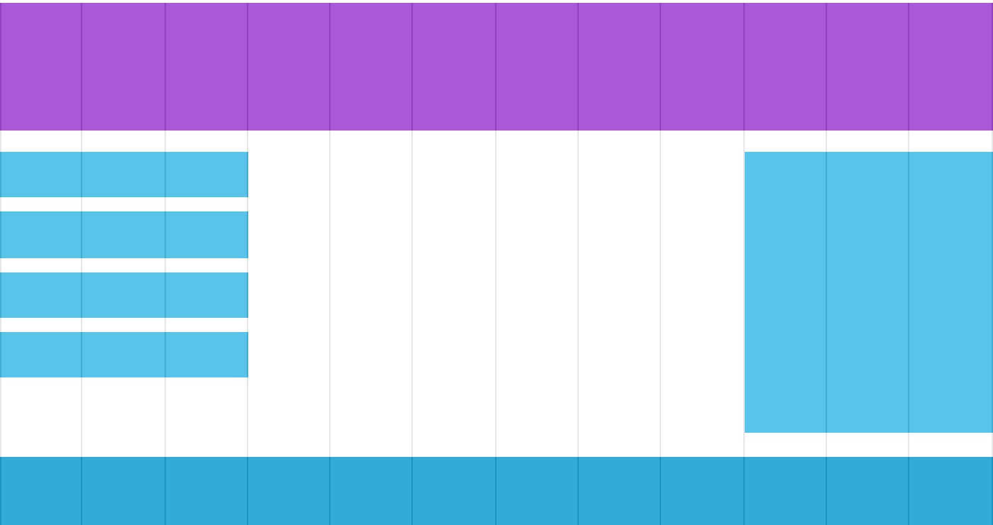
创建响应式网格视图
首先确保所有的 HTML 元素都有 box-sizing 属性且设置为 border-box。
确保边距和边框包含在元素的宽度和高度间。

* {
    box-sizing: border-box;
}
示例:
<!DOCTYPE html>
<html>
<head>
<meta name="viewport" content="width=device-width, initial-scale=1.0">
<meta charset="utf-8">
<title>CSS响应式</title>
<style>
* {
    box-sizing: border-box;
}
.row:after {
    content: "";
    clear: both;
    display: block;
}
[class*="col-"] {
    float: left;
    padding: 15px;
}
.col-1 {width: 8.33%;}
.col-2 {width: 16.66%;}
.col-3 {width: 25%;}
.col-4 {width: 33.33%;}
.col-5 {width: 41.66%;}
.col-6 {width: 50%;}
.col-7 {width: 58.33%;}
.col-8 {width: 66.66%;}
.col-9 {width: 75%;}
.col-10 {width: 83.33%;}
.col-11 {width: 91.66%;}
.col-12 {width: 100%;}
html {
    font-family: "Lucida Sans", sans-serif;
}
.header {
    background-color: #9933cc;
    color: #ffffff;
    padding: 15px;
}
.menu ul {
    list-style-type: none;
    margin: 0;
    padding: 0;
}
.menu li {
    padding: 8px;
    margin-bottom: 7px;
    background-color :#33b5e5;
    color: #ffffff;
    box-shadow: 0 1px 3px rgba(0,0,0,0.12), 0 1px 2px rgba(0,0,0,0.24);
}
.menu li:hover {
    background-color: #0099cc;
}
</style>
</head>
<body>

<div class="header">
<h1>Chania</h1>
</div>

<div class="row">

<div class="col-3 menu">
<ul>
<li>The Flight</li>
<li>The City</li>
<li>The Island</li>
<li>The Food</li>
</ul>
</div>

<div class="col-9">
<h1>The City</h1>
<p>Chania is the capital of the Chania region on the island of Crete. The city can be divided in two parts, the old town and the modern city.</p>
<p>Resize the browser window to see how the content respond to the resizing.</p>
</div>

</div>
</body>
</html>
响应式 Web 设计 - 媒体查询
使用 @media 查询,你可以针对不同的媒体类型定义不同的样式。
如果浏览器窗口小于 500px, 背景将变为浅蓝色:

@media only screen and (max-width: 500px) {
    body {
        background-color: lightblue;
    }
}
示例:
<!DOCTYPE html>
<html>
<head>
<meta name="viewport" content="width=device-width, initial-scale=1.0">
<meta charset="utf-8">
<title>CSS媒体查询</title>
<style>
* {
    box-sizing: border-box;
}
.row:after {
    content: "";
    clear: both;
    display: block;
}
[class*="col-"] {
    float: left;
    padding: 15px;
}
html {
    font-family: "Lucida Sans", sans-serif;
}
.header {
    background-color: #9933cc;
    color: #ffffff;
    padding: 15px;
}
.menu ul {
    list-style-type: none;
    margin: 0;
    padding: 0;
}
.menu li {
    padding: 8px;
    margin-bottom: 7px;
    background-color :#33b5e5;
    color: #ffffff;
    box-shadow: 0 1px 3px rgba(0,0,0,0.12), 0 1px 2px rgba(0,0,0,0.24);
}
.menu li:hover {
    background-color: #0099cc;
}
.aside {
    background-color: #33b5e5;
    padding: 15px;
    color: #ffffff;
    text-align: center;
    font-size: 14px;
    box-shadow: 0 1px 3px rgba(0,0,0,0.12), 0 1px 2px rgba(0,0,0,0.24);
}
.footer {
    background-color: #0099cc;
    color: #ffffff;
    text-align: center;
    font-size: 12px;
    padding: 15px;
}
/* For mobile phones: */
[class*="col-"] {
    width: 100%;
}
@media only screen and (min-width: 600px) {
    /* For tablets: */
    .col-m-12 {width: 8.33%;}
    .col-m-2 {width: 16.66%;}
    .col-m-3 {width: 25%;}
    .col-m-4 {width: 33.33%;}
    .col-m-5 {width: 41.66%;}
    .col-m-6 {width: 50%;}
    .col-m-7 {width: 58.33%;}
    .col-m-8 {width: 66.66%;}
    .col-m-9 {width: 75%;}
    .col-m-10 {width: 83.33%;}
    .col-m-11 {width: 91.66%;}
    .col-m-12 {width: 100%;}
}
@media only screen and (min-width: 768px) {
    /* For desktop: */
    .col-1 {width: 8.33%;}
    .col-2 {width: 16.66%;}
    .col-3 {width: 25%;}
    .col-4 {width: 33.33%;}
    .col-5 {width: 41.66%;}
    .col-6 {width: 50%;}
    .col-7 {width: 58.33%;}
    .col-8 {width: 66.66%;}
    .col-9 {width: 75%;}
    .col-10 {width: 83.33%;}
    .col-11 {width: 91.66%;}
    .col-12 {width: 100%;}
}
</style>
</head>
<body>

<div class="header">
<h1>Chania</h1>
</div>

<div class="row">
<div class="col-3 col-m-3 menu">
<ul>
<li>The Flight</li>
<li>The City</li>
<li>The Island</li>
<li>The Food</li>
</ul>
</div>

<div class="col-6 col-m-9">
<h1>The City</h1>
<p>Chania is the capital of the Chania region on the island of Crete. The city can be divided in two parts, the old town and the modern city.</p>
</div>

<div class="col-3 col-m-12">
<div class="aside">
<h2>What?</h2>
<p>Chania is a city on the island of Crete.</p>
<h2>Where?</h2>
<p>Crete is a Greek island in the Mediterranean Sea.</p>
<h2>How?</h2>
<p>You can reach Chania airport from all over Europe.</p>
</div>
</div>

</div>

<div class="footer">
<p>Resize the browser window to see how the content respond to the resizing.</p>
</div>

</body>
</html>
方向:横屏/竖屏
结合CSS媒体查询,可以创建适应不同设备的方向(横屏landscape、竖屏portrait等)的布局。
语法:
orientation:portrait | landscape
portrait:指定输出设备中的页面可见区域高度大于或等于宽度
landscape: 除portrait值情况外,都是landscape
如果是横屏背景将是浅蓝色:
@media only screen and (orientation: landscape) {
body {
background-color: lightblue;
}
}响应式 Web 设计 - 图片
使用 width 属性
如果 width 属性设置为 100%,图片会根据上下范围实现响应式功能:
img {
    width: 100%;
    height: auto;
}
使用 max-width 属性
如果 max-width 属性设置为 100%, 图片永远不会大于其原始大小:
img {
    max-width: 100%;
    height: auto;
}
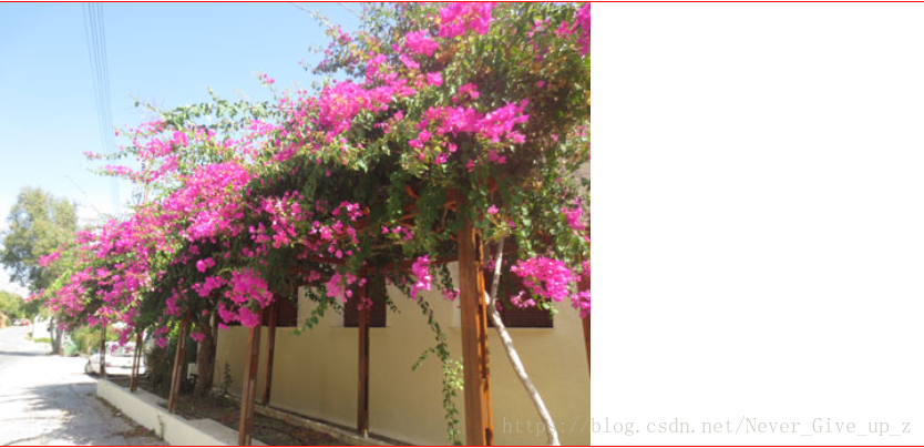
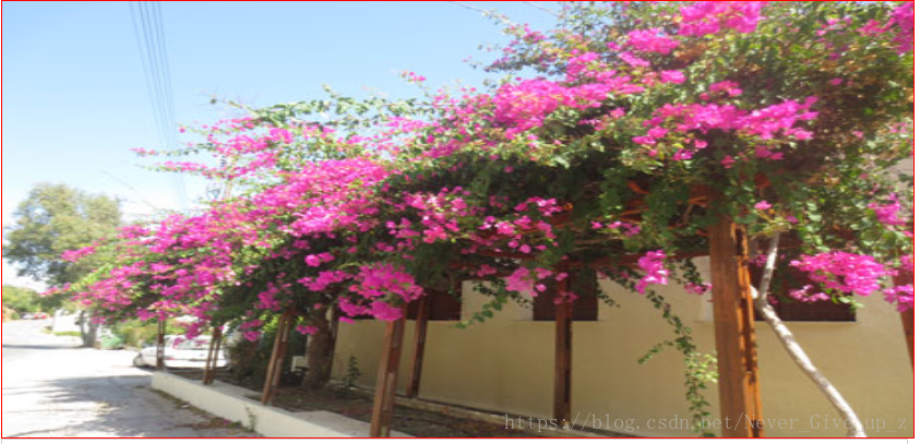
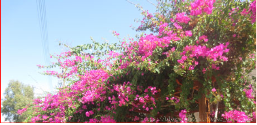
背景图片可以响应调整大小或缩放。
以下是三个不同的方法:
1. 如果 background-size 属性设置为 "contain", 背景图片将按比例自适应内容区域。图片保持其比例不变:
div {
    width: 100%;
    height: 400px;
    background-image: url('img_flowers.jpg');
    background-repeat: no-repeat;
    background-size: contain;
    border: 1px solid red;
}
2. 如果 background-size 属性设置为 "100% 100%" ,背景图片将延展覆盖整个区域:
div {
    width: 100%;
    height: 400px;
    background-image: url('img_flowers.jpg');
    background-size: 100% 100%;
    border: 1px solid red;
}
3. 如果 background-size 属性设置为 "cover",则会把背景图像扩展至足够大,以使背景图像完全覆盖背景区域。注意该属性保持了图片的比例因此 背景图像的某些部分无法显示在背景定位区域中。
div {
    width: 100%;
    height: 400px;
    background-image: url('img_flowers.jpg');
    background-size: cover;
    border: 1px solid red;
}
不同设备显示不同图片
大尺寸图片可以显示在大屏幕上,但在小屏幕上确不能很好显示。我们没有必要在小屏幕上去加载大图片,这样很影响加载速度。所以我们可以使用媒体查询,根据不同的设备显示不同的图片。

实例
/* For width smaller than 400px: */
body {
    background-image: url('img_smallflower.jpg');
}

/* For width 400px and larger: */
@media only screen and (min-width: 400px) {
    body {
        background-image: url('img_flowers.jpg');
    }
}

你可以使用媒体查询的 min-device-width 替代 min-width 属性,它将检测的是设备宽度而不是浏览器宽度。浏览器大小重置时,图片大小不会改变。
/* 设备小于 400px: */
body {
    background-image: url('img_smallflower.jpg');
}

/* 设备大于 400px (也等于): */
@media only screen and (min-device-width: 400px) {
    body {
        background-image: url('img_flowers.jpg');
    }
}
HTML5 的 <picture> 元素可以设置多张图片。
<picture>
<source srcset="img_smallflower.jpg" media="(max-width: 400px)">
<source srcset="img_flowers.jpg">
<img src="img_flowers.jpg" alt="Flowers">
</picture>
srcset 属性的必须的,定义了图片资源。
media 属性是可选的,可以在媒体查询的 CSS @media 规则 查看详情。
对于不支持 <picture> 元素的浏览器你也可以定义 <img> 元素来替代。响应式 Web 设计 - 视频(Video)
使用 width 属性
如果 width 属性设置为 100%,视频播放器会根据屏幕大小自动调整比例:

实例
video {
    width: 100%;
    height: auto;
}
注意在以上实例中,视频播放器根据屏幕大小自动调整比例,且可以比原始尺寸大。更多情况下我们可以使用 max-width 属性来替代。

使用 max-width 属性
如果 max-width 属性设置为 100%, 视频播放器会根据屏幕自动调整比例,但不会超过其原始大小:

实例
video {
    max-width: 100%;
    height: auto;
}

在网页中添加视频
我们可以在网页中添加视频。以下实例视频根据 div 区域大小自动调整并占满整个 div 区域:

实例
video {
    width: 100%;
    height: auto;
}
响应式 Web 设计 - 框架
本章节为大家介绍响应式 Web 设计框架 Bootstrap。

Bootstrap,来自 Twitter,是目前最受欢迎的前端框架。Bootstrap 是基于 HTML、CSS、JAVASCRIPT 的,它简洁灵活,使得 Web 开发更加快捷。

示例:
<!DOCTYPE html>
<html lang="en">
<head>
<title>Bootstrap Example</title>
<meta charset="utf-8">
<meta name="viewport" content="width=device-width, initial-scale=1">
<link rel="stylesheet" href="http://apps.bdimg.com/libs/bootstrap/3.3.4/css/bootstrap.min.css">
<script src="http://apps.bdimg.com/libs/jquery/2.1.4/jquery.min.js"></script>
<script src="http://apps.bdimg.com/libs/bootstrap/3.3.4/js/bootstrap.min.js"></script>
</head>
<body>

<div class="container">
  <div class="jumbotron">
    <h1>我的第一个 Bootstrap 页面</h1>
  </div>
  <div class="row">
    <div class="col-sm-4">
      ...
    </div>
    <div class="col-sm-4">
      ...
    </div>
    <div class="col-sm-4">
    ...
    </div>
  </div>
</div>

</body>
</html>