最近刚好看到drawable的相关知识,结合项目,很容易发现现在的弹窗背景、按钮背景大多使用圆角,这时候我们选择的方式就是使用drawable,而不是自定义view,原因有两个,第一使用drawable方便快捷,占用内存小;第二自定义view比较麻烦,占用内存大。综上,我们选择了drawable,这里对一些常见的drawable进行总结。
常见的Drawable
ShapeDrawable
这是一种很常见的drawable,我们通常都是使用这种来设置圆角的。这个对应shape标签。
<?xml version="1.0" encoding="utf-8"?>
<shape xmlns:android="http://schemas.android.com/apk/res/android"
    android:shape="rectangle">
</shape>
我这里任意新建了一个,这里先讲一下shape这个属性,它可以设置不同的形状(翻译过来也就是这样),不过这里面的取值是有限制的,除了上述代码中的rectangle,还有oval、line、ring,即椭圆、线、圆环。默认为矩形。
接下来就要对形状进行设置,颜色、大小等。
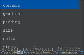
这六个属性我们分别介绍一下:
corners:即角落,这里面我们设置圆角就是设置其中的radius。
gradient:即渐变,这里我们不是很常用,后续会在自定义控件里细说,这里不细说,具体有这方面的需求再研究。
padding:这个表示空白,但不是对应的drawable空白,而是包含它的view的空白,有四个属性,即left、top、right、bottom。
size:即大小,这里可以设置drawable的宽高,对应width、height;但这里的大小只是单纯的drawable的大小,当设置为view的背景时,drawable会被拉伸和缩小为view的大小。
solid:即纯色填充,可设置color。
stroke:即图形的描边,这里可设置描边的width和color。其他属性不常用,略过。
下面贴相关使用(参考)
<?xml version="1.0" encoding="utf-8"?>
<shape xmlns:android="http://schemas.android.com/apk/res/android"
    android:shape="rectangle">

    <solid android:color="#FFFFFFFF"/>
    <corners android:radius="3dp"/>

</shape>
StateListDrawable
这是一种很常见的drawable,我们通常都是使用这种来设置可点击的背景。这个对应selector标签。
<?xml version="1.0" encoding="utf-8"?>
<selector xmlns:android="http://schemas.android.com/apk/res/android">
    <item  android:state_checked="true" />
    <item  android:state_checked="false" />
</selector>
同样新建了一个,我们主要要关注item这个标签内的state,即状态,我们这个代码给的是checked,这个一般适用于CheckBox选中,其他还有pressed,表示按下状态,比如button按下的颜色和未被按下颜色不同我们使用的就是这个;还有focused,表示已经获取了焦点,enabled表示当前处于可用状态。
余下根据具体情况,可在item标签下使用shape标签或者直接使用drawable、color等属性来完成功能。
下面贴相关使用(参考)
<?xml version="1.0" encoding="utf-8"?>
<selector xmlns:android="http://schemas.android.com/apk/res/android">
    <item android:state_pressed="false">
        <shape>
            <solid android:color="#1e82d2" />
            <corners android:radius="5dp" />
            <padding android:bottom="10dp" android:left="10dp" android:right="10dp" android:top="10dp" />
        </shape>
    </item>
    <item android:state_pressed="true">
        <shape>
            <solid android:color="#0c70c1" />
            <corners android:radius="5dp" />
            <padding android:bottom="10dp" android:left="10dp" android:right="10dp" android:top="10dp" />
        </shape>
    </item>
</selector>
LayerDrawable
这种drawable的使用就没有以上两种使用的多了,我们通常都是使用这种来设置多重颜色叠加的的背景。这个对应layer-list标签。
<?xml version="1.0" encoding="utf-8"?>
<layer-list xmlns:android="http://schemas.android.com/apk/res/android">
    <item
        android:bottom="-2dp">
        <shape>

        </shape>
    </item>
</layer-list>
内部就直接使用item标签即可,可设置left、top等属性,然后直接引用drawable或者使用shape标签。
下面贴相关使用(参考)
<?xml version="1.0" encoding="utf-8"?>
<layer-list xmlns:android="http://schemas.android.com/apk/res/android">
    <item
        android:bottom="-2dp"
        android:left="-2dp"
        android:right="-2dp">
        <shape>
            <solid android:color="#FFFFFF" />
            <stroke
                android:width="1dp"
                android:color="#F3F3F3" />
        </shape>
    </item>
</layer-list>
BitmapDrawable
这个表示的就是一张图片,不过其中的属性可以设置更多的效果。
<?xml version="1.0" encoding="utf-8"?>
<bitmap android:src="@drawable/img_2"
    xmlns:android="http://schemas.android.com/apk/res/android">

</bitmap>
src是必须的,决定显示的图片,
接下来是对图片进行效果处理

gravity:当图片小于容器时,进行定位的
alpha:图片透明度
antialias:是否开启抗锯齿,开启
dither:是否抖动,开启
filter:是否过滤,开启
mapMap:纹理映射(基本用不到)
tileMode:平铺模式(基本用不到)
这个就不举例了,因为项目中基本没有使用(只是了解一下)。
其他不常用的
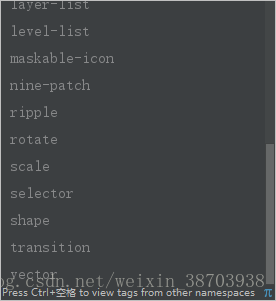
由以下标签(除掉上面常用的)对应drawable
等我有用到这些的时候再细说。
也可以使用自定义drawable,不过使用较少,可以查看源码学习。
写在最后
欢迎补充常用的drawable,如果我有说错的也欢迎指正。