转自 https://blog.csdn.net/guoyangyang123456/article/details/72842601
动态伪类并不存在于html中,只有当用户和网站交互的时候才会体现出来。动态伪类包含两种,一种是在链接中常看到的锚点伪类,一种是用户行为伪类。
链接伪类选择器:E:link(未被访问过) 和 E:visited(已被访问过),
用户行为伪类选择器:E:active(点击时)、E:hover(鼠标滑过时)、E:focus(元素获得焦点时)
例子:美化按钮
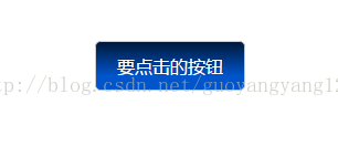
页面展示效果如下:
点击前:

鼠标滑过:
点击时:

html代码如下:
    <!DOCTYPE html>
    <html>
    <head lang="en">
        <meta charset="UTF-8">
        <title>动态伪类选择器----美化按钮</title>
        <link href="./style.css" rel="stylesheet" type="text/css">
    </head>
    <body>
        <div class="download-info">
            <a href="#" class="btn">要点击的按钮</a>
        </div>
    </body>
    </html>
CSS代码如下:
.download-info{
    text-align: center;
    margin-top: 50px;
}
/*默认状态下的按钮效果*/
.btn{
    font-size: 20px;
    /*background-color: #0074cc;*/
    /*css3,背景线性渐变*/
    background-image: -webkit-gradient(linear, 0 0, 0 100%, from(black), to(#0055cc));
    background-repeat: repeat-x;
    display: inline-block;
    border: 1px solid #cccccc;
    /*css3,色彩模块*/
    border-radius: 6px;
    cursor: pointer;
    font-weight: normal;
    /*滤镜*/
    /*filter: ;*/
    padding: 14px 24px;
    text-align: center;
    text-decoration: none;
    color: #ffffff;
}
/*悬浮状态下按钮效果*/
.btn:hover{
    background-position: 0 -15px;
    background-color: #0055cc;
    text-shadow: 0 -1px 0 rgba(0, 0, 0, 0.25);
    /*动画效果*/
    /*transition: background-position 0.1s linear;*/
    /*-webkit-transition: background-position 0.1s linear;*/
}
/*点击时按钮效果*/
.btn:active{
    background-color: red;
    background-image: none;
}
/*获得焦点时按钮效果*/
.btn:focus{
    outline: thin dotted #333;
    outline-offset: -20px;
    outline: 5px auto -webkit-focus-ring-color;
    /*background-color: darkgoldenrod;*/
}