偶然间在微信公众号
奇舞周刊上看到了这篇文章《CSS Painting API》,算是对conic-gradient的初次见面。
后来有空的时候,百度搜了一下,看了这篇文章《CSS神奇的conic-gradient圆锥渐变》后,对conic-gradient有了深刻的了解。
概述
conic-gradient:圆锥形渐变,它的两个兄弟line-gradient(线性渐变)、radial-gradient(径向渐变),算是最早认识的渐变属性。
API
background: conic-gradient(pink, yellow); // basic demo特点
圆锥渐变的起始点是图形中心,渐变方向以顺时针方向绕中心旋转实现渐变效果。
兼容性
根据 can i use,目前只在chrome 69及以上支持。
可以使用polyfill垫片库,解决兼容性问题。垫片库会根据css语法,生成对应的圆锥渐变图案,并且转化为 base64 代码。
// 需加入的js库
<script src="//cdnjs.cloudflare.com/ajax/libs/prefixfree/1.0.7/prefixfree.min.js"></script>
<script src="//leaverou.github.io/conic-gradient/conic-gradient.js"></script>
案例1-颜色表盘

    <section class="color1"></section>
    <section class="color2"></section>
/* 起始处与结尾处衔接不够自然 */
.color1 {
width: 200px;
height: 200px;
border-radius: 50%;
background: conic-gradient(red, orange, yellow, green, teal, blue, purple)
}
/* 起始处与结尾处衔接不够自然,解决:在结尾加入开始的颜色 */
.color2 {
width: 200px;
height: 200px;
border-radius: 50%;
background: conic-gradient(red, orange, yellow, green, teal, blue, purple, red);
}
案例2-饼图
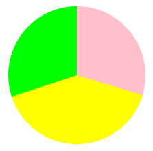
    <section class="pie"></section>

    .pie {
      width: 200px;
      height: 200px;
      border-radius: 50%;
      /* 百分比 写法一 */
       background: conic-gradient(pink 0, pink 30%, yellow 30%, yellow 70%, lime 70%, lime 100%);
      /* 写法二 不支持 chrome69 */
      /* background: conic-gradient(pink 0 30%, yellow 0 70%, lime 0 100%); */
    }
案例3-菱形背景
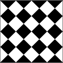
    <section class="rhombus"></section>

    .rhombus {
      width: 200px;
      height: 200px;
      background: conic-gradient(#000 0, #000 12.5%, #fff 12.5%, #fff 37.5%, #000 37.5%, #000 62.5%, #fff 62.5%, #fff 87.5%, #000 87.5%,#000 0);
      border: 1px solid #000;
      background-size: 50px 50px;
    }
终极案例-仪表盘
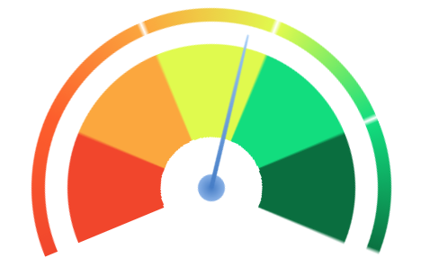
<div class="bg">
        <div class="point"></div>
</div>
.bg {
position: relative;
margin: 50px auto;
width: 400px;
height: 400px;
border-radius: 50%;
background: conic-gradient(#f1462c 0%, #fc5d2c 12.4%, #fff 12.5%, #fff 12.5%, #fc5d2c 12.5%, #fba73e 24.9%, #fff 24.9%, #fff 25%, #fba73e 25%, #e0fa4e 37.4%, #fff 37.4%, #fff 37.5%, #e0fa4e 37.5%, #12dd7e 49.9%, #fff 49.9%, #fff 50%, #12dd7e 50%, #0a6e3f 62.4%, #fff 62.4%, #fff 62.5%);
transform: rotate(-112.5deg);
transform-origin: 50% 50%;
}
.bg::before {
content: "";
position: absolute;
top: 50%;
left: 50%;
transform: translate(-50%, -50%);
width: 370px;
height: 370px;
border-radius: 50%;
background: #fff;
}
.bg::after {
content: "";
position: absolute;
top: 50%;
left: 50%;
transform: translate(-50%, -50%);
width: 320px;
height: 320px;
border-radius: 50%;
background:
radial-gradient(#fff 0%, #fff 25%, transparent 25%, transparent 100%),
conic-gradient(#f1462c 0, #f1462c 12.5%, #fba73e 12.5%, #fba73e 25%, #e0fa4e 25%, #e0fa4e 37.5%, #12dd7e 37.5%, #12dd7e 50%, #0a6e3f 50%, #0a6e3f 62.5%, #fff 62.5%, #fff 100%);
}
.point {
position: absolute;
width: 30px;
height: 30px;
transform: translate(-50%, -50%);
left: 50%;
top: 50%;
background: radial-gradient(#467dc6 0%, #a4c6f3 100%);
border-radius: 50%;
z-index: 999;
}
.point::before {
content: "";
position: absolute;
width: 5px;
height: 350px;
left: 50%;
top: 50%;
transform: translate(-50%, -50%) rotate(0);
border-radius: 100% 100% 5% 5%;
background: linear-gradient(
180deg,
#9bc7f6 0,
#467dc6 50%,
transparent 50%,
transparent 100%
);
animation: pointerRotate 3s cubic-bezier(.93, 1.32, .89, 1.15) infinite;
}
@keyframes pointerRotate {
50% {
transform: translate(-50%, -50%) rotate(150deg);
}
100% {
transform: translate(-50%, -50%) rotate(150deg);
}
}