一、静态页面
1-1、未摇之前的界面,里面加入了背景图、按钮,涉及到很多的艺术字体,所以采用的是图片
实现后的样式图:

html如下:
<html>
<head>
  <meta charset="UTF-8">
  <meta name="viewport" id="viewport" content="width=device-width, initial-scale=1">
  <title>2018桃花降临,快来抽取你的专属桃花签</title>
  <link rel="stylesheet" href="../css/style.css">
  <script src="https://cdn.bootcss.com/jquery/3.3.1/jquery.js"></script>
</head>
<div style="width: 300px;height: 300px;display: none">
  <img src="../images/fenxiang.png" alt="">
</div>
<body>
  <div class="content">
    <!-- 未摇之前 -->
    <img src="../images/q1.png" alt="tit" class="shake_img">
    <img src="../images/hand.png" alt="hand" class="hand_img">
    <img src="../images/q2.png" alt="hand_img" class="hand_btn" onclick='shake()'>
  </div>
</body>

</html>
css:
* {
margin: 0;
padding: 0;
}
.content {
width: 100%;
height: 100%;
box-sizing: border-box;
background: url("../images/q5.png");
background-size: 100% 100%;
background-repeat: no-repeat;
}
.shake_img {
width: 64%;
margin-left: 18%;
padding-top: 15%;
}
.hand_img {
width: 50%;
margin-left: 25%;
}
.hand_btn {
width: 60%;
margin-left: 20%;
margin-top: -3%;
position: relative;
z-index: 1;
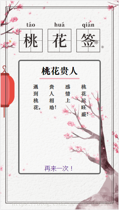
}1-2、摇之后的界面,部分采用的是图片,中间空了一个内容展示区,里面展示摇到的吉祥话标题加内容的形式展示,下方加入了一个返回按钮,可多次摇
我写的摇摇签吉祥话大部分只有四句话,所以只写了四句话的展示区域
摇摇签内容区域未采用艺术字体,如果需要采用艺术字体可以用图片来写
实现后的样式图:(加入了摇到的内容)
html如下:
<html>

<head>
  <meta charset="UTF-8">
  <meta name="viewport" id="viewport" content="width=device-width, initial-scale=1">
  <title>2018桃花降临,快来抽取你的专属桃花签</title>
  <link rel="stylesheet" href="../css/style.css">
  <script src="https://cdn.bootcss.com/jquery/3.3.1/jquery.js"></script>
</head>
<div style="width: 300px;height: 300px;display: none">
  <img src="../images/fenxiang.png" alt="">
</div>
<body>
  <div class="content">
    <!-- 桃花签 -->
    <img src="../images/q3.png" alt="" class="shake_tit">
    <div class="shake_div">
      <span class="div_tit"> </span>
      <div>
        <span class="txt1"></span>
        <span class="txt2"></span>
        <span class="txt3"></span>
        <span class="txt4"></span>
      </div>
      <a href="">再来一次!</a>
    </div>
    <!-- 未摇之前 -->
    <img src="../images/q1.png" alt="tit" class="shake_img">
    <img src="../images/hand.png" alt="hand" class="hand_img">
    <img src="../images/q2.png" alt="hand_img" class="hand_btn" onclick='shake()'>
  </div>
</body>
</html>
css如下:
.shake_tit {
  width: 69%;
  margin-top: 18%;
  margin-left: 15.5%;
  display: none;
}

.shake_div {
  position: relative;
  box-sizing: border-box;
  width: 70%;
  margin-left: 15%;
  border: 4px solid #666;
  border-radius: 0.5rem;
  background: rgba(255, 255, 255, 0.3);
  padding: 0.5rem 0 7rem 0;
  text-align: center;
  top: 3.5%;
  display: none;
  min-height: 55%;
  max-height: 64%;
}

.shake_div .div_tit {
  font-family: 'STZhongsong';
  font-weight: bold;
  font-style: normal;
  display: inline-block;
  padding: 0.3rem;
  border-bottom: 4px solid rgba(220, 20, 60, 0.3);
  font-size: 1.8rem;
}

@font-face {
  font-family: 'SourceHanSerifCN-Light';
  font-weight: normal;
  font-style: normal;
}

.shake_div div {
  width: 80%;
  margin-left: 10%;
  display: flex;
  flex-direction: row;
  justify-content: space-around;
  padding-top: 5%;
}

.shake_div div span {
  font-family: 'STZhongsong';
  font-weight: normal;
  font-style: normal;
  font-size: 1rem;
  width: 1rem;
  font-weight: bold;
  color: #444;
}

.shake_div a {
  position: absolute;
  font-size: 1.2rem;
  width: 80%;
  margin-left: 10%;
  left: 0;
  bottom: 1%;
  text-decoration:none
}

.audio {
  display: none;
}
二、动画以及功能的实现
摇之前,点击“来,摇一卦”按钮上方手会左右摇摆 摇出后会跳转到摇到吉祥话的页面
js代码如下:
//运动事件监听
  if (window.DeviceMotionEvent) {
    window.addEventListener('devicemotion', deviceMotionHandler, false);
  }

  //获取加速度信息
  //通过监听上一步获取到的x, y, z 值在一定时间范围内的变化率,进行设备是否有进行晃动的判断。
  //而为了防止正常移动的误判,需要给该变化率设置一个合适的临界值。
  var SHAKE_THRESHOLD = 20000;
  var last_update = 0;
  var x, y, z, last_x = 0,
    last_y = 0,
    last_z = 0;
  var mathNum, mathTxt;

  function deviceMotionHandler(eventData) {
    var acceleration = eventData.accelerationIncludingGravity;
    var curTime = new Date().getTime();
    if ((curTime - last_update) > 20) {
      var diffTime = curTime - last_update;
      last_update = curTime;
      x = acceleration.x;
      y = acceleration.y;
      z = acceleration.z;
      var speed = Math.abs(x + y + z - last_x - last_y - last_z) / diffTime * 10000;
      if (speed > SHAKE_THRESHOLD) {
        shake();
        palyAudio();
      }
      last_x = x;
      last_y = y;
      last_z = z;
    }
  }

  function shake() {
    palyAudio();
    // 生成随机数产生摇一摇场景
    mathNum = (Math.round(Math.random() * 5) + 1) * 1000;
    mathTxt = (Math.round(Math.random() * shakeData.length) + 1) ;
    console.log(mathNum)
    $('.hand_img').addClass('shake_hand')
    var shake = setTimeout(function () {
      stopAudio()
      $('.hand_img').removeClass('shake_hand');
      generateGame()
    }, mathNum)
  }

  function generateGame() {
    $('.content').addClass('conent_shake');
    $('.shake_img, .hand_btn, .hand_img').hide();
    $('.shake_tit,.shake_div').show();
    console.log(mathTxt)
      if(mathTxt>=shakeData.length){
          mathTxt-=1;
      }
    $('.div_tit').text(shakeData[mathTxt].tit)
    $('.txt1').text(shakeData[mathTxt].txt1)
    $('.txt2').text(shakeData[mathTxt].txt2)
    $('.txt3').text(shakeData[mathTxt].txt3)
    $('.txt4').text(shakeData[mathTxt].txt4)

  }

  function palyAudio() {
    $('.audio')[0].play();
  }

  function stopAudio() {
    $('.audio')[0].pause();
  }
css定义初始位置、摇的速度:
.shake_hand {
  animation: shake 1.5s steps(5) infinite;
}

@-webkit-keyframes shake {
  0% {
    -webkit-transform: rotate(0);
  }
  5% {
    -webkit-transform: rotate(10deg);
  }
  10% {
    -webkit-transform: rotate(-9deg);
  }
  15% {
    -webkit-transform: rotate(8deg);
  }
  20% {
    -webkit-transform: rotate(-7deg);
  }
  25% {
    -webkit-transform: rotate(6deg);
  }
  30% {
    -webkit-transform: rotate(-5deg);
  }
  35% {
    -webkit-transform: rotate(4deg);
  }
  40% {
    -webkit-transform: rotate(-3deg);
  }
  45% {
    -webkit-transform: rotate(2deg);
  }
  50% {
    -webkit-transform: rotate(0);
  }
  /* Come to rest at 50%. The rest is just stillness */
  100% {
    -webkit-transform: rotate(0);
  }
}
三、加入摇一摇的音频
<audio src="../images/music.wav" controls="controls" class="audio" loop="loop"></audio>可选自己喜欢的音频,我采用的是微信摇一摇的音频
四、写入摇摇签吉祥话的json:
我自己找的,可更换
tit为摇摇签的标题、txt1、txt2、txt3、txt4分别是展示的吉祥话,可增减
const shakeData = [{
    type: 0,
    tit: '婚姻美满',
    txt1: '搞定丈母娘,',
    txt2: '迎娶白富美,',
    txt3: '嫁给高富帅,',
    txt4: '坐上幸福的小货车。',
  }, {
    type: 0,
    tit: '红鸾星动',
    txt1: '这是个感情丰收,',
    txt2: '大幅跃进的一年!',
  }, {
    type: 0,
    tit: '桃花贵人',
    txt1: '遇到桃花,',
    txt2: '贵人相助!',
    txt3:'感情上' ,
    txt4:'桃花运旺盛!',
  }, {
    type: 0,
    tit: '桃花朵朵开 ',
    txt1: '桃花大开,',
    txt2: '并且有天厨,',
    txt3:'护婚大运!',
  }, {
    type: 0,
    tit: '圆满',
    txt1: '未婚脱单,',
    txt2: '已婚美满!',
  }, {
    type: 0,
    tit: '颜值爆表',
    txt1: '颜值飙到',
    txt2: '新高度,',
    txt3:'衣食住行',
    txt4:'靠颜度。',
  }, {
    type: 0,
    tit: '有颜有钱',
    txt1: '颜值爆表,',
    txt2: '钱包爆满。',
  }, {
    type: 0,
    tit: '好运四朵花',
    txt1: '财运如爆米花,',
    txt2: '爱情如玫瑰花,',
    txt3: '事业如牵牛花,',
    txt4: '生活如火焰花。',
  }, {
    type: 0,
    tit: '利事',
    txt1: '得鸿运,',
    txt2: '利仕途,',
    txt3: '能旺夫!',
  }, {
    type: 0,
    tit: '喜结',
    txt1: '比翼鸟,',
    txt2: ' 连理枝,',
    txt3: ' 喜相逢。',
  }, {
    type: 0,
    tit: '心动',
    txt1: '山有木兮',
    txt2: '木有枝,',
    txt3:'心悦君',
    txt4:'兮君不知!',
  }, {
    type: 0,
    tit: '知足',
    txt1: '知足不是',
    txt2: '放弃努力,',
    txt3: '而是学会',
    txt4:'珍惜眼前人!',
  }, {
    type: 0,
    tit: '任性',
    txt1: '做你想做的事,',
    txt2: '成为你想',
    txt3:'成为的人!',
  }, {
    type: 0,
    tit: '良缘',
    txt1: '逢良辰,',
    txt2: '遇良人,',
    txt3: '结良缘。',
  }, {
    type: 0,
    tit: '幸运',
    txt1: '越努力,',
    txt2: '越幸运!',
  }]
五、完整代码如下:
html:
<html>

<head>
  <meta charset="UTF-8">
  <meta name="viewport" id="viewport" content="width=device-width, initial-scale=1">
  <title>2018桃花降临,快来抽取你的专属桃花签</title>
  <link rel="stylesheet" href="../css/style.css">
  <script src="https://cdn.bootcss.com/jquery/3.3.1/jquery.js"></script>
</head>
<div style="width: 300px;height: 300px;display: none">
  <img src="../images/fenxiang.png" alt="">
</div>
<body>
  <div class="content">
    <!-- 桃花签 -->
    <img src="../images/q3.png" alt="" class="shake_tit">
    <div class="shake_div">
      <span class="div_tit"> </span>
      <div>
        <span class="txt1"></span>
        <span class="txt2"></span>
        <span class="txt3"></span>
        <span class="txt4"></span>
      </div>
      <a href="">再来一次!</a>
    </div>
    <!-- 未摇之前 -->
    <img src="../images/q1.png" alt="tit" class="shake_img">
    <img src="../images/hand.png" alt="hand" class="hand_img">
    <img src="../images/q2.png" alt="hand_img" class="hand_btn" onclick='shake()'>
  </div>
  <audio src="../images/music.wav" controls="controls" class="audio" loop="loop"></audio>
</body>
<script src="http://res.wx.qq.com/open/js/jweixin-1.2.0.js"></script>
<script>
  const shakeData = [{
    type: 0,
    tit: '婚姻美满',
    txt1: '搞定丈母娘,',
    txt2: '迎娶白富美,',
    txt3: '嫁给高富帅,',
    txt4: '坐上幸福的小货车。',
  }, {
    type: 0,
    tit: '红鸾星动',
    txt1: '这是个感情丰收,',
    txt2: '大幅跃进的一年!',
  }, {
    type: 0,
    tit: '桃花贵人',
    txt1: '遇到桃花,',
    txt2: '贵人相助!',
    txt3:'感情上' ,
    txt4:'桃花运旺盛!',
  }, {
    type: 0,
    tit: '桃花朵朵开 ',
    txt1: '桃花大开,',
    txt2: '并且有天厨,',
    txt3:'护婚大运!',
  }, {
    type: 0,
    tit: '圆满',
    txt1: '未婚脱单,',
    txt2: '已婚美满!',
  }, {
    type: 0,
    tit: '颜值爆表',
    txt1: '颜值飙到',
    txt2: '新高度,',
    txt3:'衣食住行',
    txt4:'靠颜度。',
  }, {
    type: 0,
    tit: '有颜有钱',
    txt1: '颜值爆表,',
    txt2: '钱包爆满。',
  }, {
    type: 0,
    tit: '好运四朵花',
    txt1: '财运如爆米花,',
    txt2: '爱情如玫瑰花,',
    txt3: '事业如牵牛花,',
    txt4: '生活如火焰花。',
  }, {
    type: 0,
    tit: '利事',
    txt1: '得鸿运,',
    txt2: '利仕途,',
    txt3: '能旺夫!',
  }, {
    type: 0,
    tit: '喜结',
    txt1: '比翼鸟,',
    txt2: ' 连理枝,',
    txt3: ' 喜相逢。',
  }, {
    type: 0,
    tit: '心动',
    txt1: '山有木兮',
    txt2: '木有枝,',
    txt3:'心悦君',
    txt4:'兮君不知!',
  }, {
    type: 0,
    tit: '知足',
    txt1: '知足不是',
    txt2: '放弃努力,',
    txt3: '而是学会',
    txt4:'珍惜眼前人!',
  }, {
    type: 0,
    tit: '任性',
    txt1: '做你想做的事,',
    txt2: '成为你想',
    txt3:'成为的人!',
  }, {
    type: 0,
    tit: '良缘',
    txt1: '逢良辰,',
    txt2: '遇良人,',
    txt3: '结良缘。',
  }, {
    type: 0,
    tit: '幸运',
    txt1: '越努力,',
    txt2: '越幸运!',
  }]
  //运动事件监听
  if (window.DeviceMotionEvent) {
    window.addEventListener('devicemotion', deviceMotionHandler, false);
  }

  //获取加速度信息
  //通过监听上一步获取到的x, y, z 值在一定时间范围内的变化率,进行设备是否有进行晃动的判断。
  //而为了防止正常移动的误判,需要给该变化率设置一个合适的临界值。
  var SHAKE_THRESHOLD = 20000;
  var last_update = 0;
  var x, y, z, last_x = 0,
    last_y = 0,
    last_z = 0;
  var mathNum, mathTxt;

  function deviceMotionHandler(eventData) {
    var acceleration = eventData.accelerationIncludingGravity;
    var curTime = new Date().getTime();
    if ((curTime - last_update) > 20) {
      var diffTime = curTime - last_update;
      last_update = curTime;
      x = acceleration.x;
      y = acceleration.y;
      z = acceleration.z;
      var speed = Math.abs(x + y + z - last_x - last_y - last_z) / diffTime * 10000;
      if (speed > SHAKE_THRESHOLD) {
        shake();
        palyAudio();
      }
      last_x = x;
      last_y = y;
      last_z = z;
    }
  }

  function shake() {
    palyAudio();
    // 生成随机数产生摇一摇场景
    mathNum = (Math.round(Math.random() * 5) + 1) * 1000;
    mathTxt = (Math.round(Math.random() * shakeData.length) + 1) ;
    console.log(mathNum)
    $('.hand_img').addClass('shake_hand')
    var shake = setTimeout(function () {
      stopAudio()
      $('.hand_img').removeClass('shake_hand');
      generateGame()
    }, mathNum)
  }

  function generateGame() {
    $('.content').addClass('conent_shake');
    $('.shake_img, .hand_btn, .hand_img').hide();
    $('.shake_tit,.shake_div').show();
    console.log(mathTxt)
      if(mathTxt>=shakeData.length){
          mathTxt-=1;
      }
    $('.div_tit').text(shakeData[mathTxt].tit)
    $('.txt1').text(shakeData[mathTxt].txt1)
    $('.txt2').text(shakeData[mathTxt].txt2)
    $('.txt3').text(shakeData[mathTxt].txt3)
    $('.txt4').text(shakeData[mathTxt].txt4)

  }

  function palyAudio() {
    $('.audio')[0].play();
  }

  function stopAudio() {
    $('.audio')[0].pause();
  }
</script>

</html>
css:
* {
  margin: 0;
  padding: 0;
}

.content {
  width: 100%;
  height: 100%;
  box-sizing: border-box;
  background: url("../images/q5.png");
  background-size: 100% 100%;
  background-repeat: no-repeat;
}

.shake_img {
  width: 64%;
  margin-left: 18%;
  padding-top: 15%;
}

.hand_img {
  width: 50%;
  margin-left: 25%;
}

.hand_btn {
  width: 60%;
  margin-left: 20%;
  margin-top: -3%;
  position: relative;
  z-index: 1;
}

.shake_hand {
  animation: shake 1.5s steps(5) infinite;
}

@-webkit-keyframes shake {
  0% {
    -webkit-transform: rotate(0);
  }
  5% {
    -webkit-transform: rotate(10deg);
  }
  10% {
    -webkit-transform: rotate(-9deg);
  }
  15% {
    -webkit-transform: rotate(8deg);
  }
  20% {
    -webkit-transform: rotate(-7deg);
  }
  25% {
    -webkit-transform: rotate(6deg);
  }
  30% {
    -webkit-transform: rotate(-5deg);
  }
  35% {
    -webkit-transform: rotate(4deg);
  }
  40% {
    -webkit-transform: rotate(-3deg);
  }
  45% {
    -webkit-transform: rotate(2deg);
  }
  50% {
    -webkit-transform: rotate(0);
  }
  /* Come to rest at 50%. The rest is just stillness */
  100% {
    -webkit-transform: rotate(0);
  }
}

.conent_shake {
  background: url("../images/q6.png") !important;
  background-size: 100% 100% !important;
  background-repeat: no-repeat !important;
  transition: 0.2s linear;
}

.shake_tit {
  width: 69%;
  margin-top: 18%;
  margin-left: 15.5%;
  display: none;
}

.shake_div {
  position: relative;
  box-sizing: border-box;
  width: 70%;
  margin-left: 15%;
  border: 4px solid #666;
  border-radius: 0.5rem;
  background: rgba(255, 255, 255, 0.3);
  padding: 0.5rem 0 7rem 0;
  text-align: center;
  top: 3.5%;
  display: none;
  min-height: 55%;
  max-height: 64%;
}

.shake_div .div_tit {
  font-family: 'STZhongsong';
  font-weight: bold;
  font-style: normal;
  display: inline-block;
  padding: 0.3rem;
  border-bottom: 4px solid rgba(220, 20, 60, 0.3);
  font-size: 1.8rem;
}

@font-face {
  font-family: 'SourceHanSerifCN-Light';
  font-weight: normal;
  font-style: normal;
}

.shake_div div {
  width: 80%;
  margin-left: 10%;
  display: flex;
  flex-direction: row;
  justify-content: space-around;
  padding-top: 5%;
}

.shake_div div span {
  font-family: 'STZhongsong';
  font-weight: normal;
  font-style: normal;
  font-size: 1rem;
  width: 1rem;
  font-weight: bold;
  color: #444;
}

.shake_div a {
  position: absolute;
  font-size: 1.2rem;
  width: 80%;
  margin-left: 10%;
  left: 0;
  bottom: 1%;
  text-decoration:none
}

.audio {
  display: none;
}
(仅做参考)