一、常用控件使用方法(部分属性)
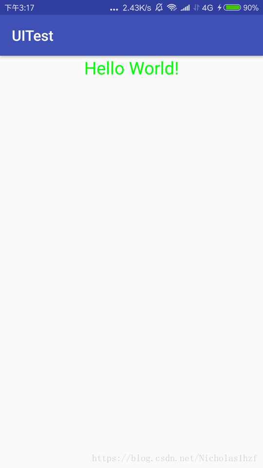
1. TextView:用于显示文本信息
A. 效果图
B. 代码
<TextView
	android:id="@+id/text_view"
    android:layout_width="match_parent"
    android:layout_height="wrap_content"
    android:gravity="center"
    android:textSize="24sp"
    android:textColor="#00ff00"
    android:text="Hello World!" />
C. 注解
1.) android:id 指定唯一标识符。
2.) android:layout_width && android:layout_height 指定控件宽度和高度。
可选值:match_parent,fill_parent,wrap_content;match和fill意义相同,官方更推荐使用match_parent;match_parent表示当前控件的大小和父布局大小一样;wrap_content表示控件内容决定当前控件大小。也可以为宽度和高度指定一个固定大小。
3.) android:textSize 指定文字大小,单位为sp。
4.) android:textColor 指定文字颜色,格式为:#6个十六进制数。
5.) android:text 指定显示的文本内容。
6.) android:gravity 指定文字对齐方式。
可选值:top、bottom、left、right、center等,可以用“|”来同时指定多个值;
center 效果上等于 center_vertical|center_horizontal 表示文字在垂直和水平方向上都居中对齐。
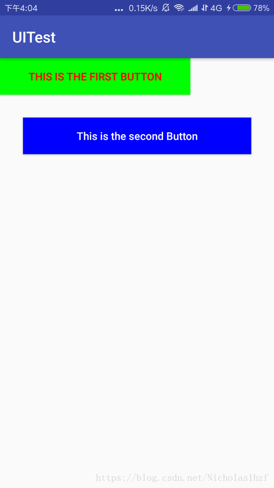
2. Button:按钮
A. 效果图
B. 代码
<Button
	android:id="@+id/first_button"
	android:layout_width="250dp"
    android:layout_height="wrap_content"
    android:text="This is the first Button"
    android:textColor="#ff0000"
    android:background="#00ff00"
    />
<Button
	android:id="@+id/second_button"
    android:layout_margin="30dp"
    android:layout_width="match_parent"
    android:layout_height="wrap_content"
    android:text="This is the second Button"
    android:textAllCaps="false"
    android:textColor="#ffffff"
    android:background="#0000ff"
    />
C. 注解
1.) android:background 用于指定按钮背景颜色。
2.) android:layout_margin 用于指定按钮外边距。
3.) android:textAllCaps 用于是否禁止系统自动将Button中所有英文字母进行大写转换。
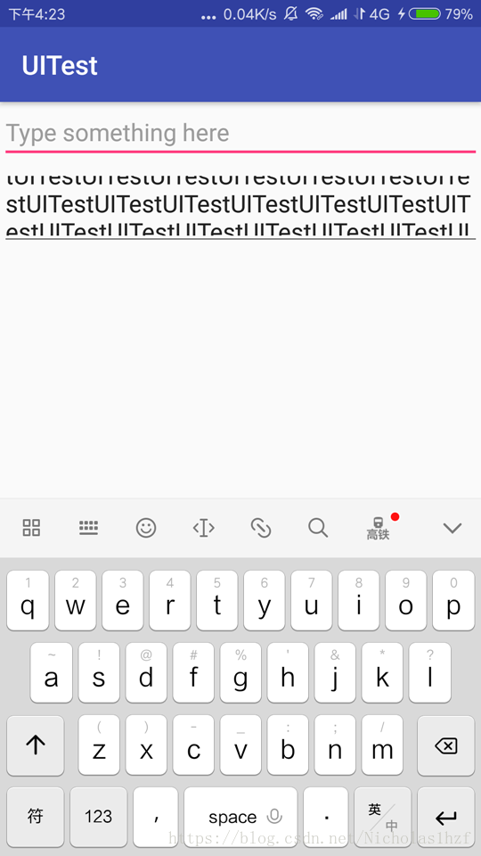
3. EditText:文本输入框
A. 效果图
B. 代码
<EditText
	android:id="@+id/edit_text"
    android:layout_width="match_parent"
    android:layout_height="wrap_content"
    android:hint="Type something here"
    android:maxLines="2"
    />
<EditText
	android:id="@+id/edit_text2"
    android:layout_width="match_parent"
    android:layout_height="wrap_content"
    android:hint="Type something here"
    android:maxLines="2"
    />
C. 注解
1.) android:hint 指定一段带有提示性的文本,输入内容时自动消失。
2.) android:maxLines 指定EditText的最大行数,当输入的内容超过最大行数时,文本会向上滚动,而EditText不会继续拉伸。
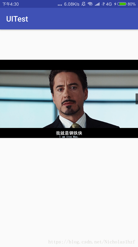
4. ImageView:用于展示图片
A. 效果图
B. 代码
<ImageView
	android:id="@+id/image_view"
    android:layout_width="wrap_content"
    android:layout_height="wrap_content"
    android:src="@drawable/ironman_3"
    />
C. 注解
android:src 指定一张图片,引用drawable图片资源。
5. ProgressBar:用于在界面上显示一个进度条
A. 效果图
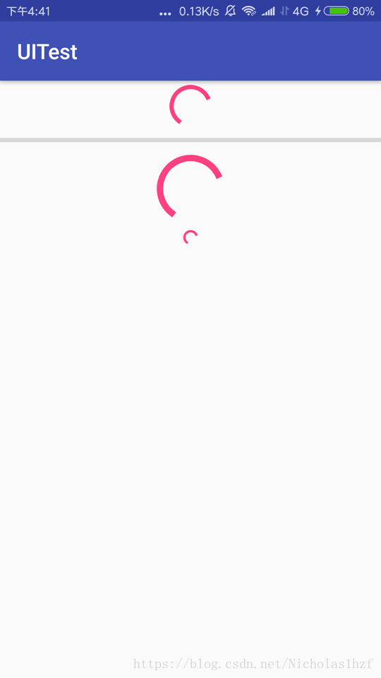
B. 代码
<ProgressBar
	android:id="@+id/progress_bar"
    android:layout_width="match_parent"
    android:layout_height="wrap_content"
    />
<ProgressBar
    android:id="@+id/progress_bar2"
    android:layout_width="match_parent"
    android:layout_height="wrap_content"
    style="?android:attr/progressBarStyleHorizontal"
    android:max="50"
    />
<ProgressBar
    android:id="@+id/progress_bar3"
    android:layout_width="match_parent"
    android:layout_height="wrap_content"
    style="?android:attr/progressBarStyleLarge"
    />
<ProgressBar
    android:id="@+id/progress_bar4"
    android:layout_width="match_parent"
    android:layout_height="wrap_content"
    style="?android:attr/progressBarStyleSmallTitle"
    />
C. 注解
1.) style="?android:attr/progressBarStyleHorizontal" 给ProgressBar指定不同的样式。progressBarStyleHorizontal 表示这是一个水平进度条。
2.)android:visibility Android控件的可见属性,所有Android控件都具有这个属性。
可选值:visible(默认)、invisible、gone;visible 表示控件是可见的;invisible 表示控件是不可见的,但仍占据着原来的位置和大小;gone 表示控件不仅不可见,而且不占用任何屏幕空间。
6. AlertDialog:用于在当前界面上弹出一个对话框
A. 效果图
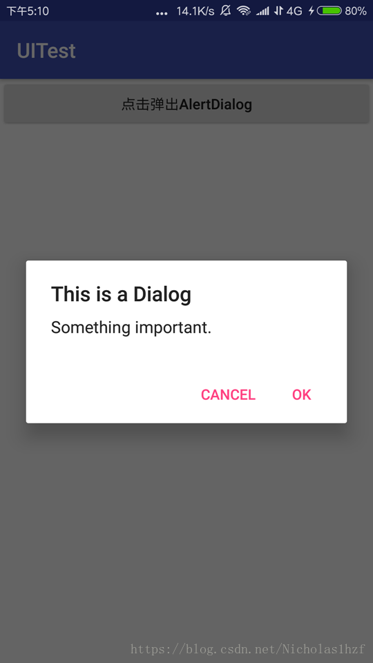
B. 代码
activity_main.xml
<?xml version="1.0" encoding="utf-8"?>
<LinearLayout xmlns:android="http://schemas.android.com/apk/res/android"
    xmlns:tools="http://schemas.android.com/tools"
    android:layout_width="match_parent"
    android:layout_height="match_parent"
    android:orientation="vertical"
    tools:context="com.example.thinkpad.uitest.MainActivity">

    <Button
        android:id="@+id/button"
        android:layout_width="match_parent"
        android:layout_height="wrap_content"
        android:textAllCaps="false"
        android:text="点击弹出AlertDialog"
        />
</LinearLayout>
MainActivity.java
package com.example.thinkpad.uitest;

import android.content.DialogInterface;
import android.support.v7.app.AlertDialog;
import android.support.v7.app.AppCompatActivity;
import android.os.Bundle;
import android.view.View;
import android.widget.Button;

public class MainActivity extends AppCompatActivity {

    @Override
    protected void onCreate(Bundle savedInstanceState) {
        super.onCreate(savedInstanceState);
        setContentView(R.layout.activity_main);
        Button button = (Button) findViewById(R.id.button);
        button.setOnClickListener(new View.OnClickListener() {
        //为按钮设置监听事件
            @Override
            public void onClick(View view) {
                AlertDialog.Builder dialog = new AlertDialog.Builder(MainActivity.this);
                //通过AlertDialog.Builder创建一个AlertDialog的实例
                dialog.setTitle("This is a Dialog");
                dialog.setMessage("Something important.");
                dialog.setCancelable(false);
                //为这个对话框设置标题,内容,可否取消属性
                dialog.setPositiveButton("OK", new DialogInterface.OnClickListener() {
                    @Override
                    public void onClick(DialogInterface dialogInterface, int i) {

                    }
                });
                //调用setPositiveButton()方法为对话框设置确定按钮的点击事件
                dialog.setNegativeButton("Cancel", new DialogInterface.OnClickListener() {
                    @Override
                    public void onClick(DialogInterface dialogInterface, int i) {

                    }
                });
                //调用setNegativeButton()方法为对话框设置取消按钮的点击事件
                dialog.show();
                //将对话框显示出来
            }
        });
    }
}
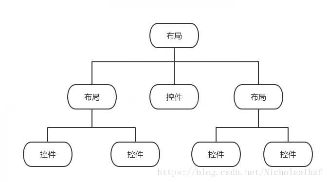
二、基本布局
布局是一种可用于放置很多控件或布局的容器,它可以按照一定的规律调整内部控件的位置,从而编写出精美的界面。
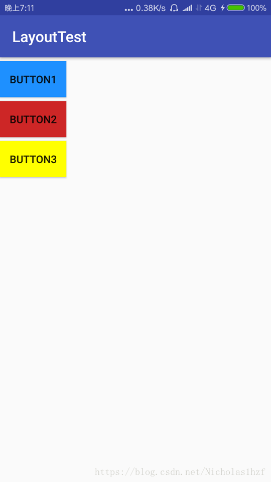
1. 线性布局LinearLayout
该布局会将它所包含的控件在线性方向上依次排列,通过android:orientation 属性指定排列方向。取值:horizontal 水平方向(默认);vertical 垂直
A. 水平效果图
B. 水平代码
<?xml version="1.0" encoding="utf-8"?>
<LinearLayout xmlns:android="http://schemas.android.com/apk/res/android"
    xmlns:tools="http://schemas.android.com/tools"
    android:layout_width="match_parent"
    android:layout_height="match_parent"
    tools:context="com.example.thinkpad.layouttest.MainActivity">

    <Button
        android:id="@+id/button1"
        android:layout_width="wrap_content"
        android:layout_height="wrap_content"
        android:layout_marginLeft="5dp"
        android:text="Button1"
        android:background="#1e90ff"
        />

    <Button
        android:id="@+id/button2"
        android:layout_width="wrap_content"
        android:layout_height="wrap_content"
        android:layout_marginLeft="5dp"
        android:text="Button2"
        android:background="#cd2626"
        />

    <Button
        android:id="@+id/button3"
        android:layout_width="wrap_content"
        android:layout_height="wrap_content"
        android:layout_marginLeft="5dp"
        android:text="Button3"
        android:background="#ffff00"
        />
		<!--android:layout_marginLeft 设置了按钮的左外边距为5dp-->
</LinearLayout>
C. 垂直效果图
D.垂直代码
<?xml version="1.0" encoding="utf-8"?>
<LinearLayout xmlns:android="http://schemas.android.com/apk/res/android"
    xmlns:tools="http://schemas.android.com/tools"
    android:orientation="vertical"
    android:layout_width="match_parent"
    android:layout_height="match_parent"
    tools:context="com.example.thinkpad.layouttest.MainActivity">
	<!--添加了android:orientation="vertical" 属性及属性值,使得布局呈垂直排列-->
    <Button
        android:id="@+id/button1"
        android:layout_width="wrap_content"
        android:layout_height="wrap_content"
        android:layout_marginTop="5dp"
        android:text="Button1"
        android:background="#1e90ff"
        />

    <Button
        android:id="@+id/button2"
        android:layout_width="wrap_content"
        android:layout_height="wrap_content"
        android:layout_marginTop="5dp"
        android:text="Button2"
        android:background="#cd2626"
        />

    <Button
        android:id="@+id/button3"
        android:layout_width="wrap_content"
        android:layout_height="wrap_content"
        android:layout_marginTop="5dp"
        android:text="Button3"
        android:background="#ffff00"
        />
		<!--android:layout_marginTop设置了按钮的上外边距为5dp-->
</LinearLayout>
E. 注意点
1.) 若LinearLayout布局的排列方向为horizontal,则其内部的控件宽度最好不要指定为match_parent,因为这样会使得单独一个控件就将整个水平方向占满;vertical同理。
2.) 注意区别 android:layout_gravity && android:gravity
android:layout_gravity → 指定控件在布局中的对齐方式
android:gravity → 指定文字在控件中的对齐方式
3.) LinearLayout布局的排列方向为horizontal时,只有垂直方向上的对齐方式才会生效;同理排列方向为vertical时,只有水平方向上的对齐方式会生效。
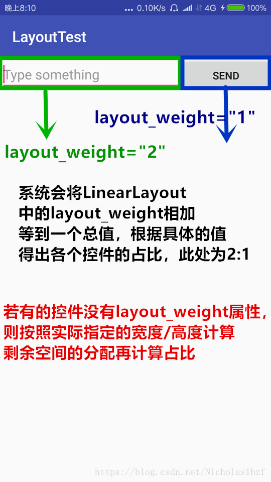
F. android:layout_weight 属性
用于指定剩余空闲空间的分割比例
1.) 效果图
2.) 代码
<?xml version="1.0" encoding="utf-8"?>
<LinearLayout xmlns:android="http://schemas.android.com/apk/res/android"
    xmlns:tools="http://schemas.android.com/tools"
    android:layout_width="match_parent"
    android:layout_height="match_parent"
    tools:context="com.example.thinkpad.layouttest.MainActivity">

    <EditText
        android:id="@+id/input_message"
        android:layout_width="0dp"
        android:layout_height="wrap_content"
        android:layout_weight="2"
        android:hint="Type something"
        />
	<!--这里指定weight时,将width指定为0dp是一种较为规范的做法,减少系统计算,提高布局性能-->
    <Button
        android:id="@+id/send"
        android:layout_width="0dp"
        android:layout_height="wrap_content"
        android:layout_weight="1"
        android:text="Send"
        />
</LinearLayout>
2. 相对布局RelativeLayout
可以通过相对定位的方式让控件出现在布局的任何位置,可相对父布局也可相对控件
A. 效果图
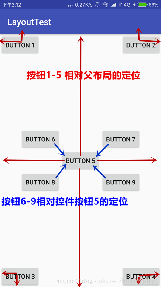
B. 代码
<?xml version="1.0" encoding="utf-8"?>
<RelativeLayout xmlns:android="http://schemas.android.com/apk/res/android"
    android:layout_width="match_parent"
    android:layout_height="match_parent">

    <Button
        android:id="@+id/button1"
        android:layout_width="wrap_content"
        android:layout_height="wrap_content"
        android:layout_alignParentTop="true"
        android:layout_alignParentLeft="true"
        android:text="BUTTON 1"/>

    <Button
        android:id="@+id/button2"
        android:layout_width="wrap_content"
        android:layout_height="wrap_content"
        android:layout_alignParentTop="true"
        android:layout_alignParentRight="true"
        android:text="BUTTON 2"/>

    <Button
        android:id="@+id/button3"
        android:layout_width="wrap_content"
        android:layout_height="wrap_content"
        android:layout_alignParentBottom="true"
        android:layout_alignParentLeft="true"
        android:text="BUTTON 3"/>

    <Button
        android:id="@+id/button4"
        android:layout_width="wrap_content"
        android:layout_height="wrap_content"
        android:layout_alignParentBottom="true"
        android:layout_alignParentRight="true"
        android:text="BUTTON 4"/>

    <Button
        android:id="@+id/button5"
        android:layout_width="wrap_content"
        android:layout_height="wrap_content"
        android:layout_centerInParent="true"
        android:text="BUTTON 5"/>
	<!--android:layout_alignParentXXXX="true" 指定控件相对父布局的XXXX侧对齐
	android:layout_centerInParent="true" 指定控件相对父布局居中显示-->
    <Button
        android:id="@+id/button6"
        android:layout_width="wrap_content"
        android:layout_height="wrap_content"
        android:layout_above="@id/button5"
        android:layout_toLeftOf="@id/button5"
        android:text="BUTTON 6"/>

    <Button
        android:id="@+id/button7"
        android:layout_width="wrap_content"
        android:layout_height="wrap_content"
        android:layout_above="@id/button5"
        android:layout_toRightOf="@id/button5"
        android:text="BUTTON 7"/>

    <Button
        android:id="@+id/button8"
        android:layout_width="wrap_content"
        android:layout_height="wrap_content"
        android:layout_below="@id/button5"
        android:layout_toLeftOf="@id/button5"
        android:text="BUTTON 8"/>

    <Button
        android:id="@+id/button9"
        android:layout_width="wrap_content"
        android:layout_height="wrap_content"
        android:layout_below="@id/button5"
        android:layout_toRightOf="@id/button5"
        android:text="BUTTON 9"/>
   <!--android:layout_below="@id/button5" 指定控件处于id控件的下面
	android:layout_toRightOf="@id/button5" 指定控件处于id控件的右侧-->
</RelativeLayout>
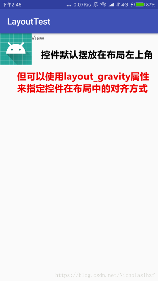
3. 帧布局FrameLayout
布局简单,应用场景少,没有方便的定位方式,所有控件默认摆放在布局左上角
A. 效果图
B. 代码
<?xml version="1.0" encoding="utf-8"?>
<FrameLayout xmlns:android="http://schemas.android.com/apk/res/android"
    android:layout_width="match_parent"
    android:layout_height="match_parent">

    <TextView
        android:id="@+id/text_view"
        android:layout_width="wrap_content"
        android:layout_height="wrap_content"
        android:text="This is TextView"/>

    <ImageView
        android:id="@+id/image_view"
        android:layout_width="wrap_content"
        android:layout_height="wrap_content"
        android:src="@mipmap/ic_launcher"
        />
</FrameLayout>
4. 百分比布局(PercentFrameLayout && PecentRelativeLayout)
上面三个布局中只有 LinearLayout 支持使用 layout_weight 属性来实现按照比例大小指定控件大小的功能。因此百分比布局为 FrameLayout 和 RelativeLayout 进行了功能扩展。提供 PercentFrameLayout 和 PecentRelativeLayout 两个布局。
现在推荐使用
Android官方增强版百分比布局:android.support.percent.PercentLinearLayout
整理学习自郭霖大佬的《第一行代码》
目前小白一名,持续学习Android中,如有错误请批评指正!