
之前写过一篇通过路径的锚点改变实现图形变化的动画SVG——入门,路径变形动画,今天这一篇的demo是简易的类似进度条之类的图形,核心原理通过改变路径的stroke-dasharray属性,路径的虚线描边。
    .path:nth-of-type(1) {
        d: path("M5,5 305,5");
        stroke-dasharray: none;
    }

    .path:nth-of-type(2) {
        d: path("M5,35 305,35");
        stroke-dasharray: 15;
    }

    .path:nth-of-type(3) {
        d: path("M5,70 305,70");
        stroke-dasharray: 15, 5;
    }

    .path:nth-of-type(4) {
        d: path("M5,105 305,105");
        stroke-dasharray: 15,5 5,5 15,5 5,5;
    }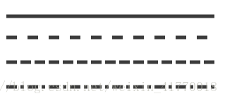
属性值的顺序大概就是 长度,间隙 长度,间隙 长度,间隙...
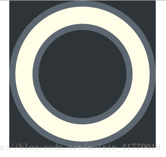
下面开始画基础部分,外侧圆环和内侧圆圈
    <svg xmlns="http://www.w3.org/2000/svg" class="svg" xmlns:xlink="http://www.w3.org/1999/xlink">
        <!-- 外圆 -->
        <circle class="" cx="150" cy="150" r="150" fill="#5d6771" />
        <!-- 内圆 -->
        <circle class="" cx="150" cy="150" r="90" fill="#2f3439" />
        <!-- 圆形路径(动画本体) -->
        <circle class="mycircle" cx="150" cy="150" r="120" />
    </svg>
.svg {
width: 300px;
height: 300px;
margin: 0 auto;
display: block;
background: #2f3439;
}
.mycircle {
fill: none;
stroke-width: 35px;
stroke: #fffde8;
}
那么 stroke-dasharray属性到底怎么用呢,下面我们来试一下
stroke-dasharray:76px;
由此分析一下页头的gif图

由图中可以分析出,动画的对象就是改变 stroke-dasharray属性的长度和间隙,下面我们用animation写出基础动画,
初始状态是虚线的长度为0,间隙是整段圆环的长度,这样第二段线就看不到了,
那么怎么能计算出圆弧的周长呢?C = 2πR?
NO NO NO
let mycircle = document.querySelector('.mycircle')
console.log('mycircle的周长为' + mycircle.getTotalLength())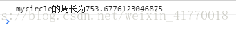
控制台输出753.6776123046875,我们可以取整,760
    @keyframes lineMove {
        0% {
            stroke-dasharray: 0, 760
        }

        100% {
            stroke-dasharray: 760, 760
        }
    }
animation: lineMove 4s ease-in-out 0s infinite;
大功告成,不过有点生硬,如果将线的两端变的圆润一点的话,那自然是最好不过
下面就要用到一个新的属性, stroke-linecap,线段两端的样式属性值
butt, round, square, inherit
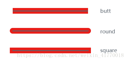
灰色线为描边的实际长度,inherit为继承属性
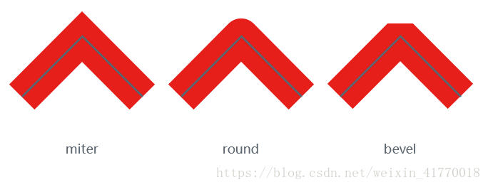
在这里要讲一下拐角的属性 stroke-linejoin,属性值也是四个 miter, round, bevel, inherit
言归正传,将圆角加在咱们的代码上
    .mycircle {
        fill: none;
        stroke-width: 35px;
        stroke: #fffde8;
        stroke-dasharray:76px;
        stroke-linecap: round;
        animation: lineMove 4s ease-in-out 0s infinite;
    }

    @keyframes lineMove {
        0% {
            stroke-dasharray: 0, 760
        }

        60% {
            stroke-dasharray: 760, 760
        }
        100% {
            stroke-dasharray: 760, 760
        }
    }
一个简单的路径动画demo就写完啦!!!