前言
最近在开发大屏看板,UI让做一个这样的效果

本来也简单,UI给个git动图放上就好了。但是UI给的图有四五十m,实在是太大了。后来想到了svg路径动画,之前从来没有搞过,就研究了下,由于svg没怎么研究过,水平有限,做成的效果差了些。
实现
原理
svg图片本质上就是由一些标签代码组成的,可以像html一样给某些标签添加动画。
<svg xmlns="http://www.w3.org/2000/svg" version="1.1">
  <g fill="none" stroke="black" stroke-width="4">
    <path  d="M5 20 l215 0" />
  </g>
</svg>

这里需要用到Stroke 属性和渐变的知识,具体用法见:
stroke-dasharray
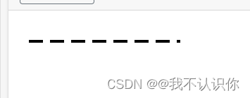
strokedasharray属性用于创建虚线,一般要提供两组数据
path{


     stroke-dasharray:20 10;
}
第一个值可以理解为实线宽度,第二个值理解为间隔宽度。效果如下:
stroke-dashoffset
用于修改虚线的偏移量
示例1
<template>
    <div>
        <svg width="731px" height="72px" viewBox="0 0 731 72" version="1.1" xmlns="http://www.w3.org/2000/svg" xmlns:xlink="http://www.w3.org/1999/xlink">
            <title>路径</title>
            <g id="页面-1" stroke="none" stroke-width="1" fill="none" fill-rule="evenodd">
                <path id="path" d="M730.5,71.3725337 L703.392856,49.3529826 C700.457722,46.8023745 697.911346,45.5270705 695.753728,45.5270705 C693.59611,45.5270705 637.336621,42.0701662 526.975259,35.1563577 C525.291584,35.2901978 523.991597,35.5387822 523.075299,35.9021109 C522.159,36.2654395 492.4668,47.9500585 433.998699,70.9559677 C432.594046,71.5113891 430.86492,71.6502444 428.811321,71.3725337 C426.757721,71.0948231 283.820614,47.4892111 5.68434189e-14,0.555697885"
                      stroke="#979797"></path>
            </g>
        </svg>
    </div>
</template>

<script>
export default {


};
</script>

<style lang="scss" scoped>
#path{


  stroke-dasharray: 1000 1100;
  animation: dash 5s linear infinite;
}
@keyframes dash {


  0%{


    stroke-dashoffset: 1100;
  }

  100%{


    stroke-dashoffset: 1;
  }
}
</style>

示例2
这与我们想要的是有区别的,我们需要的是显示一部分线,而不是全部显示。这里我们可以修改stroke-dasharray 属性来实现
stroke-dasharray:10 100;
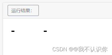
这样我们在改变偏移量时,只需要保证显示第一段就可以实现只显示一部分线条
<template>
    <div>
        <svg width="731px" height="72px" viewBox="0 0 731 72" version="1.1" xmlns="http://www.w3.org/2000/svg" xmlns:xlink="http://www.w3.org/1999/xlink">
            <title>路径</title>
            <g id="页面-1" stroke="none" stroke-width="1" fill="none" fill-rule="evenodd">
                <path id="path" d="M730.5,71.3725337 L703.392856,49.3529826 C700.457722,46.8023745 697.911346,45.5270705 695.753728,45.5270705 C693.59611,45.5270705 637.336621,42.0701662 526.975259,35.1563577 C525.291584,35.2901978 523.991597,35.5387822 523.075299,35.9021109 C522.159,36.2654395 492.4668,47.9500585 433.998699,70.9559677 C432.594046,71.5113891 430.86492,71.6502444 428.811321,71.3725337 C426.757721,71.0948231 283.820614,47.4892111 5.68434189e-14,0.555697885"
                      stroke="#979797"></path>
            </g>
        </svg>
    </div>
</template>

<script>
export default {


};
</script>

<style lang="scss" scoped>
#path{


  stroke-dasharray: 150 700;
  animation: dash 8s linear infinite;
}
@keyframes dash {


  0%{


    stroke-dashoffset: 800;
  }

  100%{


    stroke-dashoffset: 150;
  }
}
</style>

示例3
到这里起始就差不多了,案例中的线条是有渐变色的,我们可以给线条加上渐变色
 <svg width="731px" height="72px" viewBox="0 0 731 72" version="1.1" xmlns="http://www.w3.org/2000/svg" xmlns:xlink="http://www.w3.org/1999/xlink">
        <title>路径</title>
        <g id="页面-1" stroke="none" stroke-width="1" fill="none" fill-rule="evenodd">
            <path id="path" d="M730.5,71.3725337 L703.392856,49.3529826 C700.457722,46.8023745 697.911346,45.5270705 695.753728,45.5270705 C693.59611,45.5270705 637.336621,42.0701662 526.975259,35.1563577 C525.291584,35.2901978 523.991597,35.5387822 523.075299,35.9021109 C522.159,36.2654395 492.4668,47.9500585 433.998699,70.9559677 C432.594046,71.5113891 430.86492,71.6502444 428.811321,71.3725337 C426.757721,71.0948231 283.820614,47.4892111 5.68434189e-14,0.555697885"
                  stroke="url(#grad)"></path>
                  <!-- stroke="#979797"  -->
        </g>
        <defs>
            <linearGradient id="grad" x1="0%" x2="100%" y1="0%" y2="0%">
                <stop  offset="0%" style="stop-color: rgba(204,226,255,0.7);"></stop>
                <stop  offset="20%" style="stop-color: rgba(204,226,255,0.5);"></stop>
                <stop  offset="40%" style="stop-color: rgba(204,226,255,0.3);"></stop>
                <stop  offset="60%" style="stop-color: rgba(204,226,255,0.1);"></stop>
            </linearGradient>
        </defs>
    </svg>

最终效果
<template>
    <div>
        <svg width="731px" height="72px" viewBox="0 0 731 72" version="1.1" xmlns="http://www.w3.org/2000/svg" xmlns:xlink="http://www.w3.org/1999/xlink">
            <title>路径</title>
            <g id="页面-1" stroke="none" stroke-width="1" fill="none" fill-rule="evenodd">
                <path id="path" d="M730.5,71.3725337 L703.392856,49.3529826 C700.457722,46.8023745 697.911346,45.5270705 695.753728,45.5270705 C693.59611,45.5270705 637.336621,42.0701662 526.975259,35.1563577 C525.291584,35.2901978 523.991597,35.5387822 523.075299,35.9021109 C522.159,36.2654395 492.4668,47.9500585 433.998699,70.9559677 C432.594046,71.5113891 430.86492,71.6502444 428.811321,71.3725337 C426.757721,71.0948231 283.820614,47.4892111 5.68434189e-14,0.555697885"
                      stroke="url(#grad)"></path>
                      <!-- stroke="#979797"  -->
            </g>
            <defs>
                <linearGradient id="grad" x1="0%" x2="100%" y1="0%" y2="0%">
                    <stop offset="0%" style="stop-color: rgba(204,226,255,0.7);"></stop>
                    <stop offset="20%" style="stop-color: rgba(204,226,255,0.5);"></stop>
                    <stop offset="40%" style="stop-color: rgba(204,226,255,0.3);"></stop>
                    <stop offset="60%" style="stop-color: rgba(204,226,255,0.1);"></stop>
                </linearGradient>
            </defs>
        </svg>
    </div>
</template>

<script>
export default {


};
</script>

<style lang="scss" scoped>
#path{


  stroke-dasharray: 150 700;
  animation: dash 8s linear infinite;
}
@keyframes dash {


  0%{


    stroke-dashoffset: 800;
  }

  100%{


    stroke-dashoffset: 150;
  }
}
</style>