版权声明:若想转载,请在显眼的地方附上文章来源。 https://blog.csdn.net/Abudula__/article/details/81939938
下面是图片居中技术。
<!DOCTYPE html>
<html>
	<head>
		<meta charset="UTF-8">
		<title></title>

		<style>
			img{
				border: 1px solid #DDDDDD;
				border-radius: 4px;
				padding: 5px;
			}
		</style>
	</head>
	<body>
		<img src="img/1.jpg" alt="paris" style="width: 250px;" />
	</body>
</html>
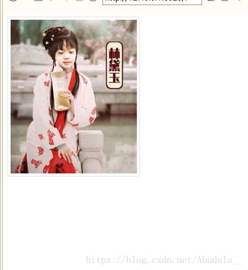
首先这个会显示出来图片,效果如下:
但它不是响应式的, 为了响应式需要多加两行代码。
 max-width: 100%;
    height: auto;
也就是把它的跨密度设置为100%且高度为auto。