loading1:
布局实现:
<div class="out">
<div class="in">
</div>
</div>
style css3动画属性实现loading
.out{
margin: 0 auto;
width: 46px;
height: 46px;
background: linear-gradient(black,white) ;
border-radius: 50%;
text-align: center;
overflow: hidden;
}
.in{
width: 40px;
height: 40px;
background: white;
margin-top:3px;
margin-left:3px;
border-radius: 50%;
}
.out{
animation: move 1s ease infinite;
}
@keyframes move{
0%{transform: rotate(0deg);}
0%{transform: rotate(360deg);}
}
loading2:
布局: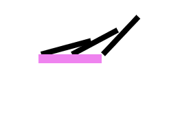
<div class="pencil">
<div class="pen">
</div>
<div class="pen">
</div>
<div class="pen">
</div>
<div class="bottom">
</div>
</div>
样式实现:
.pencil{
margin: 0 auto;
width: 200px;
height: 30px;
/*border-bottom: 5px solid #ccc;*/
position: relative;
}
.pencil>div{
float: left;
margin-left:15px ;
}
.pen{
width: 3px;
height:30px ;
background: black;
transform-origin: center bottom;
}
.pen:nth-child(1){
animation: move1 1s infinite;
}
.pen:nth-child(2){
animation: move2 1s infinite;
}
.pen:nth-child(3){
animation: move3 1s infinite;
}
.bottom{
position: absolute;
width: 10px;
height: 5px;
background: violet;
margin: 0 auto;
bottom: -5px;
animation: move4 1s infinite;
}
@keyframes move4{
0%{width: 10px;}
100%{width: 65px;}
}
@keyframes move1{
0%{transform: rotate(0deg);}
30%{transform: rotate(75deg);}
100%{transform: rotate(90deg);}
}
@keyframes move2{
0%{transform: rotate(0deg);}
60%{transform: rotate(80deg);}
100%{transform: rotate(90deg);}
}
@keyframes move3{
0%{transform: rotate(0deg);}
100%{transform: rotate(90deg);}
}