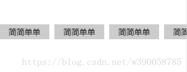
先看效果 :
    .concent {
         width:100%;
         .box {
            white-space:nowrap;   // 注释1
            overflow-x:auto;
            margin: 0;
            padding: 0;
            li {        // 注释3
                list-style:none;
                display:inline-block;
                width:0.9rem;
                height: 1.13rem;
                margin-right:0.1rem;
                background:#fff;
                text-align:center;
                border: 1px solid #ddd;
                overflow: hidden;
                .show{
                    width: 0.9rem;
                    height: 100%;
                    position: absolute;
                    background: #fff;
                    img{
                        width: 0.76rem;
                        height: 0.76rem;
                        margin-top: 0.08rem;
                        margin-left: 0.07rem;
                    }
                    p{
                        // width: -0.91rem;
                        font-size: 0.08rem;
                        margin:0.02rem 0.07rem 0;
                        overflow: hidden;
                        text-overflow: ellipsis;
                        white-space: nowrap;
                    }
                }
            }
        }
        .box:nth-child(1){
            margin-left: 0.1rem;
        }
        .lowtwo{
            border:1px solid red!important;
        }
        .box::-webkit-scrollbar {  // 注释2
            width:0;
            height:0;
            display: none;
            }
    }
componentDidUpdate(){
var u = navigator.userAgent;
var isAndroid = u.indexOf('Android') > -1 || u.indexOf('Adr') > -1; //android终端
var isUc = u.indexOf('UCBrowser') > -1; //uc浏览器
//var isiOS = !!u.match(/\(i[^;]+;( U;)? CPU.+Mac OS X/); //ios终端
if(isAndroid&&isUc){ /*注释5*/
$('.box').on('touchstart',function(){
$(document).on('touchmove',function(e){
e.preventDefault();
});
$(document).on('touchend',function(){
$(document).unbind();
});
});
} <div className="concent">
<ul className="box">
{
this.state.list.map((item,index)=>{
return(
<li key={index} onClick={()=>this.getcommodity(index)} className={this.state.classId == index?this.state.arr.join(' '):"swiper-slide"}>
<div className={this.state.classId == index ?style.low:null}></div>
<div className="show">
<img src={this.state.picTitle+item.masterImg}></img>
<p>{item.keyword}</p>
</div>
{item.keyword}
</li>
)
})
}
</ul>
</div>下面是html文档内容
<!DOCTYPE html>
<html xmlns="http://www.w3.org/1999/xhtml">
<head>
<meta http-equiv="Content-Type" content="text/html; charset=utf-8" />
<meta name="viewport" content="width=device-width, initial-scale=1.0, maximum-scale=1.0, user-scalable=0"/>
<script src="https://cdn.bootcss.com/jquery/2.0.0/jquery.min.js"></script>
<title>test</title>
<style>
body,ul { margin:0; padding:0;}
.concent { margin:50px auto; width:100%; max-width:750px; min-width:320px; }
.box { white-space:nowrap; overflow-x:auto; }		/*注释1*/
.box::-webkit-scrollbar { width:0; height:0; display: none; }     /*注释2*/
li { list-style:none; display:inline-block; width:100px; line-height:30px; margin-right:10px;
background:#ccc; text-align:center; }	/*注释3*/
li:last-child { margin:0; }
</style>
</head>
<body>
<div class="concent">
	<ul class="box">	<!-- /*注释4*/ -->
		<li>简简单单</li><li>
        简简单单</li><li>
        简简单单</li><li>
        简简单单</li><li>
        简简单单</li><li>
        简简单单</li>
	</ul>
</div>
<script>
        var u = navigator.userAgent;
		var isAndroid = u.indexOf('Android') > -1 || u.indexOf('Adr') > -1; //android终端
		var isUc = u.indexOf('UCBrowser') > -1;    //uc浏览器
		//var isiOS = !!u.match(/\(i[^;]+;( U;)? CPU.+Mac OS X/); //ios终端
		if(isAndroid&&isUc){		/*注释5*/
			$('.box').on('touchstart',function(){
				$(document).on('touchmove',function(e){
					e.preventDefault();
				});
				$(document).on('touchend',function(){
					$(document).unbind();
				});
			});
		}
</script>
</body>
</html>
二、注释解析与注意事项。
注释①,注释③:改变li标签为行内块元素(inline-block),给ul添加一个white-space:nowrap; 不让他自动换行。再添加overflow-x:auto;让他超出部分滚动显示。
注释④ : 是为了解决行内块元素之间的默认间隙问题。(关于行内块间隙问题可以查看【css】行内元素、行内块元素的默认间隙问题)。
注释②: ::-webkit-scrollbar { width:0; height:0; display: none; } 是为了解决安卓浏览器的滚动条问题,在iphone浏览器上的常规浏览器上不会出现横向的滚动条,但是在安卓设备上的chrome,火狐浏览器等一些浏览器会出现滚动条,安卓设备上高版本的uc浏览器,qq自带浏览器,微信自带浏览器不会出现滚动条。(该方法无法解决火狐浏览器出现的滚动条,网上查找了蛮多资料,都建议js去解决这问题)。
注释⑤:是为解决安卓设备上的uc浏览器一个恶心的功能,就是安卓设备上的uc浏览器如果打开好几个窗口页面。向左向右滑的时候会跳转到其他页面,这时就需要取消默认事件。
转载至 https://blog.csdn.net/w390058785/article/details/80373154