版权声明:尊重原创! https://blog.csdn.net/weixin_42675488/article/details/82758476
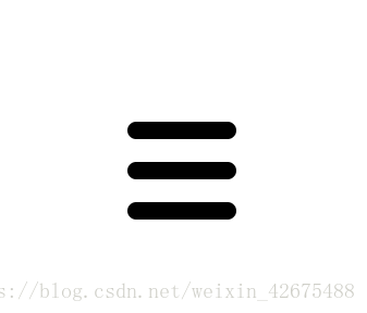
<div clas="menu-box">
	<div class="menu"></div>
</div>
.menu-box { margin-top: 200px; }
.menu {
position: relative;
width: 100px;
height: 100px;
}
.menu:before ,
.menu:after {
content: " ";
position: absolute;
left: 0;
display: block;
width: 100px;
height: 100px;
background: #000;
border-radius: 8px;
transition: all .25s ease-in-out;
}
.menu: before {
top: 5px;
// 利用阴影制作中间的那根线,当鼠标hover时隐藏
box-shadow: 0 37px #000;
}
.menu: after {
bottom: 5px;
}
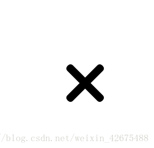
.menu:hover:before {
top: 42px;
box-shadow: none;
transform: rotate(225deg);
}
.menu:hover:after {
bottom: 42px;
transform: rotate(135deg);
}
鼠标hover