
        .box{
            width: 600px;
            height: 50px;
            background: red;
            margin: 100px auto 0;
            border-radius:10px;
            box-shadow: 0 5px 2px #a80000;
        }
        .box ul{
            height: 100%;
            padding: 0 5%;
            list-style: none;
            color: #fff;
            display: flex;
            justify-content: space-around;
            font:bold 16px/50px Arial;


        }
        .box ul li{
            height: 100%;
            width: 100px;
            display: flex;
            align-items: center;
            justify-content: center;
            text-shadow:2px 2px 4px rgba(0,0,0,.5);
            background: linear-gradient(red,#a82724,red) no-repeat right/1px 15px;
        }
        .box ul li:last-of-type{
            background:none;
        }
        .box ul li a{
            text-decoration: none;
            color: #fff;

        }
        .box ul li a:hover{
            transform: rotate(10deg);
        }


    <div class="box">
        <ul>
            <li><a href="#">home</a></li>
            <li><a href="#">home</a></li>
            <li><a href="#">home</a></li>
            <li><a href="#">home</a></li>
            <li><a href="#">home</a></li>
            <li><a href="#">home</a></li>
        </ul>
    </div>
记录点:
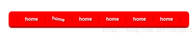
background: linear-gradient(red,#a82724,red) no-repeat right/1px 15px;
1.背景图颜色线性变化,生成分割线 position和size连写是一定要斜杠分开
2.多重背景,先写的盖住后写的,background-color只能设定一个。
背景线性变化亮点挺多的,需要多运用
拓展:
两边都需要分割线:
        .box ul:before{
            content: "";
            height: 15px;
            width: 1px;
            display: flex;
            align-self: center;
            background: linear-gradient(to left,red,black,red) no-repeat right/1px 15px;

        }
        /*.box ul li:last-of-type{
            background:none;
        }*/