今天在使用linear-gradient时,使用了兼容写法,但是忘记写不加前缀的linear-gradient了,结果发现相同的写法,带前缀和不带前缀在浏览器中表现是不一样的。
linear-gradient用法:
linear-gradient> = linear-gradient([ [ <angle> | to <side-or-corner> ] ,]? <color-stop>[, <color-stop>]+)

<side-or-corner> = [left | right] || [top | bottom]
<color-stop> = <color> [ <length> | <percentage> ]?<angle>:用角度值指定渐变的方向(或角度)。
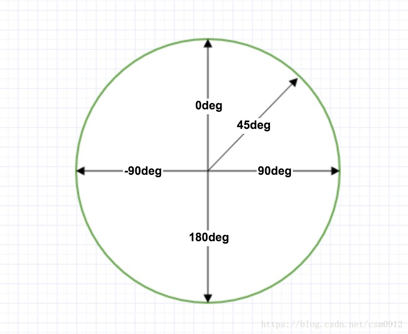
to left:设置渐变为从右到左。相当于: 270deg
to right:设置渐变从左到右。相当于: 90deg
to top:设置渐变从下到上。相当于: 0deg
to bottom:设置渐变从上到下。相当于: 180deg。这是默认值,等同于留空不写。
配一张角度图:
<color-stop> :用于指定渐变的起止颜色:
<color>:指定颜色。
<length>:用长度值指定起止色位置。不允许负值
<percentage>:用百分比指定起止色位置。
linear-gradient兼容写法:
-webkit-linear-gradient
-moz-linear-gradient
-o-linear-gradient
-ms-linear-gradient
linear-gradient
一开始我只写了带有前缀的方法:
background: -webkit-linear-gradient(90deg,#d6dfe9 0%,#ffffff 100%);
background: -moz-linear-gradient(90deg,#d6dfe9 0%,#ffffff 100%);
background: -o-linear-gradient(90deg,#d6dfe9 0%,#ffffff 100%);
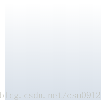
background: -ms-linear-gradient(90deg,#d6dfe9 0%,#ffffff 100%);在最新chrome浏览器中的效果是这样的:
然后我把代码改成这样:
background: -webkit-linear-gradient(90deg,#d6dfe9 0%,#ffffff 100%);
background: -moz-linear-gradient(90deg,#d6dfe9 0%,#ffffff 100%);
background: -o-linear-gradient(90deg,#d6dfe9 0%,#ffffff 100%);
background: -ms-linear-gradient(90deg,#d6dfe9 0%,#ffffff 100%);
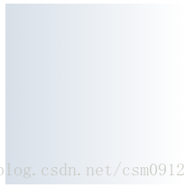
background: linear-gradient(90deg,#d6dfe9 0%,#ffffff 100%);然后页面效果是这样的:
疑问:
当没有写最后一个不带前缀的linear-gradient时,在chrome中生效的样式应该是-webkit-linear-gradient,而设置的角度为90deg,渐变效果不应该是从左到右渐变的吗,为什么变成了从下到上??
为了解决这个问题,将代码改成下面这种:
background: -webkit-linear-gradient(0deg,#d6dfe9 0%,#ffffff 100%);
background: -moz-linear-gradient(0deg,#d6dfe9 0%,#ffffff 100%);
background: -o-linear-gradient(0deg,#d6dfe9 0%,#ffffff 100%);
background: -ms-linear-gradient(0deg,#d6dfe9 0%,#ffffff 100%);
background: linear-gradient(90deg,#d6dfe9 0%,#ffffff 100%);
按照这种写法,就算不写最后一行,在各个浏览器中也能按照希望的方向进行渐变。