版权声明:本文为博主原创文章,未经博主允许不得转载。 https://blog.csdn.net/xyyojl/article/details/82718476
过渡和动画
- 过渡是什么?写法和特点
- 过渡的特性,使用环境
- 动画是什么?
- 关键帧是什么?
- 动画的特性,使用环境
- 过渡和动画的区别
过渡和动画
在不使用flash或者Javascript的情况下做出元素的规律运动的效果,可以使页面变得非常丰富,增强用户体验。
过渡 transition
过渡是使元素由一种样式变成另一种样式,为变化添加过程与效果,为元素添加transition样式(尽量不要写到伪类当中,原因:如果写到hover(还有其他伪类也是这样的)中移开transition**立马失效**)
transition-property
transition-property: 规定过渡作用在元素的哪条样式上
- none 没有过渡属性(清除)
- all 对所有可能样式生效(默认值)
- width/height/.. 选择多个属性时,以逗号分隔
效果图:
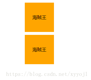
<!DOCTYPE html>
<html>
<head>
    <meta charset="UTF-8">
    <title>小demo - transition-property(通过对比,查看效果) </title>
    <style>
        body{
            margin: 0;
        }
        .box{
            width: 100px;
            height: 200px;
        }
        .box1,.box2{
            width: 100px;
            height: 100px;
            background-color: orange;
            text-align: center;
            line-height: 100px;
            cursor: pointer;
            transition: opacity .3s;
        }
        .box2{
            transition: .3s;
            margin-top: 10px;
        }
        .box:hover .box1,.box:hover .box2{
            opacity: .5;
            font-size: 20px;
        }
    </style>
</head>
<body>
    <div class="box">
        <div class="box1">海贼王</div>
        <div class="box2">海贼王</div>
    </div>
</body>
</html>
transition-duration
transtion-duration: 过渡时长,单位秒(s)和毫秒(ms)
默认值是0,不写时长等于看不到效果
<!DOCTYPE html>
<html>
<head>
    <meta charset="UTF-8">
    <title>小demo -transition-duration </title>
    <style>
        .box{
            width: 100px;
            height: 100px;
            background-color: orange;
            text-align: center;
            line-height: 100px;
            cursor: pointer;
            transition: .3s;
        }
        .box:hover{
            opacity: .5;
            font-size: 20px;
        }
    </style>
</head>
<body>
    <div class="box">海贼王</div>
</body>
</html>
transition-delay
过渡开始前的等待时间,不计入过渡时间内
PS.transition-delay在恢复也生效
延迟时间可以是负数,负数表示到提前运动多少秒的状态,正数表示延迟时间
效果图:

<!DOCTYPE html>
<html>
<head>
    <meta charset="UTF-8">
    <title>小demo - transition-property </title>
    <style>
        body{
            margin: 0;
        }
        .content:hover .box{
            width: 500px;
        }
        .box{
            width: 100px;
            height: 100px;
            background-color: orange;
        }
        .box1{
            transition: .3s;
            margin-top: 50px;
            margin-left: 50px;
        }
        .box2{
            transition: .3s -0.1s;
            margin-left: 50px;
        }
    </style>
</head>
<body>
    <div class="content">
        <div class="box1 box"></div>
        <div class="box2 box"></div>
    </div>
</body>
</html>
transition-timing-function
过渡时间的速度函数
- ease 先慢后快后慢(默认值)
- linear 匀速
- ease-in : 匀加速
- ease-out: 匀减速
- ease-in-out: 快-> 慢->快
- cubic-bezier(贝塞尔曲线) 一个带参数的曲线,用于描述运动速度的变化,可以非常精确自由方便的控制变化速率, cubic-bezier(x1,y1,x2,y2);其中x1,x2在[0,1]中,y1,y2不限
效果图:
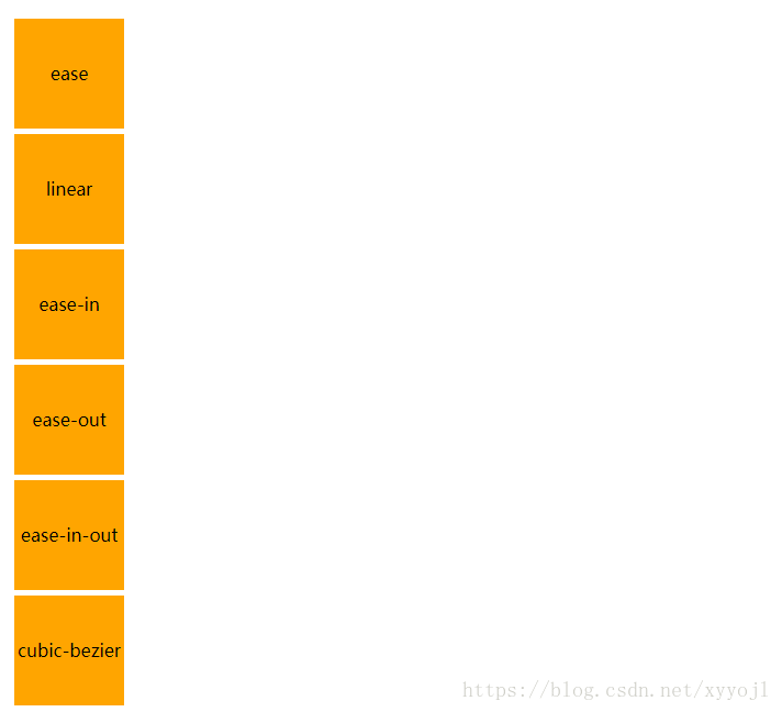
<!DOCTYPE html>
<html>
<head>
    <meta charset="UTF-8">
    <title>小demo - transition-property </title>
    <style>
        body{
            margin: 0;
        }
        .content:hover .box{
            width: 500px;
        }
        .box{
            width: 100px;
            height: 100px;
            background-color: orange;
            margin-left: 50px;
            transition: .5s;
            text-align: center;
            line-height: 100px;
        }
        .box1{
            transition-timing-function: ease;
            margin-top: 30px;
        }
        .box2{
            transition-timing-function: linear;
        }
        .box3{
            transition-timing-function: ease-in;
        }
        .box4{
            transition-timing-function: ease-out;
        }
        .box5{
            transition-timing-function: ease-in-out;
        }
        .box6{
            transition-timing-function: cubic-bezier(0.075, 0.82, 0.165, 1);
        }
        .content .box + .box{
            margin-top: 5px;
        }
    </style>
</head>
<body>
    <div class="content">
        <div class="box1 box">ease</div>
        <div class="box2 box">linear</div>
        <div class="box3 box">ease-in</div>
        <div class="box4 box">ease-out</div>
        <div class="box5 box">ease-in-out</div>
        <div class="box6 box">cubic-bezier</div>
    </div>
</body>
</html>
过渡transition复合写法
transition: transition-property transition-duration transition-timing-function transition-delay;
transition: 作用样式 时长 变化曲线 延时;
/* 只有时长不可省略 */
效果图:
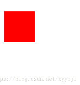
<!DOCTYPE html>
<html>
<head>
    <meta charset="UTF-8">
    <title>小demo - transition-property </title>
    <style>
        body{
            margin: 0;
        }
        .box1{
            width: 100px;
            height: 100px;
            background-color: red;
            transition: all .3s ease-in -0.1s;
            margin-top: 50px;
            margin-left: 50px;
        }
        .box1:hover{
            width: 200px;
            height: 200px;
            background-color: yellow;
        }
    </style>
</head>
<body>
    <div class="box1"></div>
</body>
</html>
过渡的例子
动画animation
animation-name自定义动画名称
调用自定义动画
/* from指时间开始,to指时间的结束 */
@keyframes 动画名称{
    form{
        样式;/* 可以省略,只有目标状态 */
    }
    to{
        样式;
    }
}
/* 自己规定动画的进程,自己添加动画的百分比 */
@keyframes 动画名称{
    a%{样式};
    b%{样式};
}
/*最小0%,最大100%,可以分成很多个阶段,每个百分比为关键帧*/
animation-duration
动画执行时长(s/ms),具体跟过渡时长差不多
animation-delay
动画延时(s/ms)
延迟时间可以是负数,负数表示到提前运动多少秒的状态,正数表示延迟时间
animation-timing-function
动画速度曲线类似于transition-timing-function
steps(n); 逐帧动画
transition-iteration-count
动画执行的次数
- 具体的数值(没有单位)
- infinite(关键词,无限重复次数)
transition-direction
动画循环播放时,每次都是从结束状态调回到起始状态,再开始播放。,使用这个属性可以改变这个。
动画播放方向,动画是否会反向播放,需要多次运动,才能看到效果
- normal 正常播放,结束后会回到起点,默认
- alternate 播放结束之后反向回到开头,偶数次反向
- reverse 反向播放 和normal相反
- alternate=reverse 先反后正,和alternate相反
animation-play-state
动画执行状态
- paused 暂停动画
- running 运行动画
animation-fill-mode
动画结束以后,会立即从结束状态调回到起始状态,如果想让动画保持在结束状态,需要使用这个属性。
- none 不改变(默认)
- forwards 动画完成停留在最后一个关键帧中,让动画停留在结束状态
- backwards 动画开始之前的延时阶段,应用0%的关键帧(让动画回到第一帧的状态)
- both 向前向后都应用(轮流应用forwards和backwards规则)
animation复合写法
animation: animation-duration animation-delay animation-name animation-timing-function animation-fill-mode animation-direction;
动画的小例子:
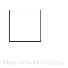
<!DOCTYPE html>
<html>
<head>
    <meta charset="UTF-8">
    <title>小demo - transition-property </title>
    <style>
        body{
            margin: 0;
        }
        div{
            width: 100px;
            height: 100px;
            border: 1px solid #000;
            margin-top: 50px;
            margin-left: 50px;
        }
        div:hover{
            animation: 1s rainbow infinite;
        }
        @keyframes rainbow{
            0%{background-color: #c00;}
            50%{background-color: orange;}
            100%{background-color: yellow;}
        }
    </style>
</head>
<body>
    <div></div>
</body>
</html>