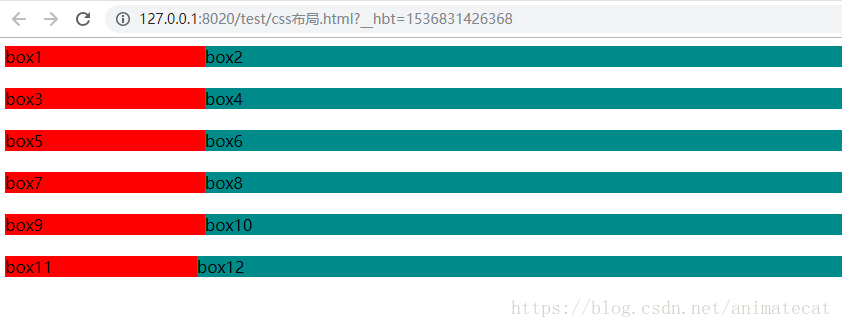
1.浮动布局
左侧设置固定宽并且左浮动,右侧加个margin-left;
.box1{
	background: red;
	width: 200px;
	float: left;
}
.box2{
	background: darkcyan;
    margin-left: 200px;
}
2.calc()计算属性
设置固定宽并且左浮动,右侧宽度为calc(100% - 宽度px);
.box3{
	background: red;
	width: 200px;
	float: left;
}
.box4{
    background: darkcyan;
	width: calc(100% - 200px);
	float: right;/*或者float:left*/
}
注意:calc的减号两边必须有空格。
3.flex(需要考虑浏览器兼容)
父级元素设置display:flex,左侧设置固定宽,右侧flex:1;
.type3{
	display: flex;
}
.box5{
	background: red;
	width: 200px;
}
.box6{
	background: darkcyan;
	flex: 1;
}
4.overflow
左侧设置固定宽并且左浮动,右侧加overflow:hidden;
.box7{
	background: red;
	width: 200px;
	float: left;
}
.box8{
	background: darkcyan;
	overflow: hidden;
}
5.absolute+margin
左侧设置固定宽并且绝对定位,右侧加margin-left;
.box9{
    background: red;
	width: 200px;
	position: absolute;
}
.box10{
	background: darkcyan;
	margin-left: 200px;
}
代码:
<html>
	<head>
		<meta charset="UTF-8">
		<title>css布局</title>
		<style>
			.box1{
				background: red;
				width: 200px;
				float: left;
			}
			.box2{
				background: darkcyan;
				 margin-left: 200px;
			}

			.box3{
				background: red;
				width: 200px;
				float: left;
			}
			.box4{
				background: darkcyan;
				width: calc(100% - 200px);
				float: right;/*或者float:left*/
			}

			.type3{
				display: flex;
			}
			.box5{
				background: red;
				width: 200px;
			}
			.box6{
				background: darkcyan;
				flex: 1;
			}

			.box7{
				background: red;
				width: 200px;
				float: left;
			}
			.box8{
				background: darkcyan;
				overflow: hidden;
			}

			.box9{
				background: red;
				width: 200px;
				position: absolute;
			}
			.box10{
				background: darkcyan;
				margin-left: 200px;
			}

			.box11{
				background: red;
				width: 200px;
				position: absolute;
			}
			.box12{
				background: darkcyan;
				width: 100%;
				position: absolute;
				left: 200px;
			}
		</style>
	</head>
	<body>
		<!--浮动布局-->
		<div class="type1">
			<div class="box1">box1</div>
			<div class="box2">box2</div>
		</div>
		<br>
		<!--clac()计算属性-->
		<div class="type2">
			<div class="box3">box3</div>
			<div class="box4">box4</div>
		</div>
		<br><br>
		<!--flex布局,需考虑兼容性-->
		<div class="type3">
			<div class="box5">box5</div>
			<div class="box6">box6</div>
		</div>
		<br>
		<!--overflow-->
		<div class="type4">
			<div class="box7">box7</div>
			<div class="box8">box8</div>
		</div>
		<br>
		<!--绝对定位absolute+margin-->
		<div class="type5">
			<div class="box9">box9</div>
			<div class="box10">box10</div>
		</div>
		<br>
		<!--左右都absolute,右侧加left-->
		<div class="type6">
			<div class="box11">box11</div>
			<div class="box12">box12</div>
		</div>
	</body>
</html>
效果图: