版权声明:本文为博主原创文章,博主不会以任何方式收取查看费用,欢迎大家转载。 https://blog.csdn.net/guozhangqiang/article/details/82379306
首先,第一步下载Echarts。
淘宝镜像
npm install --registry=https://registry.npm.taobao.org
npm install -g cnpm --registry=https://registry.npm.taobao.org
cnpm install echarts第二步,引入echarts。
import echarts from 'echarts'第三步,初始化。
let myChart = echarts.init(document.getElementById('chart_example'));第四步,定义数据。
let option = {
        color: ['#f44'],
        tooltip : {
          trigger: 'axis',
          axisPointer : {
            type : 'shadow'
          }
        },
        xAxis : [
          {
            type : 'category',
            data : ['1月','2月','3月','4月','5月','6月','7月','8月','9月','10月','11月','12月',],
            axisTick: {
              alignWithLabel: true
            }
          }
        ],
        yAxis : [
          {
            type : 'value'
          }
        ],
        series : [
          {
            name:'每月花费',
            type:'bar',
            barWidth: '60%',
            data:[995,666,444,858,654,236,645,546,846,225,547,356]
          }
        ]
      };
第五步,绘制。
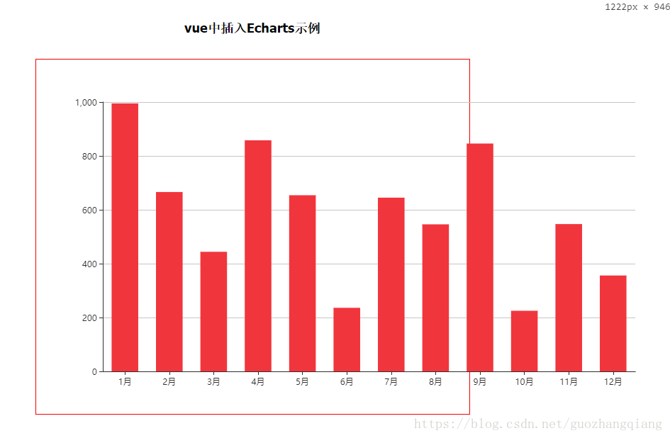
myChart.setOption(option);效果图
完整示例代码
<style scoped>
h2{
text-align: center;
padding: 30px;
font-size: 18px;
}
#chart_example{
width: 50%;
height: 500px;
border: 1px solid red;
margin: 0 auto;
}
</style>
<template>
<div>
<h2>vue中插入Echarts示例</h2>
<div id="chart_example">
</div>
</div>
</template>
<script>
import echarts from 'echarts'
export default {
data() {
return {}
},
mounted() {
let this_ = this;
let myChart = echarts.init(document.getElementById('chart_example'));
let option = {
color: ['#f44'],
tooltip : {
trigger: 'axis',
axisPointer : {
type : 'shadow'
}
},
xAxis : [
{
type : 'category',
data : ['1月','2月','3月','4月','5月','6月','7月','8月','9月','10月','11月','12月',],
axisTick: {
alignWithLabel: true
}
}
],
yAxis : [
{
type : 'value'
}
],
series : [
{
name:'每月花费',
type:'bar',
barWidth: '60%',
data:[995,666,444,858,654,236,645,546,846,225,547,356]
}
]
};
myChart.setOption(option);
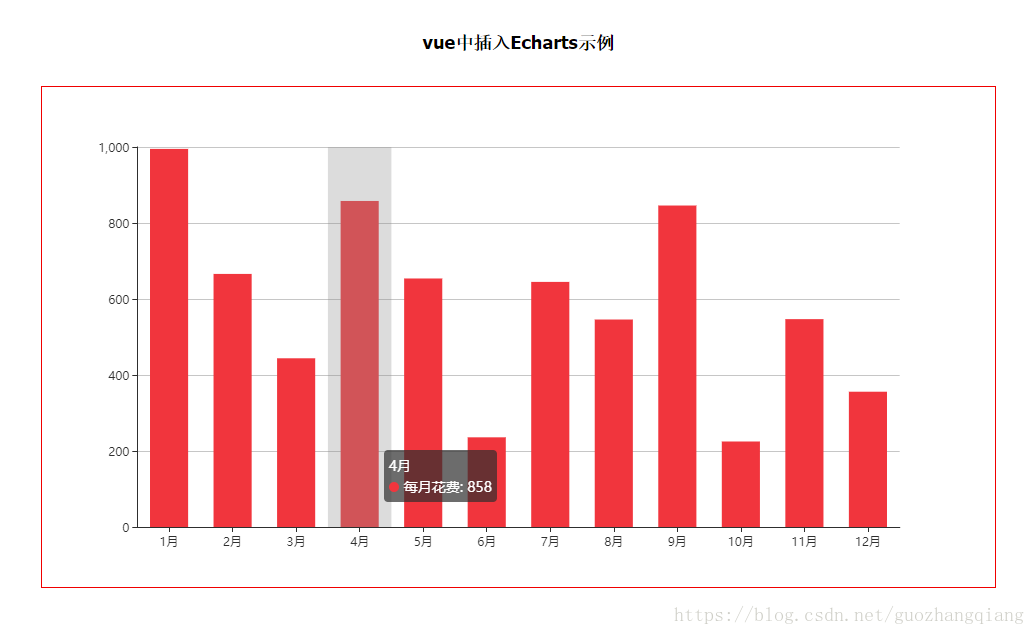
//建议加上以下这一行代码,不加的效果图如下(当浏览器窗口缩小的时候)。超过了div的界限(红色边框)
window.addEventListener('resize',function() {myChart.resize()});
},
methods: {},
watch: {},
created() {
}
}
</script>