前言
最近我的个人项目中,有一个页面需要大量用到 ProgressBar,但是每个 ProgressBar 的颜色是不确定的。
那么原生 ProgressBar 就无法满足我的需求了,因为原生 ProgressBar 的样式是根据 Drawable 来的,那么多颜色,岂不是需要创建 N 个 Drawable 文件了?并且该 ProgressBar 在 AndroidN 之前并没有动画效果,综上所述,索性去 GayHub 看看有没有好用的裤子。
看了一圈,发现有一个裤子挺好,继承自 LinearLayout 实现,很强大,代码也多,虽然能满足我的需求,但是有些过剩啊。
我的需求也不是很大,其实直接继承自 ProgressBar 就可以实现,不如自己造个轮子吧,既然 ProgressBar 是通过 Drawable 来指定样式的,那么我就可以直接在代码中生成 layout-list 和 shape 来实现一个可动态配置样式的 ProgressBar 了。
废话了一圈,阐述了下为什么有这个自定义控件。写到这,发现自己废话可真多啊。。。看这些话的时间都能理解完代码了。。。因为代码很简单、也非常少。。。
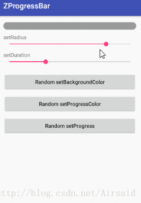
最终效果
首先看下最终的效果:
使用
XML 中:
 <com.github.airsaid.zprogressbar.widget.ZProgressBar
        android:id="@+id/progressBar"
        android:layout_width="match_parent"
        android:layout_height="20dp"
        android:max="100"
        app:zpb_backgroundColor="#999999"
        app:zpb_duration="300"
        app:zpb_progressColor="@color/colorAccent"
        app:zpb_radius="16dp"/>
代码中:
ZProgressBar mProgressBar = (ZProgressBar) findViewById(R.id.progressBar);
mProgressBar.setAnimProgress(50);
属性&方法
| 属性名 | java方法 | 作用 |
|---|---|---|
| zpb_backgroundColor | setDefBackgroundColor(int color) | 设置背景颜色 |
| zpb_progressColor | setProgressColor(int color) | 设置进度颜色 |
| zpb_radius | setRadius(float radius) | 设置背景弧度 |
| zpb_duration | setDuration(int duration) | 设置动画时长 |
步骤
1,定义属性
首先思考下,该控件我们需要动态去控制的东西有哪些?背景色、进度颜色肯定需要,还有四周的弧度、动画的时长。思考好后,我们就可以在 values 文件夹下新建个 attrs 文件,用于编写自定义属性:
 <declare-styleable name="ZProgressBar">
        <!--背景颜色-->
        <attr name="zpb_backgroundColor" format="color"/>
        <!--进度条颜色-->
        <attr name="zpb_progressColor" format="color"/>
        <!--背景弧度-->
        <attr name="zpb_radius" format="dimension"/>
        <!--动画时长-->
        <attr name="zpb_duration" format="integer"/>
    </declare-styleable>
2,自定义类继承 ProgressBar
因为我们是对原有的 ProgressBar 进行扩展,所以我们需要自定义一个类继承自 ProgressBar:
public class ZProgressBar extends ProgressBar {

    private final Context mContext;

    public ZProgressBar(Context context) {
        this(context, null);
    }

    public ZProgressBar(Context context, AttributeSet attrs) {
        this(context, attrs, 0);
    }

    public ZProgressBar(Context context, AttributeSet attrs, int defStyleAttr) {
        super(context, attrs, defStyleAttr);
        mContext = context;
    }
实现其构造方法,最终指向有三个参数的构造方法,在该方法内获取刚刚定义好的自定义属性,以及初始化操作:
    public ZProgressBar(Context context, AttributeSet attrs, int defStyleAttr) {
        super(context, attrs, defStyleAttr);
        mContext = context;
        initAttrs(attrs);
        createDrawable();
    }
private void initAttrs(AttributeSet attrs) {
TypedArray a = mContext.obtainStyledAttributes(attrs, R.styleable.ZProgressBar);
mBackgroundColor = a.getColor(R.styleable.ZProgressBar_zpb_backgroundColor, mBackgroundColor);
mProgressColor = a.getColor(R.styleable.ZProgressBar_zpb_progressColor, mProgressColor);
mRadius = a.getDimension(R.styleable.ZProgressBar_zpb_radius, mRadius);
mDuration = a.getInt(R.styleable.ZProgressBar_zpb_duration, mDuration);
a.recycle();
}private void createDrawable(){
Drawable[] layers = new Drawable[2];
Drawable background = makeBackground();
Drawable progress = makeProgress();
ClipDrawable clip = new ClipDrawable(progress
, Gravity.LEFT, ClipDrawable.HORIZONTAL);
layers[0] = background;
layers[1] = clip;
LayerDrawable layer = new LayerDrawable(layers);
layer.setId(0, android.R.id.background);
layer.setId(1, android.R.id.progress);
setProgressDrawable(layer);
}控制 ProgressBar 的样式,主要就在 setProgressDrawable 方法上,该方法的参数为一个根节点为 layout-list 的 drawable,而该 drawable 对应的类就是 LayerDrawable,于是我们需要用代码去动态生成这个类。
在上面代码中,创建了两层 drawable,分别为背景(background)和进度(progress)用于填充到 LayerDrawable:
private Drawable makeBackground(){
    return createShape(mRadius, mBackgroundColor);
}


private Drawable makeProgress(){
    return createShape(mRadius, mProgressColor);
}

private Drawable createShape(float radius, int color){
    ShapeDrawable shape = new ShapeDrawable();
    // 设置弧度
    radius = dp2px(radius);
    float[] outerRadii = new float[]{radius, radius, radius, radius, radius, radius, radius, radius};
    RoundRectShape roundShape = new RoundRectShape(outerRadii, null, null);
    shape.setShape(roundShape);
    // 设置颜色
    shape.getPaint().setColor(color);
    return shape;
}
通过 RoundRectShape 类来设置弧度,通过改变 ShapeDrawable 类的 paint 颜色来设置颜色。
在填充进度的 drawable 时,我们还必须设置 ClipDrawable,因为 ProgressBar 的进度显示效果,就是通过该类裁剪得出来的。 该类的第二个参数,可以控制裁剪的方向,这里默认是从左往右。
在设置 layotu-list 每层的 id 时,指定好 android 包下对应的 background 和 progress id,然后将创建并填充好的 LayoutDrawable 设置到 setProgressDrawable 方法中,ProgressBar 的样式就创建好了。