1.表格样式创建
表格视觉样式:Dataframe.style → 返回pandas.Styler对象的属性,具有格式化和显示Dataframe的有用方法
样式创建:
① Styler.applymap:elementwise → 按元素方式处理Dataframe
② Styler.apply:column- / row- / table-wise → 按行/列处理Dataframe
import numpy as np
import pandas as pd
import matplotlib.pyplot as plt
% matplotlib inline
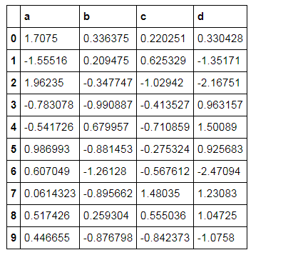
#样式
df = pd.DataFrame(np.random.randn(10, 4), columns=['a','b','c','d'])
sty = df.style
print(sty, type(sty)) # 查看样式类型

sty  # 显示样式
---->
<pandas.formats.style.Styler object at 0x00000000097731D0> <class 'pandas.formats.style.Styler'>
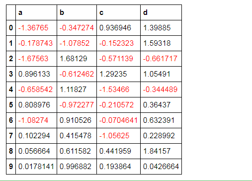
# 按元素处理样式:style.applymap()
def color_neg_red(val):
    if val < 0:
        color = 'red'
    else:
        color = 'black'
    return ('color:%s'% color)
df.style.applymap(color_neg_red)
# 创建样式方法,使得小于0的数变成红色
# style.applymap() → 自动调用其中的函数
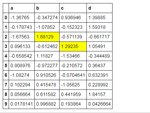
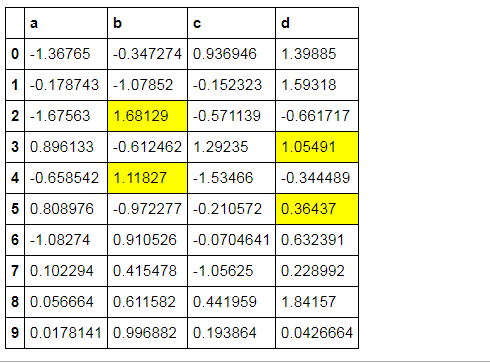
# 按行/列处理样式:style.apply()
def highlight_max(s):
    is_max = s == s.max()
    print(is_max)
    lst = []
    for v in is_max:
        if v:
            lst.append('background-color: yellow')
        else:
            lst.append('')
    return (lst)
df.style.apply(highlight_max, axis=0, subset=['b', 'c']) # axis:0为列,1为行,默认为0;  # subset:索引
# 创建样式方法,每列最大值填充黄色
0    False
1    False
2     True
3    False
4    False
5    False
6    False
7    False
8    False
9    False
Name: b, dtype: bool
0    False
1    False
2     True
3    False
4    False
5    False
6    False
7    False
8    False
9    False
Name: b, dtype: bool
0    False
1    False
2    False
3     True
4    False
5    False
6    False
7    False
8    False
9    False
Name: c, dtype: bool
# 样式索引、切片

df.style.apply(highlight_max, axis = 1,
               subset = pd.IndexSlice[2:5,['b', 'd']])  # 通过pd.IndexSlice[]调用切片

# 也可:df[2:5].style.apply(highlight_max, subset = ['b', 'd']) → 先索引行再做样式
b     True
d    False
Name: 2, dtype: bool
b     True
d    False
Name: 2, dtype: bool
b    False
d     True
Name: 3, dtype: bool
b     True
d    False
Name: 4, dtype: bool
b    False
d     True
Name: 5, dtype: bool
2.表格显示控制
df.style.format()
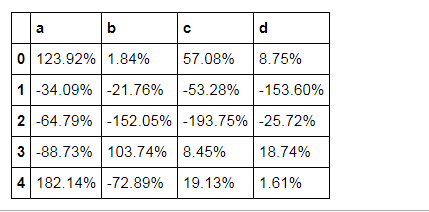
# 按照百分数显示

df = pd.DataFrame(np.random.randn(10,4),columns=['a','b','c','d'])
print(df.head())
df.head().style.format("{:.2%}")
          a         b         c         d
0  1.239244  0.018364  0.570776  0.087462
1 -0.340928 -0.217569 -0.532815 -1.535981
2 -0.647936 -1.520526 -1.937499 -0.257186
3 -0.887309  1.037361  0.084524  0.187425
4  1.821439 -0.728899  0.191298  0.016149
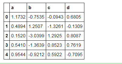
# 显示小数点数

df.head().style.format("{:.4f}")
扫描二维码关注公众号,回复:
2907782 查看本文章

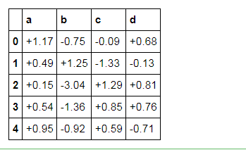
# 显示正负数

df.head().style.format("{:+.2f}")
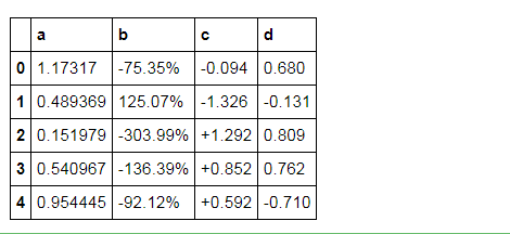
# 分列显示

df.head().style.format({'b':"{:.2%}", 'c':"{:+.3f}", 'd':"{:.3f}"})
3.表格样式调用
Styler内置样式调用
# 定位空值
df = pd.DataFrame(np.random.rand(5, 4), columns=list('ABCD'))
df['A'][2] = np.nan
df.style.highlight_null(null_color='red')

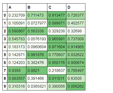
# 色彩映射

df = pd.DataFrame(np.random.rand(10,4),columns = list('ABCD'))
df.style.background_gradient(cmap='Greens',axis =1,low=0,high=1) # cmap:颜色; # axis:映射参考,0为行,1以列
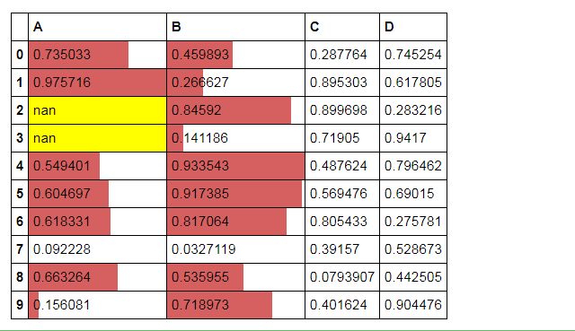
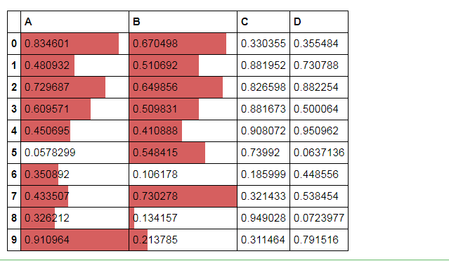
# 条形图

df = pd.DataFrame(np.random.rand(10,4),columns = list('ABCD'))
df.style.bar(subset=['A', 'B'], color='#d65f5f', width=100) # width:最长长度在格子的占比
# 分段式构建样式
df = pd.DataFrame(np.random.rand(10,4),columns = list('ABCD'))
df['A'][[3,2]] = np.nan
df.style.\
    bar(subset=['A', 'B'], color='#d65f5f', width=100).\
    highlight_null(null_color='yellow')