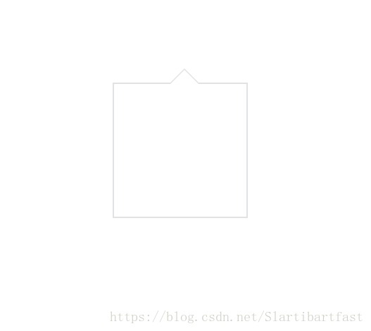
效果图:
代码:
<!DOCTYPE html>
<html lang="en">
<head>
    <meta charset="UTF-8">
    <title>三角形</title>
    <style>
        div {
            box-sizing: border-box;
            width: 96px;
            height: 96px;
            background-color: white;
            position: relative;
            left: 300px;
            top: 300px;
            border: 1px solid #E2E3E4;
        }

        div::before {
            width: 0;
            height: 0;
            content: "";
            position: absolute;
            left: 39px;
            top: -11px;
            border-left: solid 11px transparent;
            border-bottom: solid 11px #E2E3E4;
            border-right: solid 11px transparent;
        }

        div::after {
            width: 0;
            height: 0;
            content: "";
            position: absolute;
            left: 40px;
            top: -10px;
            border-left: solid 10px transparent;
            border-bottom: solid 10px white;
            border-right: solid 10px transparent;
        }
    </style>
</head>
<body>
<div>
</div>
</body>
</html>