viewport 视口(可视区窗口)
    默认不设置viewport一般可视区宽度在移动端是980
    width 可视区的宽度 (number||device-width)
    user-scalable 是否允许用户缩放 (yes||no) iOS10无效
    initial-scale 初始缩放比例
    minimum-scale 最小缩放比例
    maximum-scale 最大缩放比例
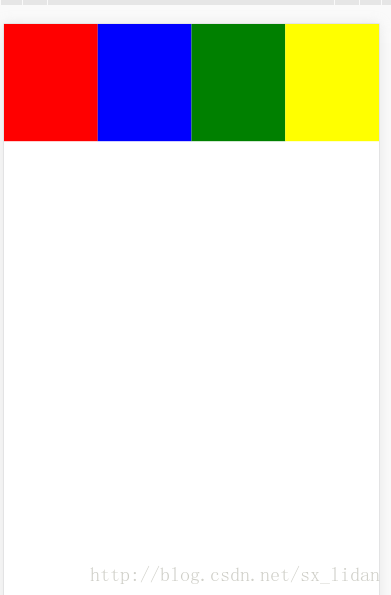
- 百分比适配
<!DOCTYPE html>
<html lang="en">
<head>
<meta charset="UTF-8">
<title>Document</title>
<meta name="viewport" content="width=device-width,user-scalable=no">
<style type="text/css">
    body {
        margin: 0;
    }
    div {
        width: 25%;
        height: 100px;
        float: left;
    }
    .box1 {
        background: red;
    }
    .box2 {
        background: blue;
    }
    .box3 {
        background: green;
    }
    .box4 {
        background: yellow;
    }
</style>
</head>
<body>
<div class="box1"></div>
<div class="box2"></div>
<div class="box3"></div>
<div class="box4"></div>
</body>
</html>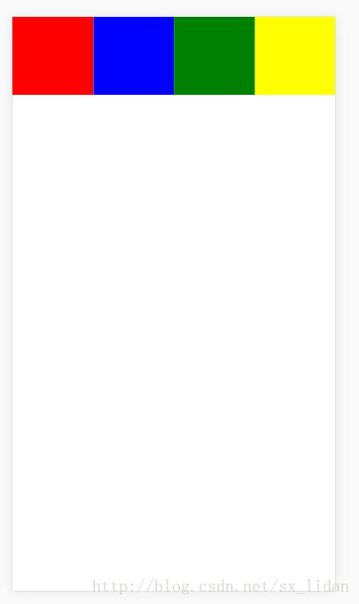
2.rem 适配
!DOCTYPE html>
<html>
    <head>
        <meta charset="UTF-8">
        <meta name="viewport" content="width=device-width,user-scalable=no"/>
        <title></title>
        <script>
            (function(){
                var html = document.documentElement;
                var hWidth = html.getBoundingClientRect().width;//320
                //console.log( hWidth );
                html.style.fontSize = hWidth/10 + "px";//32

            })()
        </script>
        <style>
            body{
                margin: 0;
            }
            div{
                float: left;
                box-sizing: border-box;
                width: 4rem;
                height: 4rem;
                border: 1px solid #000;
            }
            div:nth-of-type(1){
                background-color: red;
            }
            div:nth-of-type(2){
                background-color: yellow;
            }
            div:nth-of-type(3){
                background-color: green;
            }
            div:nth-of-type(4){
                background-color: pink;
            }
        </style>
    </head>
    <body>
        <!--
            rem / em
            root 根节点的字体大小进行计算的
        -->
        <div></div>
        <div></div>
        <div></div>
        <div></div>
    </body>
</html>
3.动态修改适配
<meta charset="UTF-8">
<title>Document</title>
<script type="text/javascript">
(function(){
    var w = window.screen.width;
    var targetW = 320;
    var scale = w/targetW; //当前尺寸/目标尺寸
    var meta = document.createElement("meta");
    meta.name = "viewport";
    meta.content = "user-scalable=no,initial-scale="+scale+",minimum-scale="+scale+",maximum-scale="+scale+"";
    //console.log(scale);

    document.head.appendChild(meta);
})();
</script>
<!--
<meta name="viewport" content="user-scalable=no,initial-scale=1.0,minimum-scale=1.0,maximum-scale=1.0">
-->
<style type="text/css">
    body {
        margin: 0;
    }
    div {
        width: 80px;
        height: 100px;
        float: left;
    }
    .box1 {
        background: red;
    }
    .box2 {
        background: blue;
    }
    .box3 {
        background: green;
    }
    .box4 {
        background: yellow;
    }
</style>
</head>
<body>
<div class="box1"></div>
<div class="box2"></div>
<div class="box3"></div>
<div class="box4"></div>
</body>
</html>